
Visual consistency is defined as the deliberate use of the same colors, typography, imagery style, and layout across every brand touchpoint, from your website to your packaging to your social feed. This is the foundation of brand recognition, and understanding why visual consistency is key separates brands that earn instant trust from those that get scrolled past. Consistent brand presentation can increase total revenue by up to 33% by reducing customer friction and simplifying recognition. That number alone makes visual consistency one of the highest-return disciplines in marketing. The cognitive psychology behind it, specifically concepts like processing fluency and cognitive ease, explains why your audience trusts what feels familiar.
Why visual consistency is key to consumer perception
Your audience forms a judgment about your brand's credibility in less than 50 milliseconds based on visual cues alone. That is faster than a blink. Before a single word is read, your color palette, typography weight, and image style have already communicated whether your brand is trustworthy or not.
The psychological mechanism at work is called processing fluency. When a brain encounters familiar, predictable visual patterns, it processes them with less effort. Processing fluency increases consumer trust through familiar visuals because the brain interprets ease of processing as a signal of reliability. A brand that looks the same across its Instagram profile, its website, and its product packaging feels like a brand that has its act together.
The opposite effect is equally powerful and far more damaging. When your visuals and messaging send conflicting signals, your audience experiences cognitive dissonance. Mental discomfort from conflicting visual and messaging cues actively drives customers away. A luxury product photographed on a cluttered, low-resolution background creates a mismatch that the brain registers as a warning sign, even if the viewer cannot articulate why.
"A social media feed is often the first handshake a brand extends to a potential customer. Visual chaos in that feed reduces perceived professionalism before a single word is read."
Consider two competing tech brands. One uses the same cool gray palette, clean sans-serif typography, and high-contrast product photography across every channel. The other mixes warm lifestyle shots on Instagram, flat vector graphics on its website, and inconsistent font choices in its email campaigns. The first brand feels authoritative. The second feels unfinished. The product quality may be identical, but the perception gap is real and it directly affects purchase decisions.
Visual information is also processed approximately 60,000 times faster than text. That speed means your visuals are doing the heavy lifting of brand communication long before your copy gets a chance to speak.

What are the measurable business benefits of visual consistency?
The financial case for visual consistency is concrete. Consistent color palettes raise brand recognition by up to 80%. Recognition is the precondition for trust, and trust is the precondition for conversion.
Brands suffering high visual-message dissonance experience conversion rates up to 38% lower than consistent competitors. That gap compounds over time. Every campaign you run with mismatched visuals is not just underperforming. It is actively eroding the brand equity you have already built.
| Metric | Consistent brand | Inconsistent brand |
|---|---|---|
| Revenue impact | Up to 33% increase | Baseline or declining |
| Brand recognition | Up to 80% higher with consistent color | Fragmented recall |
| Conversion rate | Competitive benchmark | Up to 38% lower |
| Customer friction | Reduced through familiarity | Elevated by visual noise |
| Marketing efficiency | Higher ROI per campaign | Repeated rebuilding costs |
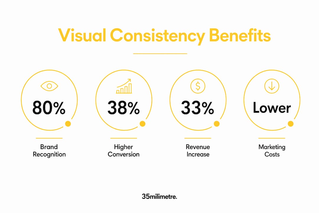
Inconsistency also inflates your marketing costs in ways that are easy to miss. When your audience does not recognize your brand immediately, you spend more on frequency and reach just to achieve the same awareness. A consistent visual identity means each impression builds on the last, compounding recognition rather than starting from zero.
Pro Tip: Audit your last three months of published content across every channel. If a stranger could not identify all of it as coming from the same brand within five seconds, your visual consistency has a gap worth addressing before your next campaign.
Common misconceptions about visual consistency
The most damaging misconception is that visual consistency means using identical assets everywhere. It does not. Visual consistency means creating a shared visual DNA that allows flexible yet cohesive adaptations across channels. A brand can use a vertical crop on Instagram, a horizontal banner on LinkedIn, and a square thumbnail on YouTube and still feel completely unified, as long as the color, typography, and image style share the same underlying logic.
A second misconception is that a style guide alone solves the problem. Style guides are necessary, but they are not sufficient. Visual consistency is a habit, not just a document. It requires systems and workflows that turn subjective design choices into repeatable rules your whole team can follow without a designer in the room.
A third misconception is that pixel-perfect consistency across every device and screen is the goal. Pixel-perfect consistency across devices is often impossible. The real target is implementation consistency, the kind that feels solid and considered even when the exact dimensions differ. A brand that looks intentional on a 4K monitor and a mobile screen has achieved something more valuable than pixel matching.
Here is where many brand teams go wrong:
- They create a style guide and treat it as finished work, rather than a living reference.
- They allow individual team members or agencies to interpret brand rules independently without shared templates.
- They prioritize creative novelty in individual campaigns over the cumulative power of a recognizable visual system.
- They confuse visual variety, which is healthy, with visual inconsistency, which is not.
Pro Tip: Convert your style guide into operational rules. Instead of "use our brand blue," write "use #1A3C8F for all primary CTA buttons and headline text on white backgrounds." Specificity removes interpretation and removes inconsistency.
How to achieve visual consistency across every channel
Building a visual system that holds across channels requires more than good intentions. It requires practical, repeatable processes that your team can execute without reinventing decisions every time.
-
Define your visual DNA, not just your assets. Document the underlying logic of your brand: the emotional tone your imagery should convey, the lighting style for product photography, the typographic hierarchy for every content format. This gives your team a decision framework, not just a color hex code.
-
Build pre-branded templates for every recurring content format. Social posts, email headers, presentation decks, ad banners, and product image backgrounds should all have locked templates. Batching content in pre-branded templates boosts consistency and productivity at the same time. When your designer is not rebuilding the same layout from scratch each week, quality and speed both improve.
-
Standardize your image styling across all product and campaign photography. Color grading, background treatment, shadow style, and retouching approach should follow written specifications. A product shot for your website and a product shot for a paid ad should look like they came from the same shoot, even if they did not.
-
Audit your social media presence as a grid, not as individual posts. Visual chaos in social feeds signals organizational disarray and undermines authority. View your last 12 posts as a single image. If the palette, tone, and style feel cohesive, your system is working. If it looks like three different brands, your workflow needs tightening.
-
Assign visual consistency ownership. Someone on your team needs to be accountable for reviewing every piece of published content against brand standards. Without ownership, inconsistency accumulates silently. This does not require a full-time brand police role. It requires a clear checklist and a designated reviewer.
For brands managing high volumes of product imagery, visual branding ROI depends heavily on whether your post-production workflow enforces consistent color grading, compositing style, and retouching standards across every image batch. One off-brand product shot in a catalog can undermine the credibility of the entire collection.
Key Takeaways
Visual consistency is the single most controllable driver of brand recognition, consumer trust, and conversion performance available to brand managers.
| Point | Details |
|---|---|
| Trust forms in milliseconds | Audiences judge brand credibility in under 50 milliseconds, making visual cues your most powerful first impression. |
| Consistency drives revenue | Consistent brand presentation can increase total revenue by up to 33% by reducing friction and building recognition. |
| Color recognition compounds | A consistent color palette alone can raise brand recognition by up to 80% over time. |
| Consistency is a system, not a document | Style guides only work when backed by templates, workflows, and team accountability. |
| Visual DNA beats pixel perfection | Cohesive adaptations across channels matter more than identical assets on every platform. |
What two decades of visual work taught us about consistency
At 35milimetre, we have spent over 20 years working on high-end visuals for technology and automotive brands, and the pattern we see most often is not a lack of talent. It is a lack of system. A brand will invest in a beautiful campaign, then let the follow-up content drift because the workflow was not built to maintain the standard.
The brands that hold their visual identity together over time are not necessarily the ones with the biggest budgets. They are the ones who treat consistency as an operational discipline, not a creative aspiration. They have written specifications for image retouching. They have locked templates for recurring formats. They have someone who checks every asset before it goes live.
We have also watched inconsistency erode brand equity in ways that are genuinely hard to recover from. A product line that looks polished on the website but flat and unretouched in marketplace listings creates a credibility gap that no amount of copy can close. Customers notice the gap even when they cannot name it. They just feel less confident about the purchase.
The shift we encourage every brand manager to make is this: stop treating your visual identity guide as a one-time deliverable and start treating visual consistency as a daily practice. The brands that win in crowded digital markets are the ones whose every touchpoint feels like it was made by the same hand, with the same intention, every single time.
— 35mm
Professional post-production for brands that cannot afford to look inconsistent
Maintaining flawless visual standards across product photography, advertising, and digital content is demanding work. Even well-resourced brand teams find that color grading, compositing, and retouching standards drift when volume increases or when multiple vendors are involved.
35milimetre's commercial post-production services are built for exactly this challenge. The studio works with ad agencies, technology brands, and automotive clients to deliver imagery that holds a consistent visual standard across every format and channel. From retouching and compositing to CGI and AI-enhanced imagery, the team brings the same exacting approach to every asset. If your brand's visual output needs to look like it came from one unified creative vision, that is the work 35milimetre does every day.
FAQ
What is visual consistency in branding?
Visual consistency in branding is the practice of using the same colors, typography, imagery style, and layout logic across all brand touchpoints. It creates a unified visual identity that audiences recognize and trust instantly.
Why is visual consistency important for conversion rates?
Brands with high visual-message dissonance experience conversion rates up to 38% lower than consistent competitors. Consistent visuals reduce cognitive friction, making it easier for customers to trust and act.
How does color consistency affect brand recognition?
Maintaining a consistent color palette can increase brand recognition by up to 80%. Color is one of the fastest visual cues the brain processes, making it a primary driver of brand recall.
Does visual consistency mean using the same image everywhere?
No. Visual consistency means sharing a visual DNA across channels, not duplicating identical assets. A brand can adapt formats for each platform while keeping color, typography, and image style cohesive.
How do you maintain visual consistency at scale?
The most effective approach combines pre-branded templates, written image styling specifications, and a designated reviewer for all published content. Batching workflows with locked templates is the most practical method for high-volume brand teams.