Explaining visual trends is the process of interpreting emerging visual styles and phenomena to guide creative and marketing decisions before those styles become mainstream vocabulary. For creative professionals and marketers, this practice is not optional context. It is the mechanism that separates brands reacting to culture from brands shaping it. Visual trends form weeks before language describing them appears, which means text-only monitoring leaves your team perpetually behind the curve. Tools like Pulsar's visual social listening, frameworks from researchers like Enrico Bertini, and data from Canva's 2026 State of Visual Communication report all confirm that understanding visual trends at the signal stage produces measurable advantages in campaign timing, brand cohesion, and audience trust.
Why explain visual trends before your competitors do
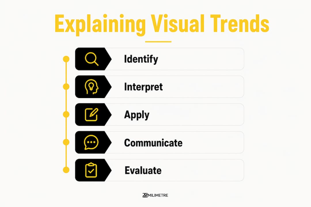
Visual trend analysis, the formal term for this practice, is the structured process of identifying, interpreting, and applying emerging aesthetic patterns across image and video content. The significance of visual trends lies in a simple but often overlooked fact: imagery communicates meaning before words catch up. A new color palette, a shift in photographic texture, or a change in motion style circulates across platforms like Instagram, TikTok, and Pinterest as pure visual signal, weeks before any trend report names it.
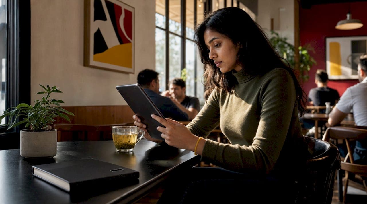
Visual social listening detects these signals at the earliest stage using image recognition and video transcription, capturing brand appearances and associations that text tools cannot see. This matters most in categories like fashion, beauty, food, and lifestyle, where visual identity moves faster than editorial coverage. A beauty brand that spots a shift toward muted, film-grain aesthetics in user-generated content three weeks before a competitor's agency briefs it has a real timing advantage in campaign production.
The benefits of visual trends extend directly into media strategy. When your team understands why a visual style is gaining traction, not just that it exists, you can make informed decisions about whether to adopt, adapt, or consciously avoid it. That interpretive layer is what separates trend awareness from trend intelligence.
- Monitor image and video content across social platforms, not just hashtags and text mentions
- Track visual signals in your specific category, since fashion, food, and beauty move on different cycles
- Document emerging aesthetics with annotated examples so your creative team can brief against them
- Connect visual signal data to campaign timelines so production can respond before a trend peaks
Pro Tip: Integrate a visual listening review into your monthly campaign planning cycle. Even a 30-minute image audit using tools like Pulsar can surface aesthetic shifts that your text analytics dashboard will not flag for another month.
How does visual framing change what audiences actually understand?
The importance of visual trends goes deeper than aesthetics. The specific visual form you choose to communicate an idea changes what your audience extracts from it. People interpret the same data differently when it is visualized as a bar chart versus a line chart, a finding from Zacks and Tversky that has direct implications for every marketer building a campaign deck or a brand story.

Bar charts communicate discrete comparisons. Line charts communicate change over time. Neither is neutral. When you choose one over the other, you are not just selecting a format. You are selecting a cognitive frame that shapes what your audience believes the data means. The same principle applies to photography style, color grading, and compositional choices in advertising. A flat-lay product shot communicates accessibility and order. A lifestyle shot communicates aspiration and context. Both can be accurate representations of the same product, yet they produce different audience responses.
This is why briefing creative teams on visual trends requires more than sharing a mood board. The brief must specify the intended cognitive message, not just the aesthetic reference. Understanding visual trends at this level means your team produces work that communicates the right meaning, not just work that looks current.
| Visual type | Primary cognitive message |
|---|---|
| Bar chart | Discrete comparison between categories |
| Line chart | Change or progression over time |
| Flat-lay photography | Order, accessibility, product clarity |
| Lifestyle photography | Aspiration, context, emotional connection |
| Grain or film texture | Authenticity, intimacy, human imperfection |
What are the cognitive limits that make motion trends hard to follow?
Animated visuals are among the fastest-growing formats in digital marketing, yet they are also among the most frequently misused. The impact of visual trends in motion-based media is constrained by a hard perceptual ceiling: people can track only 3 to 4 moving objects simultaneously before comprehension degrades.
When an animation moves too many elements at once, or advances too quickly for the eye to follow, viewers do not simply miss details. Their overall accuracy on tasks like trend identification drops significantly compared to static alternatives. This is not a matter of audience sophistication. It is a perceptual limit that applies universally, confirmed by research published in Springer's design guidelines for animated data visualization. Many trend-driven motion graphics fail precisely because their creators prioritize visual novelty over perceptual clarity.
Applying this research practically means designing animated content with deliberate constraints. Limit simultaneous moving objects to three or four, space them clearly within the frame, and pace transitions slowly enough for the eye to register each state before the next begins. When you explain visual trends to your team through this cognitive lens, you give them a framework for evaluating motion work that goes beyond "does it look good."
- Limit simultaneous animated objects to three or four per frame
- Space moving elements clearly so the eye can distinguish each one
- Pace transitions at a speed that allows viewers to register each state fully
- Use static frames or pauses to anchor complex information before animating it
Pro Tip: Before approving a motion asset, play it at 0.5x speed. If the message becomes significantly clearer at half speed, the animation is moving too fast for your audience to process at full speed.
How does explaining visual trends strengthen brand memory and trust?
The significance of visual trends becomes most tangible when you measure its effect on brand outcomes. Design-led companies achieve clearer communication at a rate of 66% versus 52% for others, and stronger brand cohesion at 61% versus 57%, according to Canva's 2026 State of Visual Communication report. These are not marginal differences. They represent the compounding effect of teams that understand and apply visual trends with intention rather than instinct.
Memory encoding is another measurable benefit. Visually engaging creative improves memory encoding 74% faster than dull alternatives, a finding grounded in neuroscience that confirms what experienced creative directors have long observed. When your visual work aligns with an emerging aesthetic that audiences are already primed to recognize, the cognitive load of processing it drops, and retention rises.
Trust is the third dimension, and it is where 2026 has introduced a genuinely counterintuitive shift. Audiences disengage from hollow or overly polished visuals in favor of casual, hand-made looks with grain, bold colors, and visible imperfection. Brands like Glossier and many direct-to-consumer food companies have leaned into this deliberately, using aesthetic imperfection not as a budget constraint but as a trust signal. Understanding this trend and explaining it to your team means the difference between executing it authentically and copying it superficially.
| Outcome | Data point | Implication |
|---|---|---|
| Communication clarity | 66% design-led vs. 52% others | Visual consistency directly improves message delivery |
| Brand cohesion | 61% design-led vs. 57% others | Trend alignment strengthens brand recognition |
| Memory encoding speed | 74% faster with engaging visuals | Trend-aligned creative reduces cognitive load |
| Audience trust | Imperfection as a 2026 trust cue | Deliberate authenticity outperforms polish |
For marketing and branding teams, the practical implication is clear. Explaining visual trends to every stakeholder in the creative process, from the strategist to the retoucher, produces work that is not just visually current but functionally stronger. You can explore how this connects to visual branding ROI in more detail if you want to see how trend alignment translates into measurable brand differentiation.
Key takeaways
Explaining visual trends produces competitive advantage because it converts aesthetic observation into strategic intelligence that improves timing, communication, and brand trust simultaneously.
| Point | Details |
|---|---|
| Visual trends lead language | Trends form weeks before verbal descriptions appear, so image monitoring is required for early detection. |
| Visual form shapes meaning | Bar charts, line charts, and photography styles each produce different cognitive messages from the same content. |
| Perceptual limits constrain motion | Animations exceeding 3 to 4 tracked objects reduce comprehension; pacing and spacing are non-negotiable. |
| Design-led teams outperform | Companies that explain and apply visual trends achieve 66% clearer communication and 74% faster memory encoding. |
| Imperfection builds trust | Deliberate aesthetic imperfection is a measurable trust signal in 2026, not a stylistic shortcut. |
What we have learned from two decades of visual production
At 35milimetre, we have watched the gap between teams that explain visual trends and teams that simply chase them grow wider every year. The studios and marketing departments that produce genuinely memorable work are not the ones with the largest trend reports. They are the ones where the art director can explain why a visual choice communicates a specific message, not just that it looks right.
The most common mistake we see is treating visual trend adoption as a styling exercise. A team spots grain texture or brutalist typography trending on Behance or in a media production trends roundup, applies it to a campaign, and wonders why the result feels derivative. The missing step is explanation. When you understand that grain texture signals intimacy and imperfection as a trust cue, you can deploy it with intention, in the right context, for the right audience, at the right intensity. Without that explanation, you are copying a surface without understanding its function.
We have also seen how cognitive framing gets overlooked in creative briefings. A brief that says "make it feel dynamic" produces very different work than one that says "use motion to communicate change over time, limiting animated elements to three objects per frame." The second brief reflects an understanding of how visual trends actually work on an audience. That level of specificity comes from studying the why behind the trend, not just the what. If you want to go deeper on applying this in practice, our piece on visual storytelling examples covers real campaign applications in detail.
The opportunity for creative professionals and marketers in 2026 is to embed visual trend explanation into the planning process itself, not as a post-production note but as a strategic input from the first brief.
— 35mm
Turn visual trend knowledge into production-ready results
Understanding visual trends is only half the equation. Executing them at a level that actually moves audiences requires technical precision in compositing, color grading, retouching, and CGI. At 35milimetre, we work with ad agencies, startups, and brand teams to translate trend intelligence into high-end visual assets that perform. Whether the brief calls for deliberate imperfection, motion-led storytelling, or photorealistic 3D renders, our team brings the production depth to make it real. If your next campaign needs visuals that are not just current but genuinely compelling, explore our post-production services and see what two decades of visual craft looks like in practice.
FAQ
Why explain visual trends instead of just following them?
Explaining visual trends means understanding the cognitive and cultural reasons a style resonates, which allows you to apply it with intention rather than imitation. Teams that explain trends produce work that communicates the right message; teams that only follow them produce work that looks dated by the time it launches.
How early do visual trends appear before language describes them?
Visual trends appear weeks before verbal descriptions emerge in trend reports or editorial coverage. Image recognition tools can detect these signals at the earliest stage, giving marketers a production timing advantage over text-only monitoring.
How do visual trends impact audience memory and brand recall?
Engaging visual creative encodes memory 74% faster than low-engagement alternatives, according to Canva's 2026 research. Trend-aligned visuals reduce cognitive load because audiences are already primed to process familiar aesthetic patterns, which accelerates recognition and retention.
What is visual social listening and why does it matter for trend analysis?
Visual social listening uses image recognition and video analysis to detect brand appearances and aesthetic patterns that text monitoring cannot capture. It is the primary tool for early visual trend detection in categories like fashion, beauty, and food, where imagery moves faster than written commentary.
Why do animated visual trends often fail to communicate clearly?
Animations fail when they exceed the perceptual capacity of the viewer. Tracking more than 3 to 4 objects simultaneously degrades comprehension, so trend-driven motion work that prioritizes visual complexity over pacing consistently underperforms static alternatives on accuracy and message retention.