
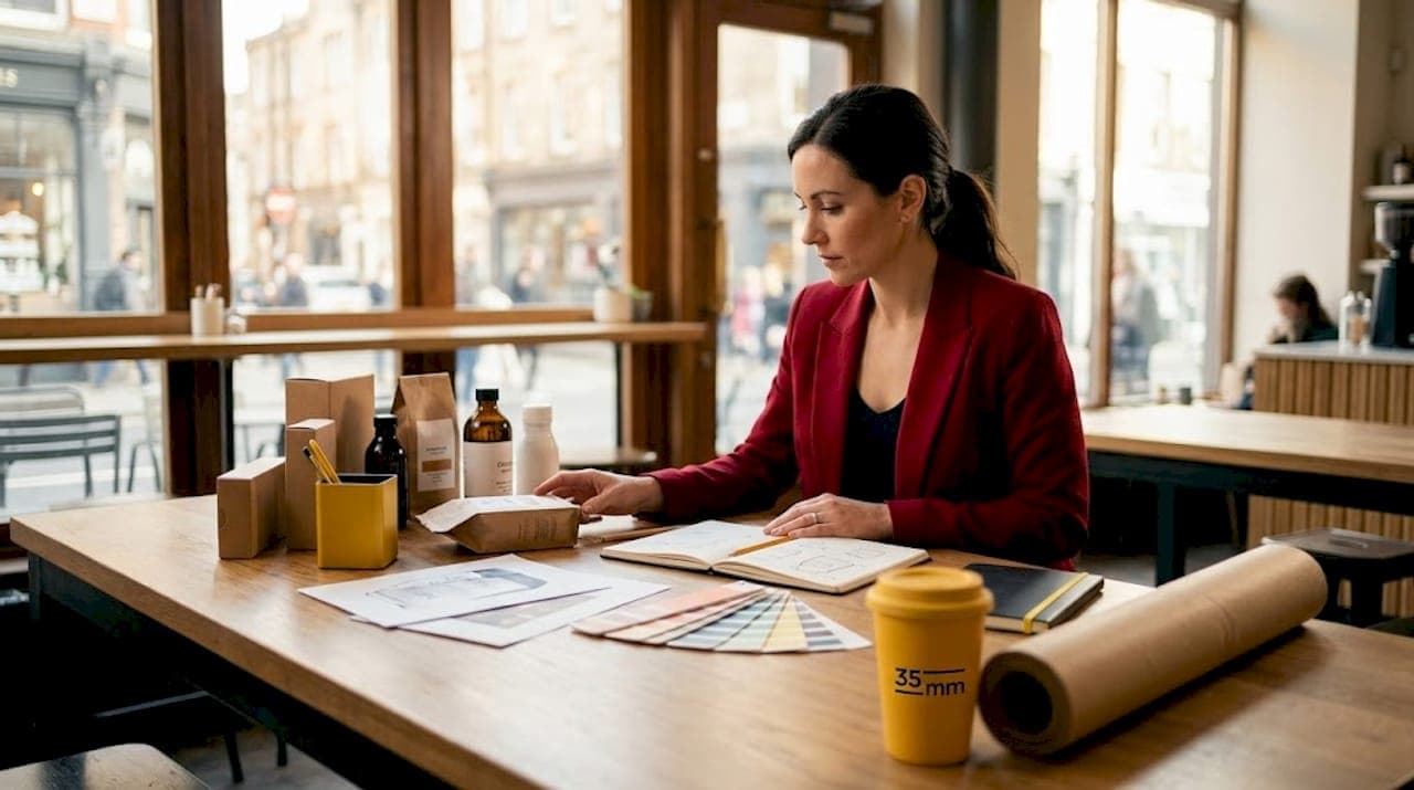
Most purchase decisions are made in seconds. 70% of CPG purchase decisions happen at the physical retail shelf, which means your packaging is doing the selling. That fact alone explains why design matters for CPG far beyond making things look attractive. Design is the mechanism through which brands communicate trust, trigger emotion, and earn loyalty before a single word is read. This article breaks down the real role of design across visual identity, structural packaging, sustainability, and marketing integration so you can make decisions that drive results.
Table of Contents
- Key Takeaways
- Why design matters for CPG: the full picture
- The power of structural and tactile packaging
- Design, sustainability, and operational performance
- Design as a retail and digital marketing tool
- My take on meaning-led design in CPG
- Elevate your CPG visuals with expert post-production
- FAQ
Key Takeaways
| Point | Details |
|---|---|
| Design drives purchase decisions | Most CPG buying choices happen on the shelf, making packaging your most powerful sales tool. |
| Visual consistency builds trust | Consistent use of color, typography, and logo across touchpoints creates recognition that converts. |
| Structure outperforms graphics alone | Tactile and structural packaging elements create recognition before branding is even consciously processed. |
| Design determines sustainability | Up to 80% of a product's environmental impact is locked in at the design stage, not the production stage. |
| Meaning beats novelty | Packaging that feels culturally relevant and emotionally resonant drives repeat purchase more than visual novelty. |
Why design matters for CPG: the full picture
Design in CPG is frequently misunderstood as a visual exercise. Brand managers commission a logo refresh, update color palettes, and call it a redesign. The reality is that the most effective CPG design integrates visual identity, structural form, sustainability goals, and media performance into one coherent system. When those pieces align, the result is a brand that consumers recognize, trust, and return to. When they do not, even the most beautiful packaging underperforms.
98% of CPG brand owners rate packaging as highly important to overall brand success. That number reflects something the best brand teams already know: packaging is not a cost center. It is a growth driver. Understanding what makes design genuinely work, rather than simply look good, is the clearest competitive advantage you can develop right now.
The shift happening in 2026 is described well by design thinkers who argue the industry has moved from "form follows function" to "form and function follow meaning." That framing matters. It means consumers are not just evaluating whether a package is attractive or easy to open. They are asking whether this brand understands them. Design answers that question before any marketing campaign has a chance to.
Visual identity and brand consistency
Strong visual branding is not about being the loudest thing on the shelf. It is about being the most immediately recognizable. The brands that do this well build a consistent visual language across typography, color, logo placement, and structural cues so that a consumer walking past at normal pace still registers the brand without stopping to read it.
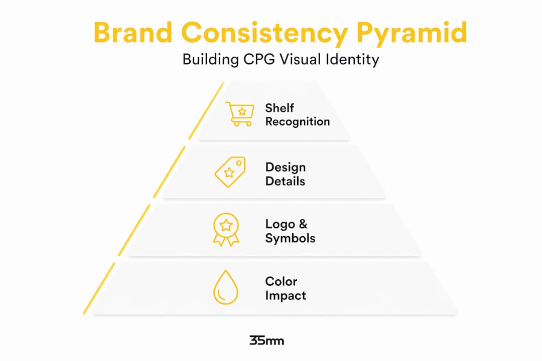
Color is the fastest communicator you have. Studies consistently show that consumers form color-based brand associations within milliseconds, which means the wrong color choice does not just look off. It sends the wrong signal before you can correct it. Typography works similarly. A font that feels clinical on a wellness product or playful on a pharmaceutical sends a message your copy cannot undo.
The practical benefits of visual consistency also extend to digital shelf performance. Minimalist packaging reads better at thumbnail size, performs better in sponsored product placements, and generates more user-generated content worth sharing. This is not a trend observation. It is a functional requirement as more CPG volume shifts online.
Here is where consistency often breaks down in practice:
- Brand standards that exist on paper but are not enforced across campaign assets, in-store displays, and secondary packaging
- Color drift between print and digital, where the primary packaging color looks noticeably different in a social ad
- Typography substitutions in markets where the licensed font is unavailable, creating visual inconsistency across regions
- Over-localization that strips brand recognition in the effort to feel culturally relevant
Getting these details right requires both clear guidelines and disciplined execution across every touchpoint where the brand appears. Brands that understand visual identity at a system level, rather than as a collection of separate design tasks, maintain coherence far more reliably.
The power of structural and tactile packaging
Here is the part that even experienced brand managers underinvest in: structural and tactile design. Graphics are immediately visible, so they attract budget and attention. But structural design triggers recognition before branding is even consciously processed. The shape of a bottle, the weight of a cap, the texture of a label. These physical signals are often what a consumer remembers as "that brand."
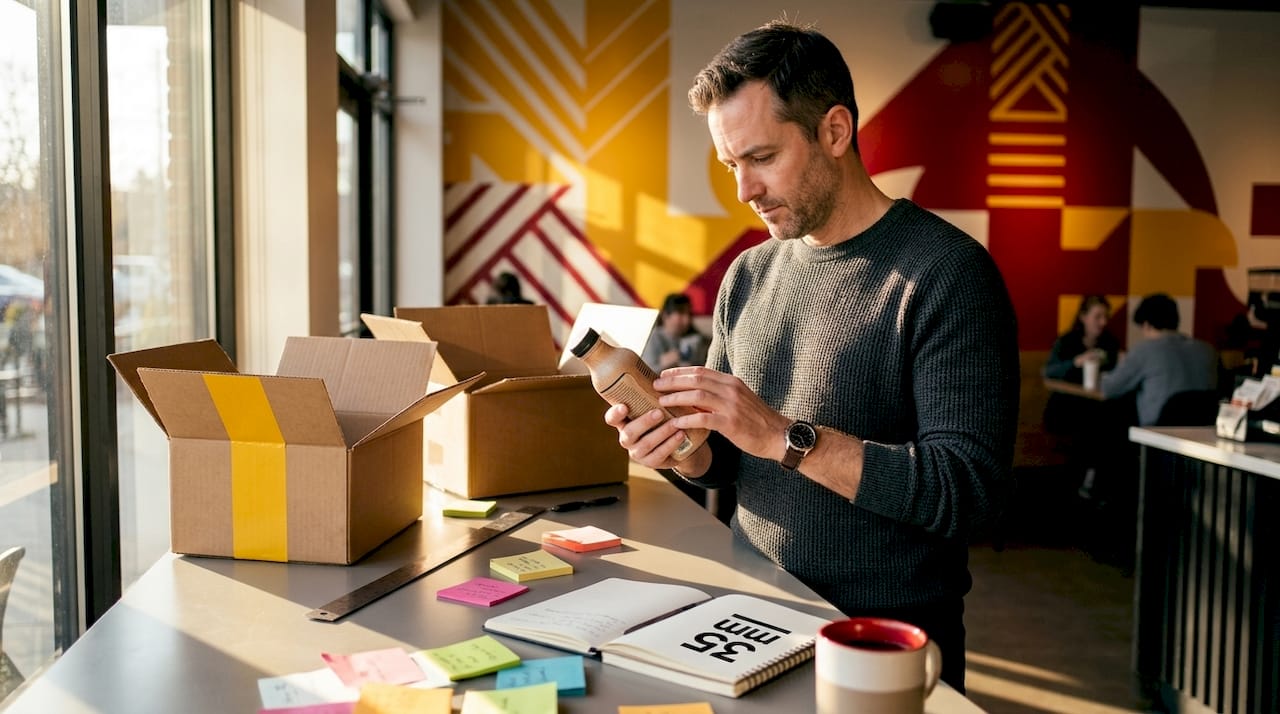
Think about how Coca-Cola's contour bottle works in a blind test. The shape alone communicates the brand. That is not an accident of history. It is structural design doing work that no amount of graphic refinement could replicate.
| Design Type | Primary Impact | Consumer Trigger | Differentiation Level |
|---|---|---|---|
| Graphic design | Visual identity, shelf standout | Conscious recognition | Moderate |
| Structural design | Form, weight, grip, shape | Pre-conscious recognition | High |
| Tactile elements | Finish, texture, embossing | Sensory and emotional recall | Very high |
| Material choice | Perceived quality, sustainability | Trust and brand positioning | High |
Tactile elements like soft-touch matte finishes, embossed patterns, and premium closure mechanisms create what designers call "emotional stickiness." A consumer may not be able to articulate why they prefer one protein bar over another in the same price range. But if one wrapper has a satisfying texture and the other feels generic, the choice is already made at a sensory level.
Pro Tip: Before committing to a structural packaging redesign, conduct an unboxing or handling session with actual consumers. Ask them to describe the product personality based only on touching and holding the package, with no branding visible. The gaps between what they say and what you intend reveal exactly where structural design is underserving your brand.
The contrast between graphic and structural investment is worth making explicit. Graphic design can be updated at relatively low cost and risk. Structural changes require tooling, materials sourcing, and sometimes entirely new production lines. That barrier is real, but it is also exactly why structural differentiation is so durable. A competitor can copy your color scheme overnight. Replicating a distinctive bottle form takes years and significant capital.
Design, sustainability, and operational performance
The importance of design in CPG goes well beyond consumer perception when you factor in environmental and operational impact. Up to 80% of a product's environmental footprint is determined during the design phase, not during manufacturing or logistics. That means the most consequential sustainability decisions your brand makes happen at the drawing board, not the factory floor.
| Design Decision | Environmental Impact | Operational Impact |
|---|---|---|
| Material selection | Recyclability, carbon footprint | Cost, supplier availability |
| Package sizing | Shipping density, waste reduction | Logistics efficiency, shelf fit |
| Structure complexity | Recyclability, end-of-life options | Manufacturing compatibility |
| Ink and finish type | Chemical load, recyclability | Print run flexibility |
This is why 99% of brand owners expect to initiate packaging design changes by 2029, driven by sustainability pressure, aesthetics updates, and shelf life requirements. The brands leading this shift are not treating sustainability as a separate workstream. They are integrating it into the design brief from day one.
Package size optimization offers one of the clearest examples of design and operations intersecting. Reducing a box by 10% in volume sounds minor. At scale, it means more units per pallet, lower freight costs, reduced warehouse space, and a smaller carbon footprint per unit. None of that happens without a deliberate design decision made early in the process.
- Durability through the supply chain is equally critical. A beautiful package that arrives damaged destroys the brand experience at the exact moment it should be creating it.
- Production compatibility must be confirmed before a structural design is finalized, since a form that cannot run on existing equipment introduces cost and delay that erases the margin benefit of the redesign.
- Minimalist design trends in 2026 are not just aesthetic preferences. They often reduce ink usage, simplify recycling, and lower unit production cost while improving shelf legibility.
Pro Tip: Bring your manufacturing and logistics teams into the design process at the concept stage rather than the approval stage. The best CPG packaging ideas are the ones that survive contact with production reality, and that requires cross-functional input early enough to actually influence the outcome.
Design as a retail and digital marketing tool
Packaging is the last marketing touchpoint before purchase, and it now affects clicks, conversions, and brand trust in digital environments just as much as on the physical shelf. That dual responsibility changes how you should think about design decisions. A color choice that reads beautifully in a store display needs to perform equally well as a 200-pixel thumbnail in an Amazon search result.
The role of post-production in FMCG advertising has grown precisely because of this dual requirement. Packaging imagery needs to be media-ready across formats, lighting conditions, and platforms simultaneously. A brand that invests in strong packaging design but does not invest in equally strong visual production loses the benefit at the media execution stage.
Story-driven packaging extends this further. Consumers who connect with a brand's origin, values, or cultural references through the packaging itself become advocates who generate organic content. That is free media. But it only happens when the design gives them something meaningful to engage with, not just something attractive to look at.
Here is how effective CPG design integrates with retail and digital marketing:
- Packaging designed for shelf impact should also be validated at thumbnail scale before final approval, since the digital shelf is where discovery increasingly begins
- Design elements that photograph well and generate consistent color reproduction make it easier to maintain visual product consistency across advertising platforms
- Precision in CPG retail media execution requires that packaging assets are media-ready and consistently rendered across every placement
- Cultural and emotional narrative embedded in design creates the conditions for user-generated content, which outperforms brand-produced content in authenticity and reach
The brands getting this right in 2026 treat packaging not as a container with graphics applied to it, but as a media asset that must perform across every environment where a consumer might encounter it.
My take on meaning-led design in CPG
I've spent years working on the visual output side of CPG and FMCG projects, specifically in post-production and compositing, and what I've noticed is that the gap between good-looking and genuinely effective design is almost always about meaning. Brands arrive with beautiful packaging, and the work we do at 35milimetre can make those visuals sing across media. But when the underlying design has not made a clear choice about what it means and who it is for, even the sharpest retouching cannot fix that.
What I've learned is that the brands with the most coherent design are the ones where the brief started with culture and emotion, not with aesthetics. The visual execution came second. That sequence matters more than most brand teams realize, because when you start with meaning, every design decision has a clear filter. When you start with "it should look premium," you get packaging that looks like everything else in the premium tier.
The uncomfortable truth I've found is that most CPG design fails not at the creative stage but at the execution stage, specifically where creative ambition meets manufacturing constraints, brand guidelines, and media production requirements. Holding creative intent through that gauntlet requires leadership, not just good design. It requires the kind of cross-disciplinary rigor that most organizations find genuinely difficult.
My honest take: the brands that will win in the next five years are the ones treating design as a strategic function, not a service function. That shift in thinking changes the quality of every decision that follows.
— 35mm
Elevate your CPG visuals with expert post-production
Strong packaging design only delivers its full value when the visuals representing it are executed to the same standard. Whether your assets are destined for retail media placements, e-commerce product pages, or campaign photography, the quality of post-production determines whether the design lands the way it was intended.
At 35milimetre, we work with CPG and FMCG brands to produce imagery that is media-ready, brand-consistent, and built to perform across every format. From compositing and color grading to retouching and CGI, our team brings two decades of hands-on experience to every project. If your packaging is strong but your visual assets are not doing it justice, that is a gap worth closing. Explore how our commercial retouching services can bring your CPG brand's visual identity to its full potential.
FAQ
Why does design matter more than advertising in CPG?
Design works at the moment of purchase, where most buying decisions are actually made. No advertising reaches a consumer at the shelf the way the package itself does.
How does structural packaging differ from graphic design?
Structural design involves the physical form, materials, and tactile properties of a package. It creates recognition at a sensory level, often before the consumer consciously processes the branding.
What percentage of environmental impact is determined at the design stage?
Up to 80% of a product's environmental footprint is set during the design phase, making material and structural choices the most consequential sustainability decisions a CPG brand makes.
How does CPG packaging design affect digital performance?
Packaging now directly influences clicks, conversions, and brand trust in online channels. A design that works on shelf must also perform as a thumbnail in e-commerce search results and sponsored placements.
What is the most common CPG design mistake?
Treating design as purely aesthetic rather than as a strategic system that must perform across shelf, digital, sustainability, and operational requirements simultaneously.