

Most brands spend months perfecting their logo, then wonder why consumers still can't tell them apart from competitors. The answer almost always lives in brand imagery. Understanding what is brand imagery, and more specifically how it works as a system of visual signals, is what separates brands that get remembered from brands that get scrolled past. This guide breaks down the brand imagery definition, explains how it shapes consumer perception at every touchpoint, and gives you a practical framework for designing, maintaining, and enhancing it across channels.
Table of Contents
- Key takeaways
- What brand imagery actually means
- Why brand imagery shapes perception so powerfully
- Brand imagery styles and what they signal
- Designing and maintaining consistent brand imagery
- How to enhance brand imagery for better results
- Our perspective on brand imagery
- Elevate your brand imagery with professional post-production
- FAQ
Key takeaways
| Point | Details |
|---|---|
| Brand imagery is a visual system | It includes photography style, color grading, composition, and iconography, not just your logo. |
| First impressions are design-driven | 94% of first impressions relate to design quality, making imagery your most immediate credibility signal. |
| Color consistency drives recognition | Consistent color usage can increase brand recognition by up to 80%, making palette decisions foundational. |
| Style guides prevent visual drift | Documenting photography direction, composition rules, and color codes keeps imagery coherent at scale. |
| Strategic photography converts better | Curated brand photography outperforms generic stock by communicating a specific value proposition. |
What brand imagery actually means
The brand imagery definition that most marketing textbooks offer is technically correct but practically thin. Brand imagery refers to the full collection of visual assets a brand uses to communicate its personality, values, and message. That includes photography style, color grading, composition choices, iconography, illustration style, and the overall visual tone that runs through every piece of content you produce.
What brand imagery is not is your brand image. The distinction matters enormously. Brand image is co-created by consumers as a perception, shaped by their experiences, associations, and interpretations. Brand imagery, on the other hand, is what your team controls and produces. It is the input; brand image is the output.
Brand identity is the broader strategic framework that includes your voice, values, positioning, and visual system. Brand imagery sits inside that framework as the visual execution layer. Think of brand identity as the blueprint and brand imagery as the materials you build with.
The core components of brand imagery include:
- Photography style: The mood, lighting, and subject matter of your photos. A wellness brand shooting in soft, natural light communicates something entirely different from a tech brand using high-contrast studio setups.
- Color grading: How images are processed and toned. A warm, desaturated grade reads as artisanal. A cool, high-saturation grade reads as modern and precise.
- Composition and framing: Whether subjects are centered or offset, whether there is breathing room or tight cropping, whether the camera angle is eye-level or elevated.
- Iconography and illustration style: The visual language used in graphics, whether flat and geometric or detailed and textured.
- Subject demographics and context: Who appears in your imagery and in what settings. These choices signal who your brand is for.
Why brand imagery shapes perception so powerfully
The influence of brand imagery on consumer perception is not subtle. 94% of first impressions are design-related, which means that before a potential customer reads a single word of your copy, your imagery has already made a case for or against your brand's credibility.

This is especially consequential for service businesses and e-commerce brands, where a product image or a campaign visual is one still frame standing in for a physical experience. Poor lighting, inconsistent sizing, or low-quality stock imagery erode consumer trust in ways that are difficult to recover from, even with strong copy or a competitive price.
Color is the most measurable lever within brand imagery. Consistent color usage increases brand recognition by up to 80%. That figure explains why brands like Tiffany & Co. and Hermès treat their signature colors as protected assets. It is not aesthetics for aesthetics' sake. It is recognition infrastructure.
"Consistent brand imagery is not about being rigid. It is about being recognizable. Every visual decision either reinforces or dilutes the mental model consumers hold of your brand."
The psychological mechanism here is straightforward. Repetition builds familiarity. Familiarity builds trust. Trust reduces the perceived risk of purchase. When your imagery is inconsistent, that chain breaks at the first link. Consumers cannot build a mental model of a brand that looks different every time they encounter it.
Brand imagery styles and what they signal
Understanding the importance of brand imagery becomes clearer when you look at how different visual strategies create entirely different brand positions, even for products in the same category.
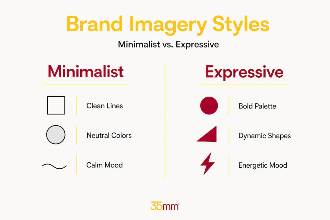
| Imagery style | Visual characteristics | Brand signal | Typical industry fit |
|---|---|---|---|
| Clean, minimal product imagery | White or neutral backgrounds, precise lighting, no distractions | Precision, premium quality, confidence | Tech, luxury, skincare |
| Lifestyle and action imagery | Real environments, natural light, people in context | Relatability, aspiration, community | Apparel, fitness, food |
| Editorial and conceptual imagery | Styled sets, bold color, artistic composition | Creativity, cultural relevance, edge | Fashion, beauty, entertainment |
| Documentary and raw imagery | Unposed, candid, high grain or natural imperfection | Authenticity, transparency, humanity | Non-profit, artisan, journalism |
The choice between these styles is not purely aesthetic. It is a strategic decision about what your audience values and how your brand wants to be positioned. A direct-to-consumer athletic brand that uses clean white-background product shots is sending the wrong signal. Its audience wants to see the product in motion, in life, with people who look like them.
Ad campaign imagery strategies that perform consistently share one trait: the visual style is chosen to match the emotional state the brand wants to activate, not just to look good.
Pro Tip: Before choosing your imagery style, write down three adjectives that describe how you want customers to feel after encountering your brand. Then ask whether your current imagery actually produces those feelings. The gap between those two answers is your visual strategy brief.
Designing and maintaining consistent brand imagery
Knowing how to design brand imagery is one thing. Knowing how to keep it consistent across a growing team, multiple agencies, and dozens of channels is where most brands struggle. Imagery style is the most neglected identity element and the hardest to maintain consistently at scale, precisely because it involves so many subjective decisions.
The solution is documentation. A brand imagery style guide should go well beyond mood boards. It needs to specify:
- Photography direction: Describe the lighting setup, color temperature, acceptable backgrounds, and subject positioning in enough detail that a photographer who has never worked with your brand can produce on-brand images.
- Color grading parameters: Define the exact tone, contrast, and saturation levels applied in post-production. Export reference images showing approved and rejected examples.
- Composition rules: Specify aspect ratios for each platform, safe zones for text overlays, and whether tight crops or wide environmental shots are preferred.
- Subject and context guidelines: Clarify who should appear in imagery, what environments are appropriate, and what props or settings are off-limits.
- Quarterly audit schedule: Review all active imagery across channels every three months to catch drift before it compounds.
The sequence in which you develop your visual identity also matters more than most teams realize. Starting with your color palette before your logo produces a more coherent visual system. The recommended order is color palette first, then typography, then logo, then imagery direction. When brands design the logo first, they end up forcing every other element to accommodate it rather than building a system where everything works together.
For teams incorporating AI-generated imagery, batch generating images with consistent prompt parameters is the most reliable way to maintain visual cohesion. Generating images one at a time with varied prompts produces fragmentation. Generating a pack of 20 images from a single, carefully constructed base prompt produces a visual family.
Pro Tip: Store your approved imagery in a centralized digital asset management system with clear naming conventions and metadata tags. This prevents teams from defaulting to whatever image is easiest to find, which is usually the wrong one.
How to enhance brand imagery for better results
Once you have a defined imagery system, the focus shifts to how to enhance brand imagery so it drives measurable engagement and conversion. Several factors consistently separate high-performing brand imagery from imagery that simply exists.
The first is replacing generic stock photography with branding photography that converts. Generic stock images fill space but rarely communicate a unique selling proposition. Curated brand photography, shot with your specific audience and positioning in mind, does both. The investment pays back in conversion rates and in the coherence it adds to your overall visual identity.
The second factor is technical quality across platforms. Image quality must account for platform-specific formats and resolution requirements. An image that looks sharp on a desktop website can appear blurry or poorly cropped on mobile or in a social feed. Optimizing for each surface is not optional if you want your brand to read as professional.
The third factor is narrative integration. Imagery should not exist independently of your messaging. When the visual tone, the copy, and the call to action all point toward the same emotional outcome, the effect compounds. Visual storytelling works because it activates both cognitive and emotional processing simultaneously, making the brand message more memorable.
Finally, periodic audits keep your imagery from aging out of relevance. Consumer aesthetics shift. What felt fresh three years ago can feel dated today. Scheduling a visual audit twice a year, comparing your imagery against current consumer expectations and competitor positioning, keeps your brand visually current without requiring a full rebrand.
Our perspective on brand imagery
I have worked on brand visuals for over two decades, and the pattern I see most consistently is this: brands treat imagery as decoration and then wonder why their brand is not recognized. They invest in a logo, write a brand guide, and then let imagery decisions get made by whoever is available that week. The result is a brand that looks like it was assembled by committee, because it was.
What I have learned is that imagery style is the identity element that does the most work in real-world brand recognition, and it receives the least strategic attention. A logo appears in specific, controlled contexts. Imagery appears everywhere, in ads, on social media, on product pages, in email campaigns. It is the texture of how a brand feels across every touchpoint.
The mistake I see most often is teams trying to force their imagery to match the logo rather than building a visual system where both emerge from the same source. Start with color. Build outward. Your logo should be one expression of your visual system, not the origin point that everything else orbits.
I also think the conversation around visual branding ROI is underserved. Brands that invest in consistent, high-quality imagery do not just look better. They convert better, retain customers longer, and command higher price points. The visual quality of your brand is a pricing signal as much as it is an aesthetic one.
— 35mm
Elevate your brand imagery with professional post-production
Building a strong visual identity requires more than good intentions. It requires technical precision, creative direction, and the ability to produce imagery that holds up across every format and platform.
At 35milimetre, we have spent over two decades helping brands in technology, automotive, and consumer sectors produce imagery that does real work. From commercial retouching and post-production to compositing, color grading, and AI-enhanced visuals, we handle the full production pipeline so your brand imagery stays consistent, high-quality, and on-strategy. Whether you are building a visual system from scratch or need to bring an existing one up to a professional standard, we work closely with your team to get it right. Reach out to discuss what your brand imagery needs.
FAQ
What is brand imagery in simple terms?
Brand imagery is the collection of visual assets a brand uses to communicate its personality and values, including photography style, color grading, composition, and iconography. It is distinct from brand image, which is the perception consumers form in response to those visual signals.
How does brand imagery differ from brand identity?
Brand identity is the full strategic framework covering voice, values, positioning, and visual system. Brand imagery is the visual execution layer within that framework, the specific images, styles, and visual choices that bring the identity to life.
Why is consistent brand imagery so important?
Consistent color usage alone can increase brand recognition by up to 80%, and 94% of first impressions are design-related. Inconsistent imagery breaks the visual familiarity that builds consumer trust and recall over time.
How do you create brand imagery that stays consistent at scale?
Document your photography direction, color grading parameters, and composition rules in a detailed style guide, then schedule quarterly audits to catch drift. For AI-generated assets, batch generation with consistent prompts preserves visual cohesion far better than one-off image creation.
What is the difference between brand imagery and stock photography?
Brand imagery is a curated visual system built around your specific brand positioning and audience. Stock photography is generic and lacks the narrative specificity needed to communicate a unique value proposition, which is why it rarely converts as effectively as purpose-built brand visuals.