

Advanced photo editing is the practice of applying precise, multi-layered techniques to an image to control its tonal hierarchy, color accuracy, texture, and narrative impact far beyond what a basic crop-and-brighten workflow can achieve. Where basic editing corrects obvious problems, advanced editing shapes how a viewer's eye moves through a frame, what mood the image carries, and whether it holds up at print resolution or on a broadcast monitor.
The technique groups that define advanced editing work are:
- Tonal control: Levels, Curves, dodging and burning, and exposure blending for HDR
- Color correction and grading: White balance, HSL adjustments, selective color, and gradation curves
- Retouching and restoration: Spot removal, frequency separation, Liquify, and compositing
- Sharpening and noise reduction: Staged capture, creative, and output sharpening
- Black-and-white conversion and creative effects: Channel mixing, vignettes, split toning, and grain
- Non-destructive RAW workflows: Layers, masks, Smart Objects, and catalog management
- Workflow automation: Presets, actions, batch processing, and tethered capture
Use advanced editing whenever a single global adjustment would sacrifice detail, whenever a client deliverable must survive multiple output formats, or whenever the image's story depends on precise visual emphasis. Basic fixes are for quick corrections. Advanced editing is for images that need to mean something.
Table of Contents
- What advanced photo editing actually does to an image
- How to correct and grade color without flattening your image
- Retouching and compositing: studio-grade techniques that hold up under scrutiny
- How staged sharpening and noise reduction keep images crisp without artifacts
- Black-and-white conversion and creative effects that serve the image
- Why a RAW-first, non-destructive workflow is the foundation of advanced editing
- How workflow automation scales quality across large shoots
- Which software tools do professional editors actually rely on?
- What studio experience teaches you about editing discipline
- How to fix perspective and remove lens distortion accurately
- How 3D elements and texturing integrate into photo editing
- Why color profiles and monitor calibration matter for accurate output
- Preparing images for print, web, and broadcast output
- Key Takeaways
- A studio's honest view of what advanced editing actually requires
- What 35milimetre's post-production team can do for your project
- Further reading and authoritative references
What advanced photo editing actually does to an image
Exposure and tonal control is where most advanced edits begin, because light is the raw material of every photograph. The goal is not to make an image brighter or darker overall. The goal is to place visual weight exactly where the subject demands it, lifting shadow detail without blowing highlights, and pulling back a bright sky without flattening the midtones underneath.
Tonal hierarchy is the decision framework professionals use: map the image's primary subject, then use local adjustments to guide the viewer's eye along the intended path. Shadows, midtones, and highlights are treated as separate territories, not a single slider.
Levels and Curves in practice. The Levels tool remaps input-output tonal ranges, letting you balance brightness and contrast by moving the black point, white point, and midtone gamma independently. Curves goes further, letting you anchor specific tonal values and bend the response curve between them. A gentle S-curve adds contrast without touching the endpoints; pulling down the upper-shadow anchor recovers blocked-up detail in a dark interior shot.
For local tonal control, dodging and burning remains the most precise method available:
- Create a new empty layer filled with 50% gray and set its blend mode to Overlay or Soft Light.
- Paint with a soft white brush at 5–10% opacity to dodge (lighten) areas you want to emphasize.
- Paint with black at the same low opacity to burn (darken) areas you want to recede.
- Use a luminosity mask to restrict the effect to the tonal range you actually want to affect.
- Feather the mask edges so the transition is invisible at normal viewing distance.
Exposure blending and HDR work best when a single RAW file cannot hold the full dynamic range of a scene. Capture two or more exposures, align them in Photoshop or Lightroom, and blend using luminosity masks rather than tone-mapping sliders, which tend to produce the characteristic HDR halo. The result looks like what the eye saw, not like a video game screenshot.
Pro Tip: Before you touch a tonal slider, identify the three brightest and three darkest areas in the frame. If any of them are not where you want the viewer to look, that is your first adjustment target, not the global exposure.
How to correct and grade color without flattening your image
Good color correction achieves two things simultaneously: it makes the image accurate to the scene as it was lit, and it sets the emotional temperature the image needs to carry. Those two goals occasionally conflict, and knowing which one to prioritize is the difference between a technically correct image and a compelling one.
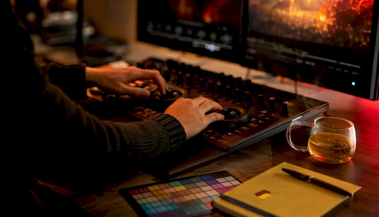
White balance is the starting point. In a RAW processor like Adobe Lightroom, Capture One, or DxO PhotoLab, you can set white balance by sampling a neutral gray in the frame or by using a calibrated color checker card shot at the same light source. Visual judgment matters when the "correct" white balance produces a skin tone that reads as sickly or a product color that does not match the physical object. In those cases, trust your eye over the eyedropper.
HSL and selective color adjustments are where global saturation increases reveal their weakness. Raising overall saturation rarely produces a professional result because it amplifies every hue equally, including the ones you did not want to touch. Instead:
- Isolate the hue you want to adjust in the HSL panel (Hue, Saturation, Luminance).
- Reduce luminance on a specific hue to add depth without adding chroma.
- Use the Targeted Adjustment tool to click directly on the color in the image rather than guessing which slider controls it.
- In Photoshop, use a Selective Color adjustment layer to shift the balance of a hue toward or away from its component primaries.
Gradation curves and split toning add creative color grading. A color curve lets you push the shadows toward a cool blue-green while keeping the highlights warm, a technique that reads as cinematic without being heavy-handed. Split toning in Lightroom or Camera Raw does the same thing with simpler controls. The risk in both cases is skin tones: always check a face or a hand against a reference before committing to a grade.
Pro Tip: Build your color grade on a duplicate of the corrected file, not on the correction itself. That way you can dial the grade back with a single opacity slider if a client requests a neutral version.
Presets speed up color workflows when the images in a set share the same lighting conditions. They become a liability when applied blindly across mixed lighting, because a preset calibrated for golden-hour sun will shift a studio strobe shot in directions you did not intend. Treat presets as starting points, not finished looks.
Retouching and compositing: studio-grade techniques that hold up under scrutiny
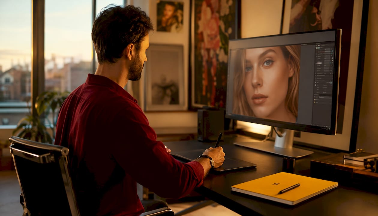
Professional retouching in portraits and product shots aims to correct genuine problems, not to erase the subject's character. A retouched portrait should look like the person on their best day, not like a different person. A retouched product shot should match the physical object's color and texture, not idealize it into something the customer will not recognize when it arrives.
Spot removal and healing follow a specific work order that keeps the process non-destructive:
- Duplicate the background layer or stamp a merged copy to a new layer before touching anything.
- Use the Healing Brush on a separate empty layer with "Sample All Layers" enabled.
- Work from the largest blemishes to the smallest, resetting your sample point frequently to avoid repeating texture patterns.
- For product shots, clone from areas with matching light direction, not just matching color.
- Zoom to 100% to judge the result, but always step back to 25–50% to confirm the edit reads naturally at viewing distance.
Frequency separation splits an image into a low-frequency layer (color and tone) and a high-frequency layer (texture and fine detail). This lets you smooth uneven skin tone on the low-frequency layer without disturbing the pore texture on the high-frequency layer. It is the right tool for large areas of uneven color. For isolated spots and blemishes, the Healing Brush is faster and less likely to produce a smeared result.
Liquify is powerful and easy to overuse. Restrict it to correcting genuine distortions introduced by lens perspective or posing, not to reshaping anatomy. When you do use it, work with a low brush pressure and check the result against the original at 50% opacity.
For compositing, matching light and color between elements is the work that separates believable composites from obvious ones. The checklist:
- Match the color temperature and tint of the light source across all elements.
- Use Levels or Curves on individual layers to match luminosity before blending.
- Refine edges with Select and Mask, paying particular attention to hair and translucent objects.
- Use blend modes (Multiply for shadows, Screen for light) to integrate elements rather than hard-pasting them.
The most common mistake in retouching is removing too much. Texture, asymmetry, and imperfection are what make a subject look real. When in doubt, reduce the opacity of your retouching layer by 20–30% and see whether the image improves. It usually does.
Pro Tip: Keep a reference image of the unretouched subject open in a second window while you work. Checking back every 10–15 minutes prevents the gradual drift toward over-editing that is almost impossible to notice in a single session.
You can go deeper on compositing fundamentals in this photo compositing guide from 35milimetre's blog.
How staged sharpening and noise reduction keep images crisp without artifacts
Staged sharpening treats the sharpening process as three distinct operations applied at different points in the workflow, each with a different purpose. Collapsing them into a single pass is the most common cause of halos, crunchy texture, and the unnatural "over-sharpened" look that marks amateur edits.
- Capture sharpening compensates for the softness introduced by the camera's anti-aliasing filter and the RAW demosaicing process. Apply it in your RAW processor (Lightroom, Camera Raw, Capture One, or DxO PhotoLab) at a moderate amount, and use the masking slider to restrict it to edges rather than flat tonal areas.
- Creative sharpening draws attention to specific focal points. Apply it selectively in Photoshop using a High Pass filter on a new layer set to Overlay blend mode, masked to the area you want to emphasize, such as the eyes in a portrait or the label on a product.
- Output sharpening compensates for the softening that occurs during resizing and printing. The correct amount depends on the output medium: screen images need less than inkjet prints, and large-format prints need more than letter-size output.
Noise reduction follows a similar logic. Luminance noise (the grainy texture that appears in shadow areas at high ISO) and color noise (the random colored pixels that appear in smooth areas) respond to different treatments. Most RAW processors separate them into two sliders. Reduce color noise aggressively, since it rarely carries useful detail. Reduce luminance noise conservatively, since it often overlaps with real texture. A mask that restricts noise reduction to the out-of-focus background while leaving the subject's texture untouched produces a cleaner result than a global pass.
Black-and-white conversion and creative effects that serve the image
A controlled black-and-white conversion does something a simple desaturation cannot: it lets you assign different luminosity values to different hues, so a red rose against green foliage can be rendered with the rose bright and the leaves dark, or the reverse, depending on what the image needs to say. Desaturation maps every hue to the same gray value its luminosity produces, which often results in a flat, undifferentiated image.
The most effective methods:
- Channel mixing (Photoshop's Black and White adjustment layer or Camera Raw's B&W panel) lets you brighten or darken each color channel independently. Raising the red channel brightens skin tones and clouds; lowering the green channel darkens foliage.
- Curve adjustments after conversion let you shape the tonal response the way you would in a darkroom, adding contrast in the midtones while protecting the highlights.
- Selective desaturation using a Hue/Saturation layer with a mask keeps one color element visible against a monochrome background, a technique that works when used with genuine editorial intent and becomes a cliché when applied as a default.
Creative effects, including vignettes, gradient maps, split toning, and controlled grain, are most effective when they reinforce the image's existing mood rather than imposing a new one. Adobe's editorial content on contemporary editing styles notes that HDR, retro, and split-toning looks communicate specific moods to audiences. The risk is using them as decoration rather than as deliberate choices.
Pro Tip: Apply creative effects on a set of images before evaluating any single one. Consistency across a shoot matters more than perfection in a single frame. An effect that looks great on one image but wrong on the next is not ready to use.
Why a RAW-first, non-destructive workflow is the foundation of advanced editing
Non-destructive editing is not a preference. It is the safety net that makes every other advanced technique possible, because it keeps original pixels intact and every edit reversible. A workflow that flattens layers or edits directly on the background layer removes the ability to correct mistakes, respond to client feedback, or repurpose an image for a different output format.
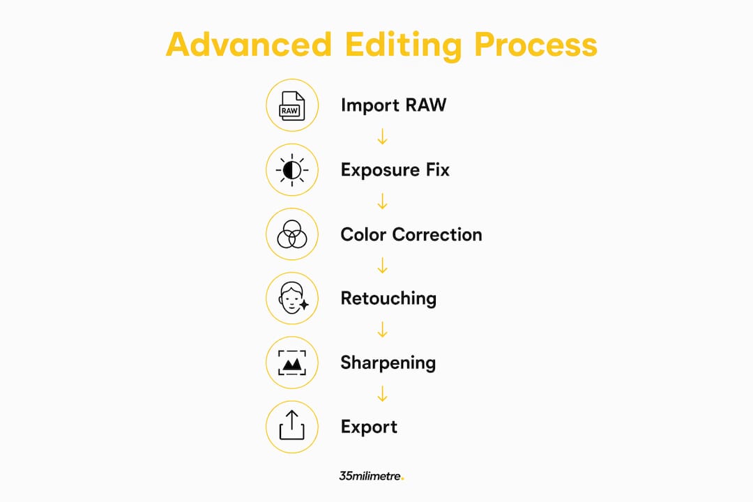
A professional RAW-first workflow follows this sequence:
- Ingest and cull: Import RAW files into a catalog (Lightroom, Capture One, or Photo Mechanic for high-volume shoots). Rate and reject before editing anything.
- RAW baseline adjustments: Set exposure, white balance, and lens corrections in the RAW processor. These adjustments are non-destructive by definition.
- Export to Photoshop as a Smart Object: This preserves the link to the RAW file so Camera Raw settings remain editable inside Photoshop.
- Build the edit in layers: Use adjustment layers (Curves, Hue/Saturation, Selective Color) rather than applying adjustments directly to pixels.
- Mask every adjustment: Even when an adjustment looks global, a mask gives you the option to refine it later without starting over.
- Save as layered PSD or TIFF: Never flatten the working file. Keep the layered master separate from the output derivative.
Cataloging and versioning matter most on multi-image projects. Name versions systematically (v01, v02, client-approved, final-output) and keep the RAW masters in a separate archive folder that no export process can overwrite. For client handoffs, deliver the output derivative and retain the layered master.
Key file formats to maintain:
- RAW master (camera-native format, never altered)
- Layered PSD or TIFF (working file, full editability)
- Flattened TIFF or high-quality JPEG (delivery file)
- Web-optimized JPEG or PNG (screen output)
The features that enable this workflow, including layers, masks, adjustment layers, Smart Objects, and blend modes, are present in every serious pixel editor. If the software you are using does not support all of them, it is not the right tool for advanced work.
How workflow automation scales quality across large shoots
Workflow automation solves two problems for professionals: it eliminates the time cost of applying the same corrections to hundreds of images, and it enforces consistency across a set so that images from the same shoot do not drift in color or exposure from one to the next.
- Presets in Lightroom or Capture One apply a baseline set of RAW adjustments in one click. Build presets from a well-exposed, correctly white-balanced image from each shoot, then apply and fine-tune rather than starting from scratch on every frame.
- Actions in Photoshop record a sequence of steps and replay them on any image. Use actions for repetitive tasks like sharpening, watermarking, or resizing for output, but record them on a duplicate layer so the action remains non-destructive.
- Batch processing applies an action or export setting to an entire folder. In Lightroom, the Sync Settings function applies one image's adjustments to a selected group. In Photoshop, File > Automate > Batch runs a recorded action across a folder.
- Tethered capture connects the camera directly to the editing software so images appear on screen immediately after capture. Lightroom and Capture One both support tethering, which lets you evaluate exposure, focus, and color in real time and correct problems during the shoot rather than in post.
Automation governance is the part most photographers skip. Every batch-processed set needs a human review pass before delivery. Check for images where the baseline preset produced an incorrect white balance (mixed lighting is the usual culprit), and check color-proofing on any image destined for print. For high-volume workflows, building a high-efficiency visual pipeline with defined review checkpoints is what separates a scalable operation from a chaotic one.
Which software tools do professional editors actually rely on?
Industry roundups consistently map professional editing software into distinct roles, and the most effective workflows combine tools from more than one category rather than relying on a single application for everything.
- Adobe Photoshop remains the standard for pixel-level retouching, compositing, and any work that requires layers, masks, Smart Objects, and blend modes. It is the tool of choice for complex composites, frequency separation, and output preparation.
- Adobe Lightroom excels at catalog management, RAW processing, and batch adjustments across large shoots. Its non-destructive architecture and tethering support make it the natural hub for studio workflows.
- Capture One is the preferred RAW processor for many commercial photographers, particularly in fashion and product work, because of its color rendering and tethering reliability. Its layer-based local adjustments are more capable than Lightroom's in several respects.
- Affinity Photo offers a capable, one-time-purchase alternative to Photoshop with support for layers, masks, RAW editing, and frequency separation. It suits photographers who need Photoshop-level features without a subscription.
- DxO PhotoLab specializes in optical corrections and noise reduction, with its DeepPRIME AI noise reduction producing results that outperform most competitors on high-ISO files.
- Skylum Luminar AI applies AI-driven adjustments for sky replacement, portrait enhancement, and atmosphere effects. It works best as a complement to a primary workflow rather than as a standalone solution, since its AI adjustments can produce unnatural results without manual refinement.
AI tools, including Photoshop's Generative Fill and Firefly, are most effective when paired with manual techniques. AI handles speed; manual methods handle control. An AI-generated sky replacement still needs edge refinement and color matching by hand to read as real. The role of AI in image editing is expanding rapidly, and 35milimetre's overview of AI in creative workflows covers how these tools integrate into production pipelines in practical terms.
Pro Tip: Match the tool to the task, not to the brand. Use Lightroom for cataloging and RAW baseline work, Photoshop for pixel editing and compositing, and a specialist like DxO PhotoLab for noise reduction on difficult files. A three-tool pipeline is more capable than any single application.
What studio experience teaches you about editing discipline
The studio principle that governs every advanced edit is this: every adjustment should reinforce what the image is already trying to say, not redirect it toward something the editor finds interesting. An edit that calls attention to itself has failed, regardless of how technically sophisticated it is.
Pro Tip: Before opening any editing software, spend 60 seconds looking at the unedited image and writing down two things: what the image is about, and what is currently preventing it from communicating that clearly. Every edit you make should address one of those two things. If it does not, skip it.
A typical product shoot at 35milimetre follows a sequence that illustrates this principle. The studio receives RAW files from a tethered shoot, culls to the selects, and applies a calibrated RAW baseline in Capture One that matches the physical product's color under the shoot's lighting conditions. The files move to Photoshop as Smart Objects, where a post-production artist builds a layered edit: background cleanup, shadow reconstruction, specular highlight control, and a final sharpening pass staged for the output format. Each stage is reviewed against the physical product and the client brief before the next begins. The result is an image that looks like the product, not like an interpretation of it.
The best retouching is invisible. When a viewer looks at a finished image and thinks "that's a great photograph," rather than "that's a great retouch," the work has succeeded. Technique serves the image; the image serves the story.
35milimetre's professional image manipulation guide covers the process-level decisions behind this kind of studio workflow in more detail, including how compositing and manipulation decisions are made at the brief stage rather than in post.
How to fix perspective and remove lens distortion accurately
Perspective correction and lens distortion removal address two distinct problems that often appear in the same image. Lens distortion (barrel distortion in wide-angle lenses, pincushion distortion in telephoto lenses) is an optical artifact that curves straight lines. Perspective distortion occurs when the camera is not parallel to the subject plane, causing vertical lines to converge or horizontal lines to tilt.
Most RAW processors apply lens distortion corrections automatically using embedded lens profiles. Adobe Lightroom, Capture One, and DxO PhotoLab all maintain libraries of lens correction profiles that remove barrel and chromatic aberration with a single checkbox. For images where the automatic profile does not exist or does not fully correct the distortion, manual radial distortion sliders let you dial in the correction by eye.
Perspective correction requires more deliberate work. Photoshop's Perspective Warp tool lets you define the planes of the subject and then adjust their angles independently, which is the right approach for architectural shots where vertical lines must be perfectly plumb. Lightroom's Transform panel offers Guided Upright, where you draw lines along edges that should be straight and the software calculates the correction. For product photography, even a 1–2 degree tilt in a flat-lay shot reads as careless at full resolution.
How 3D elements and texturing integrate into photo editing
Integrating 3D elements into a photograph is one of the more technically demanding compositing tasks, because a rendered object must match the photographic environment in lighting, perspective, shadow behavior, and surface texture simultaneously. When any of those four factors is off, the composite reads as fake regardless of how well the other three are handled.
The workflow typically begins in a 3D application (Cinema 4D, Blender, or Autodesk Maya) where the object is modeled, textured, and rendered with an HDRI environment map that matches the lighting of the photograph. The render is exported with separate passes: beauty, shadow, reflection, and ambient occlusion. In Photoshop, these passes are composited using blend modes (Multiply for shadows, Screen for reflections) so each element can be adjusted independently.
Texturing in photo editing, as distinct from 3D rendering, involves applying surface texture to a photographic subject using displacement maps, overlay blend modes, or texture painting. A product shot might have a fabric texture applied to a background using a Multiply blend mode at reduced opacity, or a skin texture enhanced using a High Pass layer to add apparent pore detail. 35milimetre's 3D artist handles exactly this kind of integration for automotive and technology clients, where CGI elements must sit convincingly inside photographic environments.
Why color profiles and monitor calibration matter for accurate output
A color profile is a mathematical description of the color space a device can reproduce. Without consistent color profile management across the editing pipeline, an image that looks correct on your monitor may print with a color cast, appear oversaturated on a different screen, or lose shadow detail in a broadcast environment.
The standard working color spaces for most photography workflows are sRGB (the smallest, most universally supported space, appropriate for web output) and Adobe RGB (a wider space that preserves more color information for print workflows). ProPhoto RGB is the widest common space and is appropriate for archiving RAW-derived files, but it contains colors that no current output device can reproduce, so it should never be used as a delivery format.
Monitor calibration is the prerequisite for all of this to work. An uncalibrated monitor introduces a color bias that the editor compensates for unconsciously, producing files that look wrong everywhere else. A hardware colorimeter (X-Rite i1Display, Datacolor Spyder) measures the monitor's actual output and generates a custom ICC profile that corrects for its specific color and luminance behavior. Calibrate monthly, or whenever the monitor is moved to a different lighting environment.
Soft proofing in Photoshop or Lightroom simulates how an image will look when converted to a specific output profile (a printer's ICC profile, a broadcast standard like Rec. 709) before you commit to the conversion. This is where you catch problems, not after the print run.
Preparing images for print, web, and broadcast output
The same image file is rarely correct for more than one output medium without adjustment. Print, web, and broadcast each impose different color space requirements, resolution standards, and file format constraints.
Print requires the highest resolution (typically 300 PPI at the final print size), an Adobe RGB or CMYK color space depending on the print process, and output sharpening calibrated for the paper surface. Matte paper absorbs ink and softens detail, so it needs more sharpening than glossy. Large-format prints viewed from a distance need less sharpening than letter-size prints viewed up close.
Web output works in sRGB, since most browsers and operating systems assume sRGB for untagged images. Export as JPEG for photographs (quality 80–90 in most cases) or PNG for images with transparency. Resize to the exact pixel dimensions the layout requires rather than relying on the browser to scale down, since browser scaling introduces softness. Embed the sRGB color profile in the exported file so color-managed browsers render it correctly.
Broadcast standards vary by region and platform. The standard color space for HD broadcast is Rec. 709, which has a narrower gamut than sRGB in some areas and a different gamma curve. Images prepared for broadcast need to be converted to Rec. 709 and checked against legal luminance limits (typically 16–235 in an 8-bit signal) to avoid clipping on broadcast monitors. This is specialized work that most still photographers encounter only when supplying images for motion graphics or on-screen display in a broadcast context.
Key Takeaways
Advanced photo editing combines non-destructive RAW workflows, precise tonal control, and selective color grading to produce images that communicate clearly across every output format.
| Point | Details |
|---|---|
| Non-destructive workflow first | Always edit on adjustment layers, Smart Objects, and masks so every decision stays reversible. |
| Tonal hierarchy drives attention | Use local dodging, burning, and Curves to guide the viewer's eye, not global contrast sliders. |
| Selective color beats global saturation | Adjust individual hues via HSL and Selective Color to preserve realism and skin tones. |
| Stage your sharpening | Apply capture, creative, and output sharpening separately to avoid halos and artifacts. |
| 35milimetre for complex deliverables | When a project requires compositing, CGI integration, or multi-format output, 35milimetre's post-production team handles the full pipeline. |
A studio's honest view of what advanced editing actually requires
The conversation around advanced photo editing tends to focus on tools and techniques, which is understandable but slightly misleading. The tools are learnable in weeks. The judgment that makes those tools produce professional results takes considerably longer, because it is not about knowing what a Curves adjustment does. It is about knowing when not to use one.
What we see most often in work that has not yet reached a professional standard is not a lack of technical knowledge. It is an excess of editing. The frequency separation is applied to skin that did not need it. The color grade is pushed past the point where it serves the image and into the territory where it serves the editor's preference. The sharpening is applied globally when it should have been masked to the focal point. Each of these decisions is technically correct in isolation. Together, they produce an image that looks worked on.
The discipline that separates studio-grade editing from enthusiast editing is restraint informed by intent. Every technique in this guide is a tool for serving the image's purpose. The visual storytelling rationale behind professional editing is not about making images look impressive. It is about making them communicate clearly, accurately, and with the right emotional register for the context they will appear in. That standard applies whether the deliverable is a product shot for an e-commerce listing or a portrait for an advertising campaign.
What 35milimetre's post-production team can do for your project
When the editing work described in this guide needs to be done at scale, under deadline, and to a standard that holds up in advertising and commercial contexts, that is where 35milimetre's post-production services come in. The studio delivers retouching, compositing, CGI integration, and AI-assisted workflows for clients who need finished imagery, not just edited files.
35milimetre works across product photography, automotive campaigns, technology brand visuals, and high-end portrait retouching. The team handles everything from background reconstruction and multi-image compositing to 3D element integration and multi-format output preparation. Projects are delivered with layered masters and output derivatives, so clients retain full flexibility for future use. If your next shoot needs post-production that goes beyond what a single editor can manage, request a quote from 35milimetre and share your RAW files or brief. The studio will respond with a scope and sample approach before any commitment is required.
Further reading and authoritative references
The sources below are drawn from the research behind this guide. They range from hands-on tutorials to conceptual explainers, and each serves a different learning purpose.
- The Ultimate Guide to Non-Destructive Editing in Photoshop (PHLEARN) — Best for hands-on practice with Smart Objects, adjustment layers, and masks. Start here if you want to rebuild your workflow from the ground up.
- The Ultimate Guide to Manual Compositing in Photoshop (PHLEARN) — Step-by-step compositing technique with emphasis on light matching and layer organization. Practical tutorial format.
- Advanced Portrait Editing in Photoshop and Adobe Camera Raw (PHLEARN) — Covers RAW adjustments, AI masking, and staged sharpening in a portrait context. Good for photographers moving from Lightroom-only to a Photoshop-integrated workflow.
- Advanced Photography Editing Techniques Every Design Student Should Master (Nick Dale Photography) — Conceptual reading on tonal hierarchy and selective adjustments. Better for understanding the principles than for step-by-step instruction.
- Unlocking Photoshop's AI Magic: Smarter, Faster Retouching for Photographers (Fstoppers) — Practical coverage of AI-assisted retouching tools and where manual refinement remains necessary.
- The Best Photo Editing Software We've Tested for 2026 (PCMag) — Useful for comparing software strengths by task category. Read as a buyer's guide, not a technical tutorial.
- 11 Contemporary Photo Editing Styles to Keep Your Feeds Fresh (Adobe Blog) — Conceptual overview of stylistic approaches and their audience effects. Useful for understanding creative intent behind specific looks.
- Advanced Editing Techniques (WhiteWall Magazine) — A readable overview of advanced editing concepts for photographers approaching the topic for the first time.