

Most brand managers in technology sectors treat design as the final step, the layer of polish applied after the strategy is done. That framing is expensive. The role of design in tech branding is far more structural: it functions as the operational mechanism that translates your brand promise into every user interaction, product screen, and marketing asset your audience encounters. Get it right, and design becomes a trust multiplier. Get it wrong, and no amount of messaging will compensate for what users feel the moment they see an inconsistency.
Table of Contents
- Key Takeaways
- The role of design in tech branding starts here
- How design systems sustain brand integrity
- Design aesthetics and consumer trust in tech
- Product design as a brand positioning function
- Practical strategies for brand managers
- My take on design as strategic infrastructure
- How 35milimetre supports your tech brand's visual consistency
- FAQ
Key Takeaways
| Point | Details |
|---|---|
| Design is strategic infrastructure | Treat design systems as brand governance tools, not visual decoration, to maintain consistency across product and marketing. |
| Color drives measurable trust | Brand color statistically impacts consumer trust and engagement, making palette decisions a business priority, not an aesthetic one. |
| Design systems deliver real ROI | Enterprise adoption reduces design and development costs by up to 46% while accelerating time to market. |
| Product and brand must align | A disconnect between your marketing site and product UI destroys trust with technical buyers faster than any messaging mistake. |
| KPIs make design accountable | Operational metrics like component reuse rates connect design consistency directly to business outcomes leadership can measure. |
The role of design in tech branding starts here
Every technology brand communicates something before a single word is read. The logo, the color palette, the spacing between interface elements, the typeface on a landing page. These are not decorative choices. They are the encoded expression of what your company believes about itself, and more importantly, what your audience believes about you.
Visual identity in tech brands encompasses several interdependent elements that work as a system rather than as isolated decisions. The logo anchors recognition. The color palette carries emotional weight and psychological associations. Typography signals whether a brand is approachable or authoritative, modern or established. Spacing and layout communicate the confidence of a company: cramped interfaces suggest scarcity of thought, while considered whitespace signals clarity of purpose.
The importance of design in technology goes beyond creating an attractive interface. These elements collectively encode brand DNA. A SaaS company using clean geometric typography and a restrained blue-gray palette is communicating precision and dependability without saying either word. A consumer tech brand using saturated color and rounded forms is saying something entirely different, and every touchpoint that deviates from that signal weakens the overall message.
Pro Tip: When auditing your brand's visual identity, print out ten random screenshots from your product UI, your marketing site, and your social media. If a viewer cannot immediately identify them as belonging to the same brand, you have a consistency problem worth solving before your next campaign.
Design systems are the frameworks that operationalize these decisions at scale. Think of a design system not as a style guide but as a living governance structure. It documents decisions, enforces them across teams, and prevents the slow drift that occurs when designers and engineers make micro-decisions in isolation.
How design systems sustain brand integrity
A style guide tells people what the brand looks like. A design system tells every team member and tool how to produce it, consistently, across every surface. That distinction matters enormously for brand managers overseeing complex technology products.
The operational mechanics of a mature design system cover several layers:
- Design tokens define the foundational values: the exact hex code for your primary blue, the specific spacing unit, the line height for body copy. These are defined once and referenced everywhere, so a single update propagates across the entire product and marketing ecosystem.
- Component libraries package reusable UI elements that have been built to spec, tested for accessibility, and approved for brand alignment.
- Documentation and governance establish who can modify components, how decisions are reviewed, and how the system evolves without fragmenting.
The impact of design systems on brand consistency is practical and measurable. When teams pull from a shared component library, they are not making individual calls about button radius or font weight. Those decisions are already made. The result is visual coherence that users experience as trustworthiness, even if they cannot articulate why.
| Metric | What it measures | Why it matters |
|---|---|---|
| Component reuse rate | Percentage of UI built from shared library | Higher reuse means fewer inconsistencies and faster delivery |
| Design-to-dev handoff time | Hours spent translating design into production | Shorter time reduces errors and brand drift |
| Accessibility incident rate | Reported or audited accessibility failures | Tracks alignment with both legal standards and brand values |
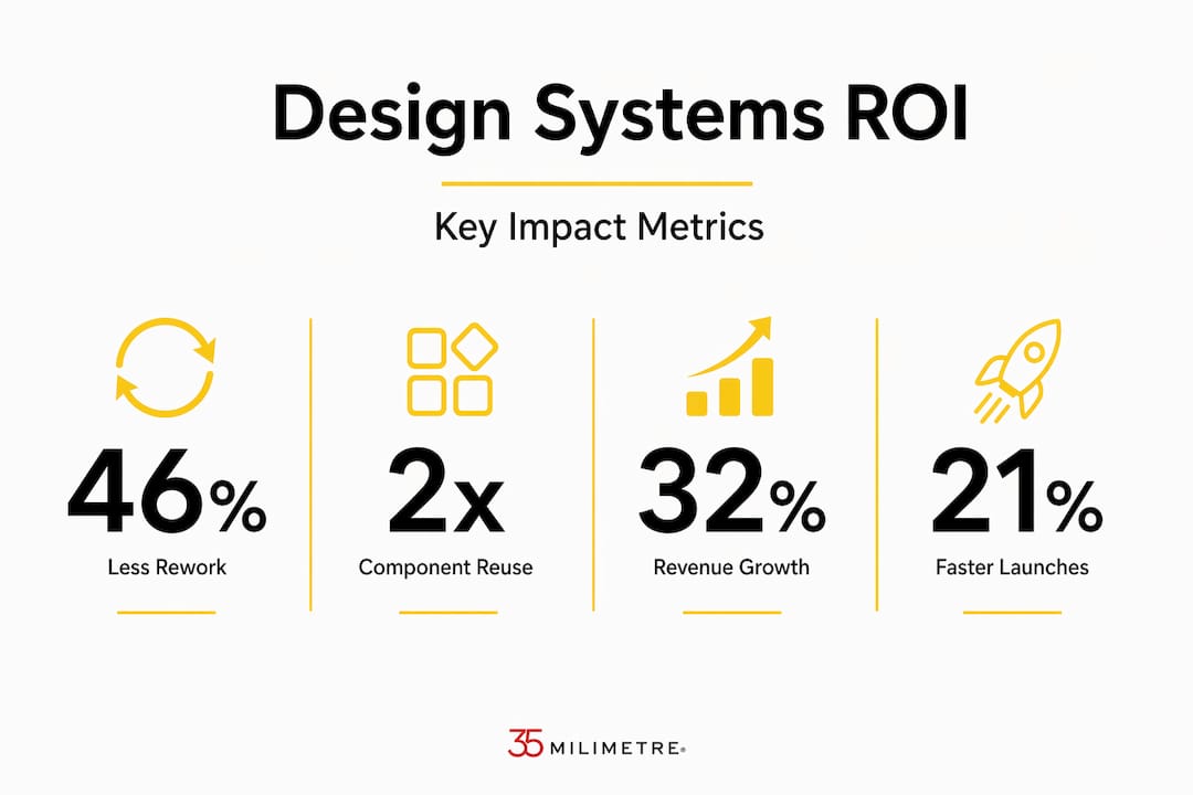
The ROI case for design systems is no longer theoretical. Enterprise adoption data shows that companies see a 46% reduction in design and development costs and a 22% faster time to market after implementing mature design systems. IBM's Carbon design system reportedly saved 75% of design costs. For brand managers, these numbers carry a message: investing in design infrastructure is not a creative luxury, it is a margin decision.
Pro Tip: Frame your design system proposal to leadership in operational terms. Use the words "reduced rework," "faster delivery," and "brand audit cost reduction." These translate better in budget conversations than "visual consistency."
Technical buyers, in particular, scrutinize brand trust signals by comparing the marketing site against the actual product interface. A visually stunning marketing page that does not match the product UI creates an immediate credibility gap. Users do not articulate this consciously; they simply feel that something is off, and that feeling undermines confidence in the product itself.
Design aesthetics and consumer trust in tech
Color is not just a branding preference. It is a behavioral influence mechanism. Research confirms that brand color significantly impacts consumer trust and perception, with a statistical relationship (R²=0.579) that is too strong to treat as subjective. Website color choices show a separate but significant effect on engagement and purchase intent (R²=0.427). These numbers should recalibrate how brand managers prioritize design aesthetics in tech.

The mechanism behind these effects is color congruence. When a brand's color palette feels internally consistent and aligned with the product category, users experience a kind of psychological comfort that makes them more willing to engage and trust. A cybersecurity company using warm pinks creates cognitive friction, not because pink is wrong in absolute terms, but because it conflicts with the visual expectations the category has established. Breaking those expectations requires intentional effort and strong messaging support. Most tech brands cannot afford either.
Beyond color, the concept of first impressions in digital environments is well documented. Users form split-second visual judgments about brand credibility, and those initial assessments are disproportionately difficult to reverse. This is why design maturity correlates with measurable business performance. Companies with high design maturity outperform peers on revenue growth by 32%, which is a figure that reframes the entire conversation about design budgets.
Effective branding through design at the visual level means making choices with intention and testing them against real audience responses. It is not about following trends. The brands that achieve lasting visual authority in technology tend to build systems around a narrow set of well-considered decisions rather than chasing what looks current.
Product design as a brand positioning function
The brand manager's role does not end at the marketing site. In technology companies, the product interface is often the most frequent touchpoint users have with the brand, yet it is routinely managed by a separate team with different priorities and metrics.
Product designers extend beyond aesthetics to actively monitor brand positioning and market influence as part of the product scope. That means collaborating on product roadmaps with brand impact in mind, tracking how design decisions influence acquisition and retention, and treating the product UI as a living expression of the brand rather than a functional tool that happens to have a color scheme.
Practical brand-related KPIs that product and marketing teams can monitor together include:
- Brand recall in usability testing: Do users associate the product visually with the company brand after a single session?
- Visual consistency scores: Systematic audits comparing UI components against the approved design system.
- Support ticket themes: Patterns of user confusion often trace back to visual inconsistency rather than feature gaps.
- NPS correlation with design updates: Tracking whether major visual changes correlate with shifts in Net Promoter Score can reveal how much brand perception depends on interface stability.
The impact of design on branding is not a one-time project. It is an ongoing collaboration between marketing, product, and development that requires shared language, shared governance, and a shared understanding of what the brand stands for at a visual level. Technology companies that silo these functions consistently underperform those that integrate them, and the difference shows up in user trust metrics before it shows up in revenue.
Practical strategies for brand managers
Knowing the theory is not enough. The real challenge for brand managers in technology is translating design strategy into organizational behavior. Here is what that looks like in practice.
Governance is where most design systems fail. Teams build a component library, publish it internally, and assume adoption will follow. It does not. Effective governance means assigning ownership, scheduling regular audits, and creating a clear process for proposing and approving design changes. Operational KPIs like component reuse rates and accessibility incident reduction give leadership a tangible way to measure design health beyond subjective review.
Brand drift is the slow accumulation of small design decisions made without reference to the system. A slightly different button shade here, an off-spec font weight in a product update there. Each individual change is minor. Together, they erode the visual coherence that builds trust. Design tokens prevent brand drift by making the correct choice the path of least resistance for every designer and engineer on the team.
Pro Tip: Run a quarterly "brand drift audit" by pulling a sample of 20 recent product and marketing assets. Check them against the design system's token values for color, spacing, and typography. Even a 10% deviation rate indicates a governance gap that will compound over time.
Aligning marketing and product design in tech environments requires deliberate cross-functional meetings, not just shared documentation. The marketing team needs to understand what the product can render consistently. The product team needs to understand what the brand promises visually. When these conversations happen regularly, the output is coherent. When they do not, you end up with a beautiful campaign that creates expectations the product cannot meet.
My take on design as strategic infrastructure
I have spent years working across technology and automotive brands, watching how visual decisions made under time pressure shape brand perception in ways that take years to correct. The pattern I see most often is not ignorance about design's importance. It is a structural failure to give design the same governance attention that code or finance receives.
When organizations treat design as an identity system rather than a service department, the results are measurably different. Faster delivery, fewer corrections, stronger user trust, and brand campaigns that feel coherent with the product they represent. The companies I have worked with that operate this way consistently produce visual work that stands out, not because they spent more, but because they decided more deliberately.
The uncomfortable truth is that many brand managers champion design in presentations but then allow it to fragment in practice, by under-resourcing governance, deprioritizing design system maintenance when timelines get tight, and treating visual audits as optional. Design-driven culture does not require a larger team. It requires treating every visual decision as a brand decision, and building the systems that make that sustainable.
— 35mm
How 35milimetre supports your tech brand's visual consistency
When strategy is clear and systems are in place, the execution still has to be exceptional. At 35milimetre, we specialize in professional visual post-production that helps technology brands maintain the visual standards their brand identity demands across every marketing asset.
From compositing and retouching to CGI and AI-enhanced imagery, our team works directly with brand managers and agencies to deliver visuals that hold up against a mature design system, not visuals that conflict with it. A single inconsistent campaign image can quietly undermine the brand trust you have spent months building through design governance. We make sure that does not happen. If your tech brand needs visual assets that match the precision of your brand system, we are ready to build them with you.
FAQ
What is the role of design in tech branding?
Design in tech branding functions as the operational system that translates brand strategy into consistent visual experiences across product UI, marketing, and communications. It directly influences how consumers perceive trust, competence, and credibility before any written message is processed.
How does a design system differ from a style guide?
A style guide documents what the brand looks like; a design system encodes the decisions and governance structure that ensure every team produces it consistently. Design systems include reusable components, design tokens, and documented workflows that prevent brand drift over time.
Why does color choice matter so much in tech branding?
Research shows that brand color impacts trust with a statistically strong relationship (R²=0.579), meaning palette decisions measurably influence whether users trust and engage with your brand before they read a single word.
How do you measure design's impact on brand performance?
Track operational KPIs like component reuse rates, design-to-development handoff time, and accessibility incident reduction. These metrics, combined with brand recall scores from usability testing, connect design consistency directly to business outcomes your leadership team can evaluate.
Does design maturity actually affect revenue?
Yes. Companies with high design maturity outperform peers by 32% on revenue growth, which reflects the compounding advantage of consistent, trust-building visual experiences across every customer touchpoint.