
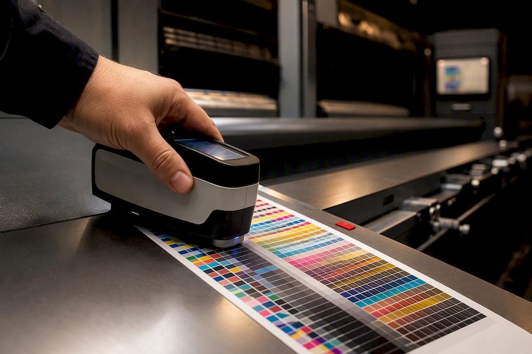
Print ad color management is the process of controlling color from screen to press so what the client approved is what runs in the publication. Before anything else, confirm the file spec (PDF/X-1a, CMYK, correct resolution), verify every display in the chain is calibrated and profiled, and request a contract proof or a measured sample before final sign-off. Expect a ΔE2000 tolerance of roughly 3 or under for brand-critical elements, and assign one owner per step so nobody assumes someone else checked it.
TL;DR:
- Ensuring a ΔE2000 of three or less requires strict file specs, calibrated devices, and a measured proof, especially for brand-critical colors.
- Proper color management involves following the four Cs: consistency, calibration, characterization, and conversion, with ownership clearly assigned at each step.
- Most print fails stem from mismatched profiles, improper color space conversion, excessive ink coverage, or incorrect viewing conditions during proofing.
- Regular monitor recalibration and using ICC profiles ensure soft proof accuracy, while ISO 3664 lighting standards reduce color evaluation disputes.
- Documenting measured proof readings, target profiles, and tight tolerances in contracts helps mitigate color disputes and ensures press runs match expectations.
Table of Contents
- What Is Print Ad Color Management? The Four Cs Explained
- File Prep and Publisher Specs: PDF/X-1a, CMYK, and TAC Limits
- Monitor Calibration, ICC Profiles, and Soft Proofing That You Can Trust
- Proofing Standards: Contract Proofs, ISO 3664, and Press Checks
- Pressroom Color Control: Spectrophotometers and ΔE Targets That Hold Up
- Diagnosing Color Shifts in Print Ads: A Practical Fix List
- Studio Practice: How 35milimetre Handles Agency Handoffs
- Why Measured Color Beats Memorized Color
- Getting Color-Accurate Ad Visuals Without the Guesswork
- Where to Verify Standards and Profiles
- Sources
What Is Print Ad Color Management? The Four Cs Explained
Color management for print ads follows a sequence X-Rite calls the four Cs: consistency, calibration, characterization, and conversion. Skip a step and the ad that looked perfect on a retoucher's monitor comes off press looking muddy, shifted, or flat.
Consistency comes first. Every device in the chain, camera, monitor, proofer, press, needs to perform predictably before you can trust anything it shows you. A designer working on an uncalibrated laptop is guessing, not managing color.
Calibration means bringing each device to a known, repeatable state. The retoucher calibrates the monitor; prepress calibrates the proofer; the printer calibrates the press against its house standard.
Characterization is where measurement enters the picture. A technician uses a spectrophotometer to build an ICC profile that documents exactly how a device renders color, so software can compensate for its quirks.
Conversion is the controlled handoff between color spaces, RGB to CMYK, screen to substrate, using the right profile and rendering intent rather than a default setting nobody checked.
For day-of sign-off, run this sequence:
- Confirm the file matches the publisher's spec (format, color space, resolution).
- Verify the studio monitor and any client-facing display share the same calibration date.
- Pull the ICC profile for the target press or proofer and confirm it matches the actual printing condition.
- Generate a soft proof and compare it against a physical contract proof if one exists.
- Log the ΔE reading from the last measured sample before releasing the file.
Each step has an owner. The designer handles layout and initial color intent, the retoucher owns calibration and characterization on the creative side, and prepress or the printer owns the final conversion and press-side control.
File Prep and Publisher Specs: PDF/X-1a, CMYK, and TAC Limits
Most publishers require PDF/X-1a because it forces embedded fonts, embedded profiles, and CMYK-only images into a single locked file. That single requirement eliminates the two most common color disasters in print advertising: a stray RGB image that gets auto-converted by an unknown engine, and a missing profile that leaves the printer guessing which color space you intended.
Resolution matters just as much as color mode. Most publication specs call for 300 dpi at final size, and a headline or logo that drops below that threshold will print soft even if the color is otherwise correct.
Total area coverage, or TAC, is where color problems hide in plain sight. Push too much ink onto the substrate and you get set-off, slow drying, and shifted blacks. A safe target is:
- TAC ceiling: 280 to 300 percent for most coated stock, lower for uncoated or newsprint.
- Rich black recipe: something like C60 M40 Y40 K100 rather than stacking four full-strength channels.
- Bleed: at least 0.125 inches beyond trim, more if the publisher's spec says otherwise.
- Safety margin: keep live text and logos at least 0.25 inches inside the trim edge.
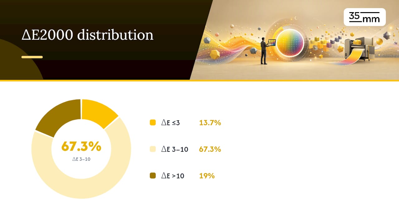
Statistic Callout: A 2018 review of 226 printed products found only 13.7% achieved a ΔE2000 of 3 or less against their reference color, and 19% exceeded a ΔE2000 of 10. Color drift is the norm, not the exception, which is exactly why file discipline matters before a single sheet hits the press.
Before sending anything, run a preflight: check color mode, confirm the embedded profile matches the target printing condition, verify TAC with a soft-proof gamut warning, and attach a one-page color readme noting the target profile and proof type.
Monitor Calibration, ICC Profiles, and Soft Proofing That You Can Trust
A soft proof is only as honest as the monitor showing it. Calibration targets for print work generally land around a D50 white point (5000K) with a luminance suited to the room's ambient light, checked with a colorimeter for routine work or a spectrophotometer for more demanding jobs.
Building the ICC profile is where characterization becomes concrete. The instrument reads a set of color patches on screen, compares them to known values, and generates a profile file that describes the monitor's actual behavior rather than its factory defaults. Store that profile centrally and share it with every partner touching the file, an agency and a print vendor working from two different profiles will disagree even when both are individually calibrated.
Inside Photoshop and InDesign, soft proofing means selecting the correct destination profile (the actual press or proof profile, not a generic CMYK preset) and choosing an appropriate rendering intent. Adobe's own guidance warns against double color management, letting both the application and the printer driver apply conversions, since that stacks two corrections on top of each other and produces an unpredictable shift.
Common mistakes worth flagging in any studio checklist:
- Leaving driver-level color management switched on alongside application-level management.
- Soft proofing with the wrong destination profile because the job spec changed after setup.
- Skipping ambient light control, a monitor calibrated correctly still lies under fluorescent office lighting.
Pro Tip: Recalibrate monitors on a fixed schedule, not "when something looks off." A profile drifts gradually, so the eye adjusts to the shift long before anyone notices a problem.
Proofing Standards: Contract Proofs, ISO 3664, and Press Checks
Color disputes rarely come from bad printing. They come from two people evaluating the same proof under different light. ISO 3664 specifies D50 lighting at roughly 2,000 lux for critical color evaluation, and that single standard resolves more agency-versus-printer arguments than any amount of back-and-forth email.
A contract proof, built to ISO 12647-7 or a comparable G7-aligned process, gives everyone a physical reference that's actually been measured against the target printing condition rather than eyeballed. Treat it as mandatory whenever a brand color, packaging tie-in, or high-visibility campaign is on the line.
Statistic Callout: Only 13.7% of print samples in one large study hit a ΔE2000 of 3 or below, which is exactly why a contract proof, not a memory of how the color "should" look, needs to be the reference everyone signs against.
At a press check, follow this sequence:
- Confirm the press sheet is being evaluated under D50 lighting.
- Measure control patches with a spectrophotometer and compare against the contract proof values.
- Photograph the press sheet next to the proof under the same light for the job file.
- Record the ΔE reading and sign off only once it falls inside the agreed tolerance.
Write tolerances directly into the job ticket. "Match proof" means nothing without a number attached to it.
Pressroom Color Control: Spectrophotometers and ΔE Targets That Hold Up
Color management and color control are different disciplines. Management sets the system up correctly before the job starts; control is what keeps that system in spec while the press is actually running.
On press, technicians measure color bars or control patches printed alongside the ad, typically checking multiple points across the sheet rather than a single spot. Interpreting those readings comes down to ΔE2000: a difference of 3 or under is generally considered a safe target for brand-critical logos and product colors, while general ad copy can often tolerate a wider margin without a viewer noticing anything off.
Practical run-to-run control includes:
- Continuous spectrophotometer readings pulled at set intervals through the run.
- Automated ink-key adjustments that respond to those readings instead of waiting for a human to eyeball a shift.
- A logged record of every measurement, not just a final "looks good" from the pressroom.
Ask the printer for that measurement log before you sign off on delivery. A printer confident in their process will hand it over without hesitation, and a printer who hesitates is telling you something about how tightly that run was actually controlled.
Diagnosing Color Shifts in Print Ads: A Practical Fix List
Most color failures trace back to one of four causes, and diagnosing which one saves you a reprint.
- Wrong viewing conditions. Check whether the disputed proof was evaluated under D50 light. Half of all color arguments dissolve once both sides look at the same sheet under the same lamp.
- Missing or mismatched embedded profiles. Open the file and confirm the profile matches the actual target condition, not a generic default left over from an earlier draft.
- Color space errors. An RGB image that slipped through into a CMYK-flagged file will convert unpredictably depending on which engine touches it last.
- TAC violations. Excess ink coverage causes set-off, dot gain, and shifted blacks that no amount of screen calibration will predict.
Substrate and finishing complicate all four. A gloss coating boosts perceived saturation and contrast, while uncoated stock absorbs ink and mutes color, so the same file can look meaningfully different on two approved paper stocks. Varnish and lamination shift things further, sometimes enough to fail a tight ΔE tolerance even when the underlying file was correct.
When a shift shows up on press, a quick prepress fix, adjusting the profile or TAC, sometimes solves it. When measurements show the press itself drifted mid-run, escalate with the actual ΔE readings and control-patch data rather than a description of how the color "looks wrong." Printers and ink suppliers respond to numbers, not adjectives.
Pro Tip: Keep a physical swatch from every approved press check. When a dispute happens three months later, that swatch settles the argument faster than any file comparison.
Studio Practice: How 35milimetre Handles Agency Handoffs
A clean handoff between agency and studio prevents most color problems before a file ever reaches prepress. On brand-critical campaigns, that means asking the agency for the target CMYK or Pantone reference, the publication's file spec, and any existing contract proof, then returning a soft proof built against the correct destination profile before final files go out.
35milimetre runs brand-critical jobs through a compact sequence: soft proof against the client's target profile, physical contract proof where the campaign warrants it, and a measured handoff with ΔE readings attached to the delivery. That last step, and this efficient handoff workflow for ad agency visuals captures the pattern in more detail, turns "trust us" into a documented fact the printer can check.
What to capture on any high-stakes job:
- The target profile and rendering intent used for final export.
- ΔE readings from the last measured proof before delivery.
- File spec confirmation (format, resolution, TAC) signed off by both sides.
Why Measured Color Beats Memorized Color
A Pantone chip on a fan guide is a starting point, not a contract. Physical swatches behave differently across substrates, so a color that reads correctly on coated cardstock can shift noticeably on uncoated stock or newsprint. Treating a swatch as gospel, rather than a spectral value measured on the actual substrate, is how avoidable disputes start.
Realistic tolerances depend on context. A packaging tie-in with a strict brand mandate deserves a tighter ΔE ceiling than a full-page magazine ad running on lower-grade paper, and pretending brand consistency demands identical numbers everywhere only sets everyone up for a fight nobody can win. Write the tolerance into the contract, tied to a measured proof, and most disputes disappear before they start.
— 35mm
Getting Color-Accurate Ad Visuals Without the Guesswork
35milimetre builds print ad visuals the way this article describes color management working: with ICC-profiled exports, files prepped for PDF/X-1a compliance, and measured handoffs instead of a hopeful glance at a screen. That's the practical advantage for agencies and brands tired of reprints traced back to a profile mismatch nobody caught in time.

The studio's retouching, compositing, and CGI work integrates directly into agency and printer workflows, so a file that leaves 35milimetre arrives with the color data a prepress team actually needs, not a flattened export they have to second-guess. That consistency also protects the brand equity a visual identity depends on across every placement a campaign runs in.
If your next campaign has a color-critical asset on the line, get in touch through 35milimetre's services page and request a color-managed handoff for your next print ad job.
Where to Verify Standards and Profiles
For job templates and contracts, keep these on hand: X-Rite's color management overview for the four Cs, Prepressure's PDF/X-1a explainer for file specs, and Just Normlicht's D50 viewing guidance for proofing setups. Save all three directly into your studio's standard job checklist.