
Design is not decoration. In advertising, it is the mechanism that decides whether a viewer stops scrolling or moves on, and that decision happens in under five seconds. For marketing professionals and brand managers in technology and automotive sectors, this is not a minor detail. It is the difference between a campaign that converts and one that disappears into the feed. This guide breaks down how foundational design principles, attention science, emerging technologies, and brand-specific visual strategies work together to produce advertising that earns measurable results. If you have ever wondered why some ads feel magnetic while others feel forgettable, the answer almost always lives in the design.
Table of Contents
- Why design is the engine of memorable advertising
- Practical frameworks: Visual hierarchy and attention science
- AI, 3D, and interactivity: The new frontiers of ad design
- Matching brand identity with visual complexity
- Expert perspective: What most marketers get wrong about design's real role
- Enhance your campaigns with advanced visual solutions
- Frequently asked questions
Key Takeaways
| Point | Details |
|---|---|
| First seconds matter | Ad design determines what audiences notice within moments and defines campaign success. |
| Frameworks drive results | Applying proven visual hierarchy and layout rules boosts clarity and engagement. |
| Tech boosts creativity | AI, 3D, and interactivity open avenues for immersive, high-performing advertising. |
| Simplicity vs. complexity | Tailor visual complexity to brand identity for optimal fluency and recall. |
| Beyond just visuals | True design impact comes from aligning creative with objectives, not just aesthetics. |
Why design is the engine of memorable advertising
To understand how design impacts advertising outcomes, we must first clarify what design really accomplishes at a cognitive level. Most marketing teams treat design as the final step, the visual polish applied after strategy and copy are locked. That framing is backwards. Design is the first language your audience reads, and it speaks before a single word registers.
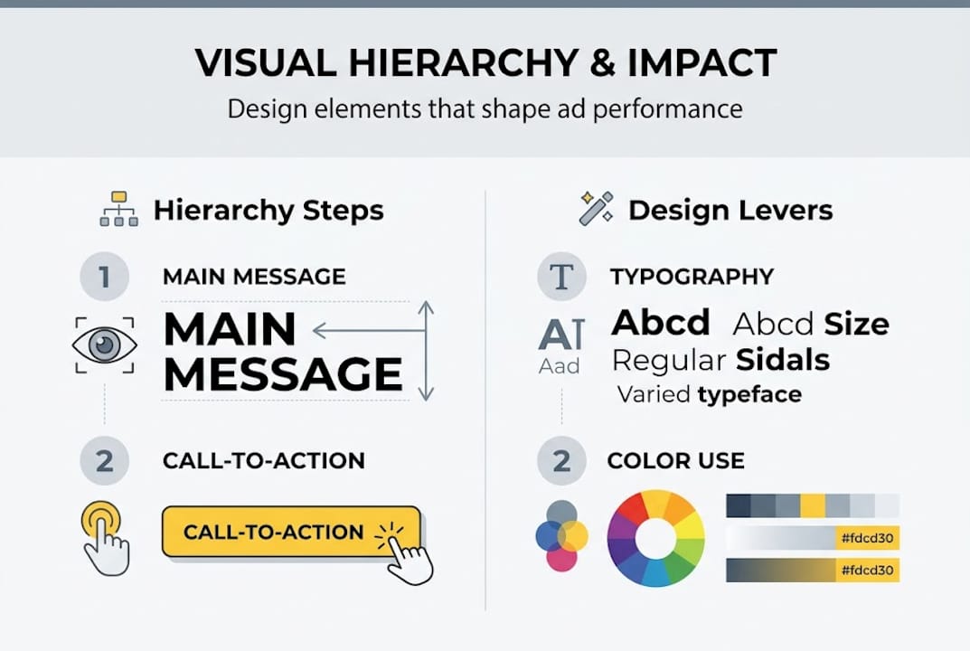
Visual hierarchy is the organizing principle that tells a viewer where to look and in what order. Without it, an ad becomes visual noise. The brain, overwhelmed by competing elements, disengages. With it, attention flows naturally from the headline to the key visual to the call to action, exactly the sequence you need for conversion. Post production design fundamentals are built on this logic, and understanding them changes how you brief creative teams.
"Design in advertising establishes visual hierarchy using patterns like F-pattern and Z-pattern, guiding viewer attention in 5 seconds or less via principles such as contrast, balance, and the 3-element rule to avoid cognitive overload."
The F-pattern describes how readers scan text-heavy layouts: across the top, down the left side, then across again at a lower point. The Z-pattern applies to image-dominant layouts, where the eye travels from top-left to top-right, diagonally to bottom-left, then across to bottom-right. Knowing which pattern your ad format triggers lets you place your most critical information exactly where attention naturally lands.
For technology and automotive brands, the stakes are especially high. A smartphone ad needs to communicate innovation and elegance before the viewer consciously processes the specs. A car ad must trigger aspiration and trust in the same frame. These are not simple asks, and they cannot be solved with copy alone.
The 3-element rule is a practical guardrail: limit any single ad to three main focal points. More than three and you risk cognitive overload, which is the mental fatigue that occurs when the brain processes too many competing stimuli at once. The key principles of visual design consistently reinforce that simplicity, contrast, and intentional use of white space are not stylistic preferences but functional requirements for effective advertising.
- Visual hierarchy directs attention in the correct sequence
- Contrast separates the signal from the background noise
- White space gives the eye permission to rest and focus
- The 3-element rule prevents cognitive overload in complex layouts
Practical frameworks: Visual hierarchy and attention science
With a foundational understanding of design's function, the next step is applying visual hierarchy frameworks that work under severe attention constraints. The F-pattern and Z-pattern are not just academic concepts. They are practical tools that should inform every layout decision you make.
Display ads typically follow the Z-pattern because they are image-led and scanned quickly. Social ads often blend both patterns depending on the ratio of image to text. Video ads operate differently, using motion to control where attention goes at each moment. Understanding which format you are designing for determines which framework applies.
| Ad format | Dominant pattern | Primary design priority |
|---|---|---|
| Display banner | Z-pattern | Brand mark and CTA placement |
| Social feed image | F-pattern or Z-pattern | Hook visual in top-left zone |
| Video pre-roll | Motion-guided | First 3 seconds carry full load |
| Interactive HTML5 | User-driven | Entry point clarity |
Building visual hierarchy in practice follows a clear sequence. First, identify the single most important message in the ad. Second, assign it the largest or most visually dominant element. Third, use contrast, color, and scale to establish a clear second and third focal point. Fourth, remove anything that does not support those three points. Fifth, test legibility and design speed by viewing the ad at a reduced size for two seconds and asking what you remember.

Typography plays a larger role than most marketers acknowledge. Using more than three type sizes in a single ad creates visual chaos. Ad layout grid systems help constrain these decisions and keep layouts disciplined across multiple ad sizes and placements.
Pro Tip: Before finalizing any ad creative, squint at it. Literally. If the primary message and call to action are still identifiable when the image is blurry, your hierarchy is working. If everything blends together, you have too many competing elements.
Color is another lever that most teams underuse strategically. High saturation draws attention but can also signal artificiality, which matters more than you might expect, especially as AI-generated imagery becomes common in campaigns. Warm colors advance visually, cool colors recede. Used deliberately, this creates depth and guides the eye without the viewer ever noticing.
AI, 3D, and interactivity: The new frontiers of ad design
Once the basics are set, marketers can leverage cutting-edge technologies to design ads that break through the clutter and drive emotional engagement. Artificial intelligence, 3D rendering, and interactive formats are no longer experimental. They are production-ready tools that leading brands in technology and automotive are already using to significant effect.
AI-generated imagery is perhaps the most discussed and most misunderstood of these tools. The research is nuanced: AI images can exceed human CTR by up to 19 percent, but only when the imagery is not perceived as AI-generated. The moment an audience recognizes the telltale signs, such as unnaturally high color saturation or anatomically improbable details, the effectiveness drops sharply. This means the craft of making AI imagery look authentic is itself a critical skill.
For automotive advertising, 3D animation and VFX have become the standard for a reason. You cannot photograph a car driving through a volcanic landscape or a smartphone assembling itself from liquid metal in a real studio. 3D and VFX in automotive ads enable these impossible scenarios, and the emotional payoff is substantial. Honda's Dream Generator used AI personalization to create individualized visual narratives for viewers. Jeep's interactive banner campaign yielded a 35 percent increase in brand recall compared to static alternatives.
Advanced visual post-production is what bridges the gap between a good concept and a finished asset that performs. Compositing, color grading, and CGI integration are not afterthoughts. They are where the emotional resonance of an ad is either locked in or lost.
- AI imagery performs best when it mimics authentic photography, not when it looks generated
- 3D renders allow total control over lighting, angle, and environment without a physical shoot
- Interactive formats increase dwell time and create memorable brand touchpoints
- VFX sequences can communicate product innovation in ways that live-action cannot
Pro Tip: If you are using AI-generated visuals in a campaign, run them past a small focus group before launch. Ask one question: does this look like a real photo? If more than a third of respondents say no, the creative needs refinement before it goes live.
Matching brand identity with visual complexity
Beyond frameworks and technologies, success in ad design often hinges on aligning visual style with brand identity and campaign objectives. This is where many campaigns quietly fail. The visuals are technically competent but feel mismatched to the brand, and audiences sense that disconnect even if they cannot articulate it.
Research published in the International Journal of Research in Marketing found that visual complexity and brand gender interact in ways that directly affect advertising effectiveness. Simpler visuals tend to perform better for brands perceived as masculine, while more complex, layered visuals enhance effectiveness for brands perceived as feminine. The mechanism is conceptual fluency, which is the ease with which a viewer processes and makes sense of what they see. When the visual style matches audience expectations for that brand, fluency increases and so does positive response.
"Conceptual fluency is not about dumbing things down. It is about making the right things immediately legible to the right audience."
For technology brands, this often means restraint. Clean lines, generous white space, and a single hero product shot communicate precision and confidence. For automotive brands targeting aspirational buyers, layered environments, dramatic lighting, and motion blur can all serve the brand story without overwhelming the viewer.
Balancing simplicity and detail is a judgment call that requires understanding both the brand's visual language and the specific campaign objective. A performance campaign optimized for clicks needs a different visual approach than a brand awareness campaign designed to build long-term association.
Here are practical ways to assess and adjust visual complexity for your sector:
- Audit your brand's existing creative for visual consistency across touchpoints
- Define whether your brand skews toward high or low complexity based on audience research
- Test two versions of the same ad at different complexity levels before committing to a full run
- Align complexity decisions with the campaign objective, not just aesthetic preference
- Review competitor creative to understand the visual baseline your audience already expects
Expert perspective: What most marketers get wrong about design's real role
Drawing on industry learnings and real-world results, it is clear that the deepest value of design is often misunderstood. The most common mistake we see is treating design as a quality filter rather than a strategic tool. Teams ask "does this look good?" when they should be asking "does this communicate the right thing to the right person in the right context?"
Beautiful design that lacks strategic clarity fails. We have seen campaigns with stunning visuals that produced flat results because the hierarchy was wrong, the complexity mismatched the audience, or the emotional tone contradicted the brand. Conversely, some of the most effective ads we have encountered are visually simple to the point of being plain, but they are ruthlessly clear.
One finding from recent research reinforces this: modifying existing creatives with AI consistently underperforms compared to either full AI generation or original human creative. Patching a weak concept with new technology does not fix the underlying problem. The lesson is to start from the campaign objective and work forward to the visual, not the other way around. Aesthetics follow strategy, not the reverse.
Enhance your campaigns with advanced visual solutions
If you are ready to move from theory to transformative creative results, expert partners and effective design tools are within reach. At 35milimetre, we work with marketing teams and ad agencies in technology and automotive sectors to produce high-end visuals that are built around campaign objectives, not just aesthetic standards.
Our professional visual post-production services cover everything from compositing and color grading to full CGI builds and AI-enhanced imagery. Whether you need a single hero asset or a full campaign suite, we bring over two decades of hands-on experience to every brief. You can explore innovative campaign examples directly on our site to see how strategic design and expert finishing translate into campaign performance.
Frequently asked questions
How does design impact ad click-through rates?
Well-crafted visual design can raise click-through rates by up to 19 percent, particularly when imagery appears authentic and human-like rather than visibly generated or artificial.
What are the most important design principles in advertising?
Visual hierarchy, simplicity, and clear focal points are foundational. Ads that guide attention within the first five seconds using contrast, balance, and the 3-element rule consistently outperform those that do not.
Why should automotive brands invest in 3D and interactive visual effects?
3D animation and interactive formats enable storytelling that live-action photography cannot achieve. Jeep's interactive banners produced a 35 percent lift in brand recall, illustrating the measurable advantage these formats provide.
Should ad designs always be simple for better results?
Not always. Simplicity works best for performance-focused campaigns, but matching visual complexity to brand identity and audience expectations can meaningfully enhance effectiveness for brand-building campaigns.