
A conversion-ready hero image strategy communicates the primary benefit in one glance and gives visitors exactly one clear action, all while loading fast enough to protect your Core Web Vitals. That last part is not optional. Get the message right and lose it to a three-second load time, and you've built a beautiful billboard nobody sees.
Before touching design files, check three levers in this order:
- Message clarity and CTA: Can a visitor state your value proposition and next step within five seconds, with only one button competing for their click?
- Mobile art direction: Does the hero use a dedicated mobile crop with the focal point sitting inside a safe zone, or is it just a squeezed desktop image?
- Technical delivery: Is the hero image serving as WebP or AVIF, sized under roughly 500 KB, and preloaded so it doesn't tank your Largest Contentful Paint?
Nail those three, and most of what follows in this guide is refinement.
Key Takeaways
A conversion-ready hero image strategy pairs one clear message and CTA with mobile-first art direction and a technical build that protects Largest Contentful Paint.
| Point | Details |
|---|---|
| Message clarity first | State the primary benefit and one CTA within a five-second glance, before refining the visual. |
| One CTA on the primary hero | Two competing buttons split attention and lower click-through on both. |
| Art-direct per breakpoint | Deliver a distinct mobile crop with the focal point in a safe zone, not one scaled master image. |
| Keep files under 500 KB | Use WebP or AVIF, and preload the hero image to protect LCP scores. |
| Test types, not opinions | A/B test hero types, copy, and CTA wording, tracking conversion and LCP together. |
| Studio production closes the gap | 35milimetre delivers layered files, breakpoint crops, and pre-tuned WebP/AVIF exports ready for engineering handoff. |
Table of Contents
- What Is a Hero Image, and What Makes Up a Hero Section?
- Why Does Hero Image Design Affect Conversion Rates?
- What Are the Main Types of Hero Images?
- Which Design Rules Actually Move Conversion Rates?
- How Do You Art-Direct a Hero Image for Every Device?
- What Technical Setup Keeps a Hero Image From Hurting LCP?
- How Should You A/B Test Hero Image Changes?
- What Do Strong Hero Images Look Like in Practice?
- How Does 35milimetre Produce Hero Images at a Studio Level?
- What the Data Actually Rewards in Hero Design
- Get Hero Images Built Right the First Time
- Sources
What Is a Hero Image, and What Makes Up a Hero Section?
A hero image is the large visual sitting at the top of a webpage, the first thing a visitor's eye lands on. A hero section is bigger than that. It's the visual plus the headline, subheadline, supporting copy, and call to action working together as one conversion unit. Confusing the two is why so many redesigns fail: teams obsess over the photo and forget the section has to function as a system.
A well-built hero section typically includes:
- The image or video that sets tone and, ideally, shows the product or outcome in use.
- A headline stating the core benefit in plain language, not a clever tagline.
- A subheadline adding one layer of specificity or proof.
- A single CTA button with action-specific microcopy.
- Optional trust signals like a customer logo strip or a star rating, kept visually secondary.
Not every page needs a full hero. A blog post or a deep internal page often converts better with a smaller banner or a typographic opener, since visitors there already know why they clicked. Save the full hero treatment for landing pages, homepages, and product pages where you're making a first impression and asking for a decision in the same breath.
Why Does Hero Image Design Affect Conversion Rates?
The hero is a five-second test. If a visitor can't answer "what's in it for me" almost instantly, the best-practice guidance from HubSpot is blunt about the outcome: they leave, and no amount of clever copy further down the page recovers that visitor. Clarity beats polish every time this gets tested.
The hero image is very often your page's Largest Contentful Paint element — the metric Google uses to judge how fast your main content appears, and one of the three Core Web Vitals that factor into search ranking and user experience scoring, according to Web. Ship an unoptimized 4 MB hero photo and you're not just slowing the page. You're actively working against the same first impression the image was supposed to create.
When you validate a hero change, track more than "does it look better." Prioritize:
- Click-through rate on the primary CTA.
- Overall conversion rate for the page's goal action.
- LCP score, measured on real mobile devices, not just desktop Lighthouse runs.
- Bounce rate and scroll depth, which reveal whether visitors engage past the fold.
Design opinions are cheap. These four numbers tell you if the redesign actually worked.
What Are the Main Types of Hero Images?
Most effective heroes fall into four categories, and the CXL guide to hero image heuristics recommends testing between them rather than assuming one is universally right for your brand.
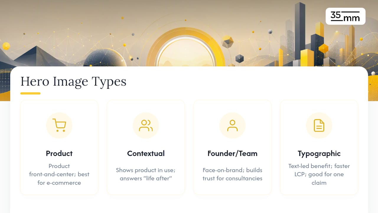
Product hero shots put the item front and center, isolated or in a clean lifestyle context. This works best for e-commerce, hardware, and any product whose physical form is part of the pitch. The risk: a product hero image says nothing about the outcome or benefit unless the composition or copy fills that gap.
Contextual heroes show the product or service in use, a person actually experiencing the benefit. This tends to outperform isolated product shots for services and software, because it answers "what does my life look like after I buy this" instead of just "what does this look like." The tradeoff is production complexity. Contextual imagery usually needs real photography or CGI staging rather than a quick studio shot.
Founder or team heroes put a real person's face on the brand, which builds trust fast for consultancies, agencies, and early-stage companies where credibility is the conversion barrier. This type has limits. It doesn't scale well past the founder-led stage of a business, and it distracts more than it helps when the product itself should be the star.
Typographic or non-contextual heroes skip photography entirely and lead with bold type stating a single benefit or statistic. The DreamHost glossary on hero images notes that message-first designs can outperform photo-based heroes when the goal is delivering one sharp claim, and they carry a real performance advantage since there's no large raster image weighing down LCP.
Choosing among these should never be a coin flip. If you're torn between two types, that's the test to run, not the decision to agonize over in a meeting.
Which Design Rules Actually Move Conversion Rates?
Most hero redesigns fail not because the visual is wrong, but because the section around it breaks basic hierarchy. Here's the priority order that matters most, based on what consistently shows up in conversion-focused testing.
- Establish headline, then subheadline, then CTA, in that visual weight. The headline states the benefit. The subheadline adds specificity. The CTA is the smallest text block but the highest-contrast element on the page. If a visitor's eye can't find all three in that order within a glance, the hierarchy has failed before the copy even matters.
- Run exactly one CTA on the primary hero. Two competing buttons split attention and measurably drag down click-through on both. Secondary actions belong lower on the page, not fighting for the same eye-line as your main conversion goal.
- Write CTA microcopy that's specific and short. "Get Started" tells a visitor nothing. "Get Your Free Quote" or "See Pricing" does. Aim for three to five words that name the actual next step, not a vague nudge toward one.
- Avoid auto-rotating carousels for primary messaging. Data cited by Neil Patel's guide on hero images and conversions confirms what most CRO practitioners already suspect: the first slide gets the overwhelming majority of engagement, and every slide after it is close to wasted design effort. If you genuinely need to rotate multiple messages, cap it at two or three slides and give visitors manual controls instead of forcing an unwanted rotation.
- Check accessibility before you check aesthetics. Text over imagery needs a contrast ratio that meets WCAG AA at minimum, roughly 4.5:1 for body text. Every interactive element in the hero, including the CTA, needs to be reachable and operable by keyboard alone. And if the hero includes any motion or autoplay video, respect the
prefers-reduced-motionmedia query so visitors with vestibular sensitivities aren't stuck watching something they can't turn off.
Pro Tip: Map your hero's visual gaze lines before finalizing the crop. If your image includes a person looking toward the CTA, or an implied line of sight created by lighting or composition, visitors' eyes tend to follow it. Art-direct that safe zone deliberately instead of leaving it to chance in the final crop.
None of these five rules require a bigger budget or a longer timeline. They require someone on the team willing to cut a second CTA button or say no to the carousel a stakeholder loves. That's usually the actual obstacle, not the design skill.
How Do You Art-Direct a Hero Image for Every Device?
A single master image scaled down for mobile is one of the most common ways a strong desktop hero becomes an unreadable phone screen. The fix is art direction: deliberately different crops for different breakpoints, not one file stretched or squeezed to fit.
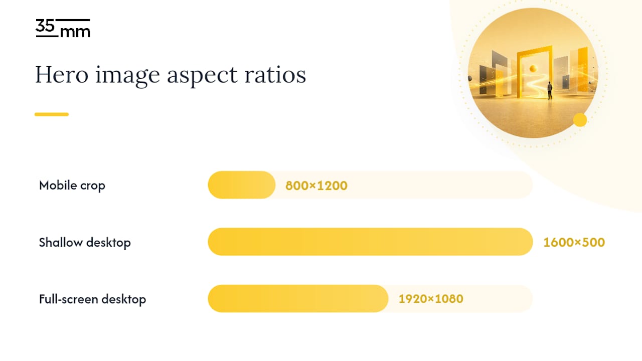
Start with a mobile-first mindset even if desktop is where the creative review happens. Deliver a distinct mobile crop, ideally near a vertical 800×1200 ratio, and keep the focal point centered inside a safe zone that survives the transition from a wide desktop frame to a narrow phone screen. The practical sizing baselines from Justinmind put common desktop hero dimensions around 1600×500 for a shallow strip layout or 1920×1080 for a full-screen treatment, but neither of those ratios survives a direct crop to mobile without losing the subject.
If your hero includes a person, use their eye-gaze on purpose. A subject looking toward the headline or CTA does more compositional work than most copywriting, guiding attention exactly where you want it without a single word of instruction.
Text legibility over a photo usually needs a gradient overlay or localized contrast adjustment, not a flat dark box slapped over the whole image. A well-built gradient darkens only the zone behind the text, which keeps the image feeling authentic instead of muddy. This kind of contrast work is far more reliable when it's baked into the image file itself during retouching, rather than left to a CSS overlay layered on top afterward, since a baked-in treatment renders identically everywhere instead of depending on how each browser handles the overlay.
- Deliver separate crops per breakpoint, not one scaled master.
- Center the subject or focal point inside the mobile safe zone.
- Use eye-gaze and lighting to direct attention toward the CTA.
- Bake contrast and gradient treatments into the file rather than relying on CSS alone.
Pro Tip: When budget allows, commission bespoke photography or CGI over stock. Stock imagery can work with the right retouching, but bespoke shots let you control gaze direction, product placement, and safe zones from the first frame instead of fighting a stock photo's existing composition.
What Technical Setup Keeps a Hero Image From Hurting LCP?
Format choice is the first decision, and it's not close. AVIF and WebP compress meaningfully smaller than JPEG at equivalent visual quality, with a JPEG fallback for the small sliver of older browsers that don't support them. This single swap is often the fastest performance win available to a team that hasn't touched image formats in a few years.
Resist the temptation to export one enormous master file and let the browser scale it down for every screen size. Serve art-directed assets per breakpoint using the HTML <picture> element or srcset, so a phone downloads a phone-sized file instead of quietly pulling the same 1920-pixel desktop asset and burning mobile bandwidth for no visual benefit.
Aim to keep the hero image file size small enough to ensure quick loading, optimizing it as much as possible without compromising quality, a target echoed in Justinmind's practical guidance on hero image creation. Pair that with <link rel="preload"> on the hero image so the browser starts fetching it before it discovers the tag in the render tree, which shaves meaningful time off LCP on image-heavy pages.
If the hero uses video instead of a static image, keep it muted and autoplay-only, provide a lightweight poster image for mobile so phones aren't forced to buffer full video on a cellular connection, and avoid heavy multi-megabyte clips on mobile breakpoints entirely. A poster image with a play affordance almost always beats a slow-loading autoplay clip on a mobile network.
- Export in AVIF or WebP with a JPEG fallback.
- Serve breakpoint-specific crops via
srcsetor<picture>, never one scaled master. - Target under 500 KB per hero asset.
- Preload the hero image so it doesn't wait to be discovered in the render tree.
- Use muted autoplay and mobile poster images for any hero video.
A deeper walkthrough of compression settings, lazy loading, and responsive delivery lives in 35milimetre's guide to optimizing visual content, and the Baby Love Growth breakdown of website speed and conversions covers the SEO side of the same performance work in more depth.
How Should You A/B Test Hero Image Changes?
Guessing which hero performs better is a habit worth breaking. Testing removes the guesswork, and the CXL guide on hero image testing recommends tracking design fit and technical performance together, not one at the expense of the other.
- Pick one variable per test. Run image type against image type, copy against copy, or CTA color against CTA color. Testing three changes at once tells you the combination worked, not which piece did the work.
- Track primary metrics together. CTA click-through rate, page conversion rate, and LCP score should all move in the same experiment dashboard, alongside bounce rate and scroll depth as secondary signals.
- Size your test to your traffic, not your patience. A page pulling a few hundred visitors a day needs weeks to reach a reliable result. Segment by device and traffic source so a mobile win doesn't get diluted by desktop data pulling the average the other way.
- Let the business metric win the argument. If the variant that looks better in a design review converts worse, ship the version that converts better. A hero that's twenty percent slower to load but wins on conversion still needs a second look at why, since the two usually move together, not apart.
Run the test long enough to cross a full weekly cycle at minimum. Traffic behaves differently on a Tuesday than a Saturday, and cutting a test short on a lucky Wednesday is how teams ship the wrong winner.
What Do Strong Hero Images Look Like in Practice?
Six patterns turn up again and again in heroes that convert well, each tied to a specific principle already covered above.
- A SaaS dashboard screenshot as a contextual hero shows the product mid-use instead of an abstract lifestyle photo. Testable hypothesis: swapping a stock photo for a real product screenshot increases signup CTA clicks, since it answers "what am I actually buying" immediately.
- A single bold statistic in typographic type, no photo at all, stating a benefit like a percentage improvement. This works when the number itself is the strongest asset you have, and it loads almost instantly since there's no large raster file.
- A founder photo paired with a short, direct headline on an early-stage consultancy site, where trust is the primary barrier. Hypothesis: replacing a stock photo with the founder's actual face increases contact-form submissions.
- A tightly cropped product-only shot on an e-commerce category page, isolated on a clean background with a single "Shop Now" CTA. Hypothesis: removing background clutter and lifestyle staging increases add-to-cart rate from the hero itself.
- A muted looping video with a static mobile poster, used sparingly for a physical product that benefits from showing motion, like a piece of hardware in operation.
- A gradient-overlaid contextual photo with the CTA positioned inside the visitor's implied gaze line, applying the eye-gaze principle directly rather than just placing the button wherever there's empty space.
Full case breakdowns of how imagery choices tie to campaign outcomes are worth studying in more depth through 35milimetre's roundup of visual storytelling examples.
How Does 35milimetre Produce Hero Images at a Studio Level?
Agency-grade hero production is less about a single stunning photo and more about the full set of deliverables an engineering team actually needs to ship it without breaking anything. 35milimetre handles the full chain: retouching, compositing, CGI rendering, and AI image generation, built specifically for teams who need a hero asset that works across breakpoints and formats on delivery day.
A typical production package includes:
- Layered source files, so future edits don't mean starting from scratch.
- Preset art-directed exports for desktop widescreen, tablet, and portrait mobile crops.
- Pre-tuned WebP and AVIF exports at quality settings chosen for the specific image, not a blanket default.
- Baked-in contrast and gradient treatments for legible text zones, rather than leaving that work to CSS.
The full production checklist and export specifications are detailed in 35milimetre's guide to preparing campaign imagery, built for teams handing assets directly to developers.
What the Data Actually Rewards in Hero Design
Most hero image advice treats creative direction and technical delivery as two separate jobs handed to two separate teams, and that split is exactly where conversion gets lost. A gorgeous hero that ships as a 3 MB JPEG is not a design win. It's a Core Web Vitals problem wearing a nice photo as a disguise.
The conventional wisdom oversells personality and undersells restraint. Brand teams often push for a hero that "feels premium," when the research consistently points to clarity and speed as the two variables that move conversion the most. A typographic hero stating one sharp benefit will frequently outperform an art-directed lifestyle shot, not because it's more attractive, but because it loads instantly and asks nothing of the visitor's patience.
If there's one thing worth prioritizing above the rest covered here, it's this: decide the CTA and the mobile crop before the photography brief goes out. Too many teams shoot first and figure out the message hierarchy later, which is backward. Design the hero section as a system, then commission the visual to fit it.
Get Hero Images Built Right the First Time
Most teams solve the hero image problem by choosing between a stock photo library and a full agency retainer, and neither one delivers what the checklist above actually needs: layered files, per-breakpoint crops, and pre-tuned WebP or AVIF exports handed off ready to implement. 35milimetre works project by project instead, so you get studio-grade retouching, compositing, and CGI without committing to an ongoing contract.
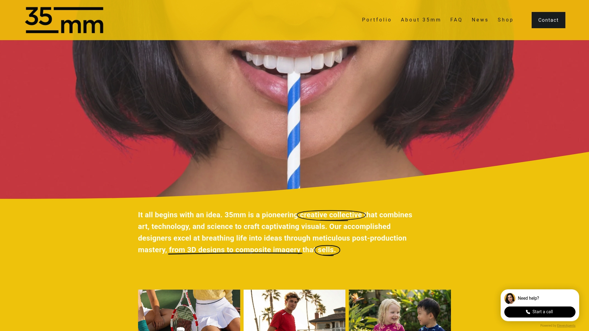
The studio has spent two decades producing high-end visuals for technology and automotive brands, and its team, led by Mehmet Turan, has been actively expanding into AI image generation to keep pace with how quickly production tools are changing. Whether you need a contextual hero shot built from a CGI product render or a full set of art-directed mobile crops for an existing campaign, the deliverables arrive matched to the technical specs your engineering team needs to hit LCP targets. Visit 35milimetre's services page to scope your next hero image project and get a quote for your specific format and breakpoint requirements.