
Graphic design best practices are standardized principles that guide the creation of visually compelling, clear, and accessible designs that effectively communicate brand messages. Mastering these principles, from WCAG 2.x contrast standards to modular typography scales and CRAP composition frameworks, separates work that merely looks good from work that actually performs. Whether you manage a design team, brief an agency, or produce visuals yourself, understanding how design principles orchestrate elements rather than simply select them is the difference between visual noise and visual authority.
1. Graphic design best practices start with mastering core principles
The foundation of every effective design is a set of principles that control how viewers perceive and process visual information. Design principles directly influence attention control, comprehension, and perceived organization. They are not decorative choices. They are structural decisions.
Contrast directs the eye by creating visual differences between elements. High contrast between a headline and its background signals importance. Low contrast signals secondary information. Hierarchy builds on contrast by using size, color, and placement to communicate what matters most, guiding the viewer through content in a deliberate sequence. Alignment creates invisible structure. Even a single misaligned element introduces visual tension that readers feel before they can name it.
Proximity groups related elements together, reducing cognitive load by signaling relationships without words. Repetition reinforces unity across a layout and across a brand. When a color, typeface, or spacing rhythm repeats consistently, it builds recognition and trust. Balance and scale work together to create visual stability, while dominance and similarity focus user attention on the most critical message.
Gestalt principles sit underneath all of these. The brain naturally seeks patterns, groups similar shapes, and fills in gaps. Designers who understand Gestalt-informed composition can predict how a viewer will read a layout before it is ever tested with a real audience.
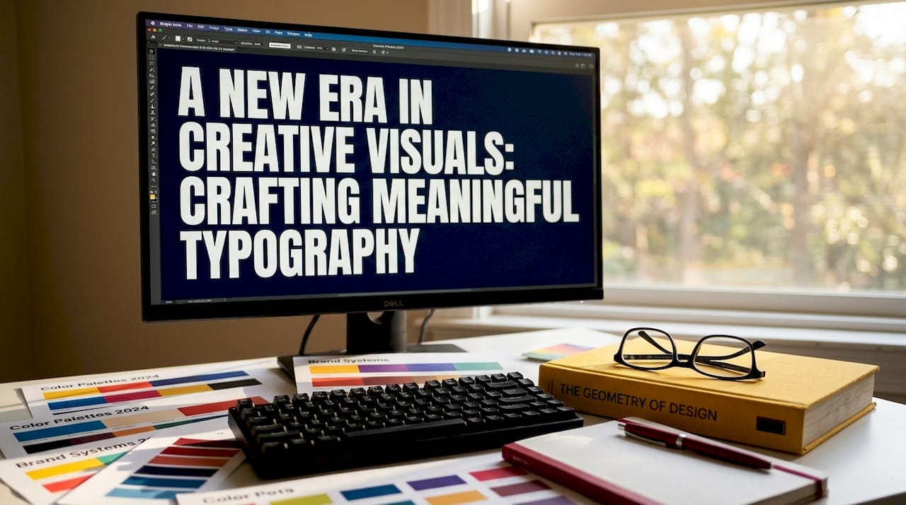
2. Typography systems are the backbone of readable, consistent design
Typography is not a styling choice. It is a system, and treating it as one is among the most effective graphic design tips a working designer can internalize. A modular typography system includes a type scale, defined typeface roles, vertical rhythm, and responsive behavior to maintain consistent hierarchy across devices.
A modular scale sets font sizes in a consistent ratio, such as 12, 14, 16, 20, 24, 32, and 48 pixels, built from a base body size of 15 to 17 pixels. This approach, documented by AllTools typography reference, eliminates arbitrary sizing that causes inconsistent design across a project. When every size has a logical relationship to the others, the hierarchy reads naturally without manual adjustment at every breakpoint.
Line height matters as much as font size. Body text typically reads best at a line height ratio of 1.5 to 1.7, while headings benefit from tighter spacing in the range of 1.1 to 1.3. These ratios are not aesthetic preferences. They reflect how the eye tracks across lines and returns to the start of the next one.
Pro Tip: Treat your type scale as a constraint system, not a suggestion. Limit yourself to five or six size steps and two typeface roles, such as display and body, and resist the urge to add a third "just for this project." Every exception you make becomes a precedent that erodes consistency over time.
3. Color contrast is a non-negotiable design standard
Color contrast is the single most commonly failed accessibility requirement in professional design work, and it affects far more than users with visual impairments. Poor contrast reduces legibility for everyone reading on a bright screen outdoors, on an aging monitor, or in a poorly lit room.
WCAG 2.x Level AA requires a minimum contrast ratio of 4.5:1 for normal text and 3:1 for large text. These ratios are computed from the relative luminance of two colors using a precise mathematical formula. Eyeballing contrast is not sufficient. A pairing that looks fine in a design tool at full brightness can fail the calculation by a margin that matters in real-world conditions.
WCAG Level AAA raises the standard to 7:1 for normal text and 4.5:1 for large text. Reaching AAA is not always required, but designing with that headroom gives you flexibility for dark mode variants, printed materials, and branded environments where color rendering differs from your calibrated studio monitor.
Contrast failures frequently occur in overlooked UI states such as placeholder text and disabled controls, which are often treated as non-content and skipped during accessibility audits. Placeholder gray text almost always fails a compliant contrast check and must be treated as content.
Common failure modes extend beyond placeholder text. Hover states, focus indicators, icon-only buttons, and watermarks all require contrast checks. When adjusting a failing color pair, change luminance rather than hue. Shifting a color darker or lighter preserves brand identity while bringing the ratio into compliance.
Pro Tip: Design your primary palette with at least two luminance variants of each brand color, one for light backgrounds and one for dark. This makes dark mode and multi-theme work far less painful and prevents last-minute contrast fixes that compromise the original design intent.
4. CRAP composition principles create layouts that guide, not confuse
CRAP is an acronym that stands for Contrast, Repetition, Alignment, and Proximity. It is one of the most practical frameworks in graphic design principles because it gives designers and non-designers alike a shared vocabulary for evaluating layout decisions.
| CRAP Principle | Role in layout | Common failure |
|---|---|---|
| Contrast | Signals importance and separates elements | Using similar weights and sizes for unequal content |
| Repetition | Ties elements together and builds visual rhythm | Inconsistent button styles or heading treatments |
| Alignment | Creates invisible grid order and professional finish | Mixing centered and left-aligned text without intent |
| Proximity | Groups related content and reduces clutter | Placing captions far from their images |
CRAP principles improve layout clarity and guide viewer focus, making information easier to scan and process. White space is not empty space. It is the breathing room that makes figure-ground relationships legible, allowing the viewer's eye to identify what is foreground and what is background without effort.
Symmetrical balance feels stable and authoritative, which is why it dominates financial and legal branding. Asymmetrical balance feels dynamic and modern, which is why technology and lifestyle brands favor it. Neither is inherently better. The choice should reflect the brand's personality and the audience's expectations.
Pro Tip: Build your CRAP principles into your design templates before a project begins. Lock alignment grids, define spacing tokens, and document repetition rules in a shared style guide. When these decisions are made at the system level, individual designers spend less time debating layout and more time solving communication problems.
5. Workflow and system-level strategies embed best practices at scale
Individual design skill matters, but the most consistent visual output comes from teams that have embedded best design techniques into their daily defaults rather than relying on individual judgment at every decision point. Design principles work best as guidelines grounded in real user needs, not as rigid rules applied uniformly regardless of context.
A practical system-level approach includes several interconnected elements. Type scales, color palettes, and spacing systems should live in shared templates that every team member pulls from, not in individual files that diverge over time. Naming conventions for components, colors, and text styles should be documented and enforced. A button labeled "primary-cta-blue" communicates more than one labeled "blue-button-2."
Embedding design principles into processes reduces subjective taste conflicts and improves scalability across projects and team members. Design reviews are more productive when they reference documented standards rather than personal preference. A grayscale hierarchy check, where you strip color from a layout to see whether contrast and emphasis still work, is one of the fastest quality checkpoints available. Grayscale testing reveals weak contrast or misplaced emphasis that full-color versions can mask.
For marketing professionals and business owners managing designers, the most valuable investment is a documented design system that captures these decisions once and makes them repeatable. Building a high-efficiency visual workflow from the start prevents the kind of brand drift that accumulates when every campaign is built from scratch. The essential design assets that agencies rely on, from component libraries to approved color tokens, are the practical output of this system-level thinking.
Key takeaways
Effective graphic design requires treating contrast, typography, color, and composition as interconnected systems rather than independent choices, with accessibility standards and documented workflows holding everything together.
| Point | Details |
|---|---|
| Principles over aesthetics | Design principles like hierarchy, contrast, and proximity control comprehension, not just appearance. |
| Typography as a system | A modular type scale with defined line heights prevents inconsistency across devices and projects. |
| Contrast is measurable | WCAG 2.x requires 4.5:1 contrast for normal text. Eyeballing is not a substitute for calculation. |
| CRAP guides layout decisions | Contrast, Repetition, Alignment, and Proximity give teams a shared framework for evaluating layouts. |
| Systems beat individual judgment | Embedding type scales, palettes, and spacing into shared templates reduces drift and subjective conflict. |
What two decades of design work taught us about principles
At 35milimetre, we have worked across enough campaigns, brand identities, and post-production projects to have a clear opinion on this: the studios and marketing teams that produce the most consistent, high-impact visuals are not necessarily the ones with the most talented individuals. They are the ones with the most disciplined systems.
The shift toward mobile-first consumption has made hierarchy more critical than ever. A layout that reads beautifully on a 27-inch monitor can collapse into visual chaos on a 6-inch screen if the hierarchy was built on spatial relationships rather than contrast and scale. We see this constantly in retouching and compositing work where the original design was never stress-tested at smaller sizes.
Accessibility is not a compliance checkbox. It is a quality standard. When we apply WCAG contrast requirements to a visual, we are not constraining creativity. We are making sure the work actually communicates to the full range of people who will encounter it. Designs that fail contrast checks are designs that fail part of their audience, and that is a brand problem, not just a technical one.
The most common mistake we observe in teams managing multiple designers is treating hierarchy as something to tune manually on each project. Hierarchy consistency in branding is maintained by treating it as a system of constraints, with type scale, rhythm, and color roles defined once and applied consistently. When those constraints are documented and shared, the work scales. When they live only in one designer's head, the brand drifts the moment that person is unavailable. Build the system. Trust the system. Adjust it deliberately, not reactively.
— 35mm
How 35milimetre brings design principles to life in visual production
At 35milimetre, every visual we produce, from commercial retouching and CGI to compositing and AI-enhanced imagery, is built on the same principles covered in this article. Contrast, hierarchy, color accuracy, and compositional clarity are not afterthoughts in post-production. They are built into every stage of the workflow. For marketing professionals and business owners who need imagery that holds up across campaigns, platforms, and formats, working with a studio that treats graphic design principles as production standards rather than guidelines makes a measurable difference. Explore how our visual post-production services can bring that standard to your next project.
FAQ
What are graphic design best practices?
Graphic design best practices are foundational principles, including contrast, hierarchy, alignment, repetition, and proximity, applied consistently to create clear, accessible, and visually effective communication. They function as a system of constraints rather than a checklist of rules.
What contrast ratio is required for accessible text?
WCAG 2.x Level AA requires a minimum contrast ratio of 4.5:1 for normal text and 3:1 for large text. Level AAA raises those thresholds to 7:1 and 4.5:1 respectively for users with lower vision acuity.
How do I improve graphic design consistency across a team?
Embed type scales, color palettes, and spacing systems into shared templates and document naming conventions for all components. Design principles embedded into processes reduce subjective conflicts and make quality repeatable regardless of who is working on a given project.
What is a modular typography scale?
A modular typography scale is a set of font sizes built from a consistent ratio, such as 16, 20, 24, 32, and 48 pixels, anchored to a base body size. It prevents arbitrary sizing decisions and maintains visual hierarchy across devices and screen sizes.
What does CRAP stand for in design?
CRAP stands for Contrast, Repetition, Alignment, and Proximity. It is a practical composition framework that helps designers and non-designers evaluate layout decisions using a shared, objective vocabulary rather than subjective preference.