
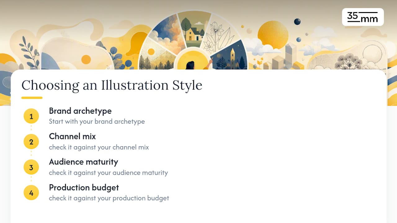
Match your illustration style to your brand archetype, your channel mix, and your production budget, in that order. Get the archetype match wrong and even flawless artwork will feel off. Get it right and a simple flat-vector icon set will outperform an expensive 3D campaign.
Here are quick picks to get you started:
- Fintech or B2B SaaS: geometric flat illustration with subtle texture. Precise, credible, cheap to scale.
- Consumer app or wellness brand: inflatable 3D characters or soft doodle mascots. Warm, approachable, memorable.
- Premium media or editorial brand: hatched line art. Sophisticated, slower to produce, high perceived value.
- Enterprise tech or infrastructure: isometric or technical illustration. Clarifies complexity without oversimplifying.
Complexity is the real cost driver here, not creativity. A two-color flat icon set can ship in days; a custom 3D character system takes weeks and specialized production. The checklist below walks through how to weigh that tradeoff against your brand's actual needs.
Key Takeaways
The right brand illustration style is the one that matches your archetype, holds up at every size your channels require, and stays reproducible as your team or studio changes over time.
| Point | Details |
|---|---|
| Archetype drives style | Precise, technical brands suit geometric or isometric styles; warm, human brands suit hand-drawn or doodle styles. |
| Tokens beat talent alone | Document stroke weights, color limits, and level rules so any illustrator can reproduce the system. |
| Match complexity to budget | Flat and icon-scale styles ship fastest and cheapest; 3D and photorealistic collage need the longest lead times. |
| Use photography for fidelity | Reserve illustration for abstraction and explanation, not product accuracy or regulated imagery. |
| 35milimetre builds the system | 35milimetre develops custom illustration, CGI, and scalable token-based systems for brands that need production consistency across channels. |
Table of Contents
- What Brand Illustration Styles Actually Are (and Why They Matter)
- The Main Brand Illustration Styles and What Each One Signals
- How to Choose the Right Illustration Style for Your Brand
- Building an Illustration System That Scales Without Breaking
- When Photography Beats Illustration (and How to Combine Both)
- Frequently Asked Questions
- Sources
What Brand Illustration Styles Actually Are (and Why They Matter)
A brand illustration style is a repeatable visual grammar, not a single pretty picture. It's the set of decisions, line weight, shape language, color behavior, texture, and character treatment, that make a hundred different assets look like they came from the same hand. Aethera's framework for agency illustration systems describes this grammar as the difference between a one-off graphic and an actual system other designers can extend without breaking the brand.
That system does real strategic work. Illustration signals personality faster than copy does, and it does it before anyone reads a headline. But every style choice involves tradeoffs a brand manager needs to make consciously rather than by accident:
- Personality vs. scalability. A highly detailed, hand-inked style is distinctive but painful to reproduce quickly across fifty product cards.
- Uniqueness vs. production cost. Fully custom 3D characters differentiate a brand hard, but they cost more and take longer than adapting a flat-vector template.
- Emotion vs. clarity. Painterly, expressive styles build warmth; geometric styles build precision. Few styles do both well.
Pro Tip: Before you brief anyone, write down your stroke rules and color limits as if they were law. Airbus's illustration guidelines go as far as requiring at least one 3pt stroke line and capping any single illustration at three greyscale tints. That kind of specificity is what separates a style from a mood board.
The Main Brand Illustration Styles and What Each One Signals
Every illustration style carries a tone whether you intend it to or not. Below is a practical rundown of the styles brand teams reach for most, what they communicate, and where they tend to break.
Flat vector is the workhorse of modern branding: solid shapes, no gradients, minimal detail. It communicates simplicity and modernity, scales cleanly from a 16px icon to a hero banner, and is the cheapest style to produce and maintain. Export as SVG, limit palettes to two or three brand colors, and it will hold up everywhere from app icons to email footers.

Geometric flat with texture adds grain, noise, or subtle gradients on top of flat shapes. It reads as precise but not cold, which is why fintech and productivity brands lean on it. Production cost is low to moderate; the texture layer adds a step but doesn't require a different skill set.
Line art and hatching relies on stroke work rather than fill, often with cross-hatching for shading. It signals editorial sophistication and craft, the kind of tone premium media and publishing brands want. It's slower to produce and doesn't scale down well below icon size, since fine hatching turns to mush at 24px.
Hand-drawn and sketch styles use visible pencil or ink texture to signal warmth, humanity, and approachability. Wellness, education, and lifestyle brands use this constantly. The catch is consistency: hand-drawn work is hard to standardize across multiple illustrators without a very tight reference sheet.
Character and mascot illustration (doodle-style, outlined figures) builds emotional connection and works well for onboarding flows and error states. Headspace's illustration system leans on soft, rounded doodle figures to keep a mental health product feeling gentle rather than clinical. That's the lesson to copy: keep proportions consistent across every character so the cast reads as one family.
3D, inflatable, and bubblegum styles produce rounded, glossy, toy-like renders that feel playful and premium at once. Bolt uses a 3D illustration approach across its app and marketing to make ride-hailing feel friendly rather than transactional. Production complexity is high, rendering pipelines and lighting setups are specialized skills, and file sizes are heavier, so this style suits brands with real production budgets and a need for motion-ready assets.
Isometric and technical illustration explains systems, workflows, and infrastructure without needing a 3D render. It communicates competence and clarity, which is exactly why B2B and infrastructure brands favor it. Airtable's product marketing frequently leans on this kind of technical-diagram illustration to make abstract database concepts legible.
Collage and mixed-media styles combine photography, texture, and illustrated elements into one composition. They signal creativity and cultural relevance but require a skilled art director to keep the mix from looking chaotic. Photorealistic collage, layering illustrated elements over real photography, is a strong hybrid for brands that need product fidelity and personality in the same frame.
Watercolor and painterly styles communicate softness, craft, and often heritage or artisanal positioning. They're expensive to produce consistently at scale because texture and bleed vary illustration to illustration, which makes them a poor fit for anything requiring pixel-perfect repetition.
Vintage and retro styles borrow print-era techniques, limited palettes, halftone textures, to signal nostalgia or authenticity. MailChimp built much of its early brand recognition on a quirky, slightly retro illustrated mascot and hand-lettered feel, proof that a distinctive, slightly odd style can outlast far slicker competitors if it's consistently applied.
Micro-illustration and icon-scale styles are simplified, single-color or two-color marks meant to work at tiny sizes across dashboards and UI. Red Hat and Motorola Solutions both rely on tightly controlled icon-scale systems, because at enterprise scale, consistency across thousands of touchpoints matters more than individual illustration flair.
How to Choose the Right Illustration Style for Your Brand
Run through this checklist before you brief anyone, whether that's an internal designer or an outside studio:
- Define your brand archetype. Practitioner guidance on style selection is blunt about this: precise, expert brands need geometric restraint; human, optimistic brands need softer, hand-rendered textures. Forcing a playful 3D mascot onto a brand that needs to project credibility creates the kind of mismatch that erodes trust rather than building it.
- Map your channel mix. A style that only works as a large hero illustration is useless if 80% of your usage is app icons.
- Check audience maturity. Early-stage or unfamiliar categories often benefit from illustration that explains; established categories can lean on style alone.
- Confirm production cadence. If you need new assets weekly, avoid styles that require a specialist illustrator for every piece.
- Set the budget tier honestly. Low tier (flat/icon systems) can run days to a couple weeks per batch. Mid tier (hand-drawn, line art) typically takes longer to onboard multiple illustrators consistently. High tier (3D, photorealistic collage) requires the longest lead times and the most specialized production.
Before signing off on any style, ask the illustrator or studio these questions:
- Can this style be reproduced by a second illustrator without a visible drop in quality?
- What are the color, stroke, and detail-level rules, in writing?
- Does this style hold up at both icon scale and hero scale?
- Is it motion-ready, or will animation require a redesign?
Building an Illustration System That Scales Without Breaking
A single great illustration is easy. A hundred consistent ones require tokens, the same discipline product teams apply to design systems generally. Red Hat's brand standards tie every illustration decision back to brand voice specifically so complex technical topics stay approachable across a global team, not just for one campaign.
A workable illustration-system checklist looks like this:
- Palette rules: cap spot illustrations at two to three colors plus an outline. Mutual of Omaha's brand standards apply exactly this restraint to keep icons and detailed scenes visually related.
- Stroke-weight conventions: pick two weights, for example 1.5px and 3px, and never introduce a third.
- Level rules: Motorola Solutions structures its system in tiers. Level 1 elements get full color, level 3 background elements stay greyscale with a maximum of three tints. That hierarchy keeps busy compositions from fighting for attention.
- Export formats: SVG for line and geometric work, WebP or high-resolution PNG for raster and 3D renders.
- Character proportions and corner radii: lock these in a reference sheet so a second illustrator can match the first.
Pro Tip: You can run a primary and a secondary style at once, a flat icon system alongside a richer hero-illustration style, as long as they share the same color palette and corner-radius logic. Shared tokens are what keep two visually different styles from reading as two different brands.
What Successful Brands Did With Their Illustration Style
- Bolt: committed to glossy 3D characters to make ride-hailing feel friendly. Copy the commitment to one signature render style; avoid mixing 3D with flat icons in the same view.
- Spotify: uses bold, saturated illustration and gradient collage in campaign work to feel culturally current. Copy the boldness; avoid overusing gradients in UI contexts where flat clarity matters more.
- Headspace: soft, rounded doodle characters reduce clinical distance in a mental health product. Copy the consistent proportions across characters; avoid adding sharp edges elsewhere in the system.
- MailChimp: built recognition on a quirky, slightly retro mascot and hand-lettered feel. Copy the distinctiveness; avoid diluting it with generic stock-style icons.
- Airtable: leans on clean isometric and flat illustration to explain abstract database concepts. Copy the clarity-first approach; avoid adding decorative detail that competes with the explanation.
- Red Hat: balances geometric structure with human touches to keep technical content approachable at global scale. Copy the voice-first thinking; avoid letting geometric rigor tip into coldness.
- Motorola Solutions: uses strict two-tone, level-based rules for predictable scaling across a huge product line. Copy the tier system; avoid applying full color everywhere out of habit.
When Photography Beats Illustration (and How to Combine Both)
Illustration is the wrong tool when fidelity is the point. Skip it for hardware product shots, detailed product imagery where texture and finish matter, retail contexts where a shopper needs to see the actual item, or any regulated product representation where accuracy isn't optional.
Hybrid approaches often outperform either extreme alone:
- Illustrated overlays on top of real product photography for campaign hero images.
- Isometric diagrams paired with annotated real photos to explain a physical process.
- Two-tone narrative illustration used for storytelling, with straight photography for the actual product shot.
Pro Tip: Use illustration to explain and abstract; use photography to prove and build trust. When a visual needs to answer "what does this actually look like," reach for a camera, not a pen.
The Studio Take on Building a Style That Lasts
Most brands overthink the art and underthink the grammar. A style survives contact with real production only if it's reproducible: the same stroke rules, the same palette limits, applied by a different illustrator six months later with the same result. Commission bespoke illustration when a style needs to be genuinely distinctive at your brand's core touchpoints; adapt licensed or stock assets for lower-stakes, high-volume contexts where consistency matters more than originality.
How 35milimetre Builds Illustration Systems That Scale
Most in-house teams can brief one great illustration. Few can turn that into a system a second designer, or a second studio, can reproduce identically eight months later without a style guide translator. That's the gap 35milimetre closes: a small, senior team that has spent over two decades in image production building the stroke rules, color tokens, and export templates that keep custom illustration, CGI, and AI-generated imagery consistent across every touchpoint a brand ships to.
Whether you need a full custom illustration system built from scratch or an existing style extended into new formats and file types, the studio handles the production end to end, delivering SVG, WebP, and print-ready assets with documented tokens so your internal team can keep using the system after handoff. If your current illustration approach feels inconsistent across channels, get in touch with 35milimetre to scope a system built around your brand's actual production needs.
Frequently Asked Questions
What are the most common brand illustration styles? Flat vector, geometric flat with texture, line art and hatching, hand-drawn sketch, character or mascot illustration, 3D or inflatable styles, isometric, collage and mixed-media, watercolor, vintage/retro, and micro-illustration are the styles brand teams reach for most often.
How do I choose an illustration style for my brand? Start with your brand archetype, then check it against your channel mix, audience maturity, and production budget. A precise, technical brand rarely benefits from a playful 3D style, and vice versa.
How much does custom brand illustration cost? Cost tracks complexity more than anything else. Flat icon systems are the cheapest and fastest to produce; hand-drawn and line-art styles take longer to standardize across illustrators; 3D and photorealistic collage require specialized production and the longest lead times.
Should I use illustration or photography for my brand? Use illustration when you need to explain something abstract or build a distinctive tone efficiently. Use photography when fidelity, texture, and trust in the actual product matter more than personality.
How do I keep my illustration style consistent across platforms? Document your tokens, palette limits, stroke weights, corner radii, and level rules, so any designer or studio working on the brand can reproduce the style without guessing.