
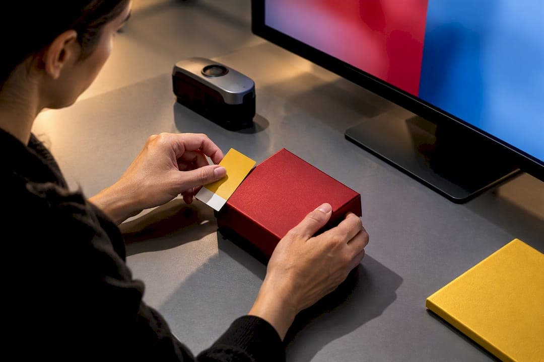
Brand color accuracy comes from a governed, measurement-driven workflow, not a hex code pasted into a brand guide. You need spectral or spot color targets defined at the start, tracked with Delta E tolerances, verified on calibrated devices, and confirmed with physical comps before anything ships. Skip any one of those checkpoints and the color drifts, usually right when a client or customer notices.
TL;DR:
- Color consistency requires measurement-driven workflows, including spectral targets and Delta E tolerances verified on calibrated devices before approval.
- Physical color comps on the actual substrate are essential to prevent drift and ensure the final product matches the approved color.
- Monitor calibration and embedding ICC profiles are critical for accurate digital color decisions, with sRGB being the safest choice for web assets.
- Spot colors should be used for critical brand hues, and substrate differences significantly affect color appearance, necessitating physical testing on final materials.
- Regular device recalibration and centralized cloud platforms help maintain consistent color standards across multiple vendors and production stages.
Table of Contents
- What Is Brand Color Accuracy and Why Does It Matter?
- Design → Proof → Production: A Role-By-Role Workflow That Prevents Drift
- Monitor Calibration and Color Spaces: Getting Screens Right First
- Print and Packaging: Pantone vs. CMYK and Substrate Reality
- Product Photography: Protecting Brand Color From Capture to Upload
- Governance and Tools: Making Color Accuracy Repeatable
- 35milimetre's Field Notes: A Quick Checklist and Common Fixes
- Why Governed Color Systems Are Non-Negotiable
- How 35milimetre Closes the Color-Accuracy Gap
- Sources
- FAQ
What Is Brand Color Accuracy and Why Does It Matter?
Color is one of the fastest things a customer's eye registers, faster than a logo shape or a tagline. When a brand's signature red or blue shifts even slightly between a package, a website banner, and an Instagram product shot, that consistency breaks and so does the sense of quality the brand worked to build. This is the practical core of brand color consistency: the same color, verified the same way, everywhere it appears.
The cost of getting it wrong is not abstract. A packaging run printed off-target can mean a reprint on a tight retail deadline. A product photo with a warm-shifted hue can trigger returns from customers who received "a different color than the site showed." A digital banner using an untagged sRGB export can look muddy on one browser and oversaturated on another.
Most of these failures trace back to the same root cause: too many disconnected "sources of truth."
- A designer's Illustrator file with one RGB value.
- A printer's converted CMYK build with a slightly different one.
- A marketing team's canva export with a third.
- A photographer's edited RAW file matched by eye, not by measurement.
Each version might look close enough in isolation. Stacked together across a product launch, they create the kind of visible inconsistency that erodes brand recognition over time, not in one dramatic failure but in a hundred small ones.
Design → Proof → Production: A Role-By-Role Workflow That Prevents Drift
Color accuracy breaks down most often at handoffs, the moment a file moves from one team to another. A pipeline with clear ownership at each stage closes that gap.
- Design locks the target. The designer or brand manager defines the authoritative color as a spectral measurement or a Pantone spot reference, not just an RGB or hex value. This target, along with file specs (color space, resolution, bleed), becomes the record everyone downstream works against.
- A production-ready comp gets built. Before any large run, a physical comp must be produced on the actual production substrate, coated stock, uncoated stock, kraft, fabric, whatever the final product uses. A comp printed on the wrong paper tells you nothing useful about how the color will look on the real material.
- Prepress converts and measures. The prepress team converts spot colors to CMYK builds where needed, generates a proof, and measures it against the target using a spectrophotometer, not a monitor and not a guess.
- Press runs and verifies. The pressroom pulls samples during the run and checks them against the approved comp and its Delta E reading, catching drift before a full batch is wasted.
- The comp and spec get retained. The approved comp and its written specification become the permanent reference for reorders, new vendors, or future campaigns, stored somewhere every stakeholder can access, not buried in one designer's inbox.
Pro Tip: Photograph and log every approved comp with its Delta E reading and substrate name before it leaves the building. Six months later, when a new print vendor asks "what does the correct green actually look like," you want an answer that doesn't depend on memory.
This sequence works because it assigns a clear owner to each decision. When something goes wrong, and eventually something will, you know exactly which step to audit first. Teams that skip the physical comp stage, relying instead on a PDF proof viewed on an unmanaged monitor, are the ones most likely to discover a color problem after ten thousand units are already printed.
Monitor Calibration and Color Spaces: Getting Screens Right First
Every downstream color decision starts on a screen, so an uncalibrated monitor poisons the whole pipeline before a single file leaves the design team. Calibration is not optional for anyone signing off on brand color, whether that's a designer, an art director, or a brand manager approving a comp remotely.
Professional calibration typically uses a hardware device such as the X-Rite i1Display Pro or the Datacolor Spyder X, targeting a D65 (6500K) white point and roughly 80 cd/m² of luminance for color-critical work. Initial setup runs two to three hours once you account for warm-up time, profiling, and verification, and it should repeat on a schedule, not just when a monitor looks off.
Color space choice matters just as much as calibration:
- sRGB covers the smallest gamut but renders reliably across most consumer displays and browsers, making it the safe default for web and digital assets.
- Adobe RGB captures a wider range, useful for print-bound work where you need headroom before converting to CMYK.
- Display P3 has become common on newer devices and can hold saturated brand hues that sRGB clips, but it requires careful handling on export.
Whichever space you choose, embed the ICC profile in every file. An untagged file forces the next application, or the next person's monitor, to guess how to interpret the color, and that guess is rarely the one you intended. Avoid destructive edits that strip embedded profiles, and check exports at each stage rather than assuming the RAW-to-final pipeline held its color through every save.
Pro Tip: If two people on your team are reviewing the same file and seeing different colors, stop the review. That's not a taste disagreement, it's a calibration failure, and no amount of back-and-forth feedback will fix it.
Print and Packaging: Pantone vs. CMYK and Substrate Reality
Pantone spot colors exist because CMYK cannot reliably reproduce every brand hue, especially saturated oranges, deep blues, and metallics that fall outside the four-color gamut. When a logo color is genuinely brand-critical, insist on a spot ink rather than accepting a CMYK simulation, which will vary from printer to printer and press to press.
Substrate changes everything, too. The same Pantone number looks different on coated stock than it does on uncoated, kraft, or recycled material because each surface absorbs and reflects light differently. A comp approved on glossy coated paper tells you nothing reliable about how that color will read on a matte recycled mailer. Comps must be produced on the actual substrate and finish the final product will use, every time.
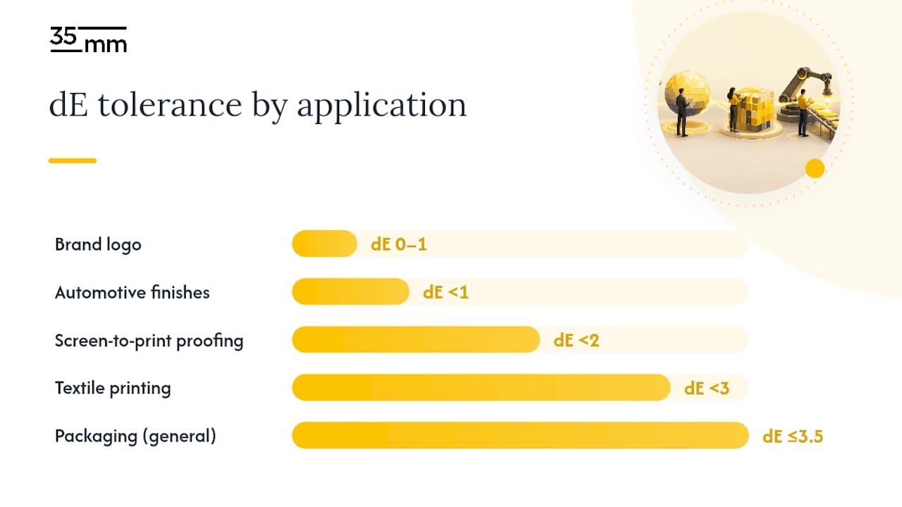
Delta E (dE) is the industry standard for measuring perceptual color difference, and it gives brand teams a shared language for "close enough" versus "off." A Delta E under 1 is imperceptible to the human eye; 1 to 2.3 is noticeable under close inspection but commercially acceptable for many applications.
Practical tolerance targets vary by application, and knowing which ladder rung applies keeps conversations with converters grounded in numbers instead of opinions:
- Brand logo colors: dE 0 to 1, the tightest tolerance, since logos carry the most recognition weight.
- Screen-to-print proofing: dE under 2, close enough that most viewers won't notice a shift.
- Textile printing: dE under 3, accounting for dye and fabric variability.
- Packaging generally: dE up to 3.5, a workable range for most coated and uncoated stock runs.
- Automotive finishes: tighter than 1 in many cases, where panel-to-panel matching is scrutinized under showroom lighting.
Build these numbers into your supplier communication from day one. A print ad color management checklist that specifies dE targets up front prevents the awkward conversation that happens when a converter delivers a run that "looks close" but measures three points off target.
Product Photography: Protecting Brand Color From Capture to Upload
Ecommerce product photography is often the weakest link in a brand's color chain, because errors that would trigger a proofing rejection in print get uploaded straight to a live product page. A small white balance error can shift a coral color toward orange, and an uncalibrated monitor amplifies that error rather than catching it.
- Shoot RAW with a locked white balance. Never rely on a camera's automatic white balance for brand-critical products; set it manually and confirm it against a known reference before the first frame.
- Shoot tethered with a color reference in frame. A ColorChecker or gray card in at least one frame per lighting setup gives you a measurable anchor to correct against later, rather than trusting your eye on a laptop screen at the shoot.
- Edit in a color-managed workspace. Proof the file for its actual final output, web or print, since a wide-gamut edit that looks perfect in Adobe RGB can clip the moment it exports to sRGB, muting exactly the saturated brand hues you were trying to protect.
- Verify before upload. Compare the exported file against your physical color reference or your Pantone target one last time, on a calibrated display, before it goes live.
Pro Tip: Keep the ColorChecker frame from every shoot in your archive. When a client asks six months later whether the product photo matches their packaging, you have a measurable reference instead of a memory.
This is where a disciplined color-managed editing approach earns its keep, catching the gap between "looks right on my screen" and "measures right against the brand target" before a customer ever sees the difference.
Governance and Tools: Making Color Accuracy Repeatable
Individual discipline breaks down the moment a brand works with more than one vendor, and most brands work with many. That is where measurement devices and centralized platforms take over from spot-checking by eye.
Spectrophotometers read the full spectral signature of a color and are the standard for brand and packaging work; colorimeters are faster and cheaper but less precise, better suited to display calibration than to matching printed spot colors. Whichever device your team relies on, scheduled recalibration and certification across your whole device fleet prevents slow, compounding drift that nobody notices until a supplier three steps removed is measuring against a device that quietly went out of spec.
Cloud-based color management platforms solve the coordination problem at scale. Tools in this category centralize spectral targets and substrate-specific tolerances, publishing one governed reference that designers, prepress teams, and printers all pull from instead of maintaining their own slightly different versions.
- Assign one owner responsible for publishing the authoritative color spec, no exceptions.
- Version-control every update to the spec, with a changelog visible to all partners.
- Use dashboards or scorecards to track measured dE results across suppliers over time, not just at approval.
- Integrate the platform with the creative tools your team already uses so approved colors flow directly into design and proofing files.
35milimetre's Field Notes: A Quick Checklist and Common Fixes
If a comp gets approved on the wrong substrate, stop production immediately. Reproduce the comp on the correct material with proper spot matching, measure the Delta E against your brand target, and issue a fresh corrected approval, retaining both comps for the record.
For any new supplier brief, hand over the color-managed file, the spectral or Pantone target, the specified viewing conditions, and the retained physical comp. In our own compositing, retouching, and packaging work, we run that same check at every handoff, because a color problem caught before production costs nothing and a color problem caught after costs a reprint.
Why Governed Color Systems Are Non-Negotiable
Color governance protects brand equity in a way that's easy to underestimate until a reprint bill lands on your desk. A single authoritative spec, measured and retained, costs far less than untangling three conflicting color files after a launch goes sideways. If your team can't say who owns the current source of truth, that's the audit to run this week, before the checklists above become necessary rather than preventive.
— 35mm
How 35milimetre Closes the Color-Accuracy Gap
Most studios approve color by eye on a screen and hope it survives the trip to substrate. 35milimetre builds the measurement step into the process itself, so the comp your supplier receives already matches the spectral target, not just the monitor it was designed on.

That means color-managed retouching that holds up against your Pantone or spectral reference, packaging comps built on the actual production substrate rather than a stand-in stock, and proof-ready files with the ICC profile and specs your prepress team actually needs. For ecommerce work, that same discipline extends to product photography, correcting the white-balance and color-space issues that turn a coral into an orange before it ever reaches a product page.
A typical engagement scopes around a specific deliverable, a packaging comp with its spectral spec and proofing checklist, or a batch of color-managed product photos ready for a marketplace listing. If you're an ad agency, brand, or photographer trying to close this exact gap, check Amazon retouching and compositing pricing or start a packaging design project to get a comp built against your actual production substrate.
Sources
For readers ready to go deeper, a few references are worth bookmarking directly.
- What is Delta E? — Konica Minolta | Sensing
- ChromaQA for Brands — Techkon / Datacolor
- i1Display Pro vs Spyder — Image Science
- What is color accuracy in packaging? — 3D Color
FAQ
What counts as good color accuracy?
Good color accuracy usually means a Delta E under 2 for most commercial work, with tighter targets for logos (dE 0 to 1) and automotive finishes (under 1). Anything under Delta E 1 is imperceptible to the human eye, while 1 to 2.3 is noticeable only under close inspection.
How do I check color accuracy on my own files?
Measure your file or printed sample against your approved target using a spectrophotometer and read the resulting Delta E value. For screen work, confirm your monitor is calibrated to D65 and around 80 cd/m² using a device like the i1Display Pro or Spyder X before trusting anything you see on it.
How do I choose the right colors for my brand?
Start with what the color needs to communicate and how it will actually be reproduced, screen, print, fabric, or packaging, since not every hue survives every medium equally. Lock the choice as a spectral or Pantone target rather than a single RGB value, and test it on the real substrate before finalizing it. 35milimetre can build that target and a production-matched comp as part of a packaging design or retouching project.
Do iPhones have good color accuracy for checking brand colors?
Modern iPhone displays are factory-calibrated and reasonably accurate for general viewing, but they are not a substitute for a calibrated reference monitor when approving brand-critical color. Use a phone screen for quick checks, never for final sign-off on a comp or a print proof.
Why does the same Pantone color look different on two products?
Substrate and finish change how a spot ink reflects light, so the same Pantone number can look noticeably different on coated stock versus kraft or fabric. That's why a physical comp on the actual production material, not just a Pantone chip, is the only reliable production target.