
For printed billboards, the industry-standard range runs from 10–75 DPI depending on viewing distance. Highway bulletins viewed from 300 feet or more typically need only 15–30 DPI. Closer street-level boards may warrant 50–75 DPI. Digital LED billboards work differently: forget DPI entirely and design to the screen's exact native pixel dimensions in RGB.
The rule of thumb most experienced designers use: match your DPI to the minimum viewing distance, not the maximum. For a standard 14×48 ft highway bulletin at 30 DPI, the math is straightforward. Multiply each dimension in inches by your target DPI: 14 ft × 12 in/ft × 30 DPI = 5,040 pixels tall; 48 ft × 12 in/ft × 30 DPI = 17,280 pixels wide. PictureSizes confirms that a 14×48 ft bulletin at 30 DPI yields approximately 5,040×17,280 pixels, and at 15 DPI roughly 2,520×8,640 pixels. Both are widely used production targets.
- Printed billboards: 10–75 DPI, scaled to viewing distance
- Highway bulletins (14×48 ft): 15–30 DPI is standard
- Street-level or pedestrian boards: 30–75 DPI
- Digital LED boards: design to native pixel matrix, RGB color mode
- Always request the operator's template before building your file
Pro Tip: Before opening a new document, call or email the billboard operator and ask for their print template or digital spec sheet. Operators like Lamar, Clear Channel, and regional vendors publish exact file requirements. Starting from their template eliminates the most common preflight failures.
Key Takeaways
Printed billboards need 10–75 DPI matched to viewing distance; digital LED boards require artwork built to the screen's exact native pixel dimensions in RGB, not a DPI target.
| Point | Details |
|---|---|
| Match DPI to viewing distance | Highway bulletins need 15–30 DPI; pedestrian-level boards warrant 40–75 DPI. |
| Use the operator's template | Always start from the vendor's spec sheet to get correct dimensions, bleed, and color mode. |
| Digital boards need native pixels | Design to the LED screen's exact pixel matrix in RGB; DPI is irrelevant for digital displays. |
| Preflight before every submission | Outline fonts, verify linked images, confirm CMYK for print or RGB for digital, and include a scaled proof. |
| 35milimetre handles end-to-end prep | The studio manages retouching, color conversion, and preflight packaging for print and digital billboard formats. |
Table of Contents
- Why billboard image resolution depends on how far away viewers stand
- Common U.S. billboard sizes and what pixel dimensions you actually need
- How digital billboards differ from printed vinyl in file preparation
- How to prepare your files from concept to final delivery
- What to check before you send the file to the operator
- Why your billboard looks blurry or the colors shifted
- The formula that confirms whether your DPI choice is right
- A studio perspective on getting billboard artwork right
- 35milimetre prepares billboard-ready artwork from source to submission
- Sources
Why billboard image resolution depends on how far away viewers stand
The reason a billboard can look sharp at 10 DPI while a magazine page needs 300 DPI comes down to human visual acuity. The human eye resolves approximately 1 arc-minute of detail, which translates to roughly 1/100th of an inch at 10 inches. As viewing distance grows, the eye's ability to distinguish fine detail drops proportionally. At 500 feet, a viewer physically cannot perceive the difference between a 10 DPI file and a 30 DPI file. Pushing resolution beyond what the eye can resolve at a given distance only inflates your file size.
SignageWorks notes that anything beyond the distance-driven resolution requirement provides near-zero visual benefit for signage. That is not a cost-cutting compromise; it is how large-format print physics actually works.
A practical formula practitioners use: Maximum visible PPI = (3438 / viewing distance in inches) × 1.5. For a viewer standing 300 feet (3,600 inches) away: (3438 / 3600) × 1.5 ≈ 1.43 PPI. That confirms why 15–30 DPI is more than sufficient for highway bulletins. The Print Handbook's signage guidance reinforces this: designers who over-engineer files beyond what viewers can resolve create production headaches without any visible payoff.
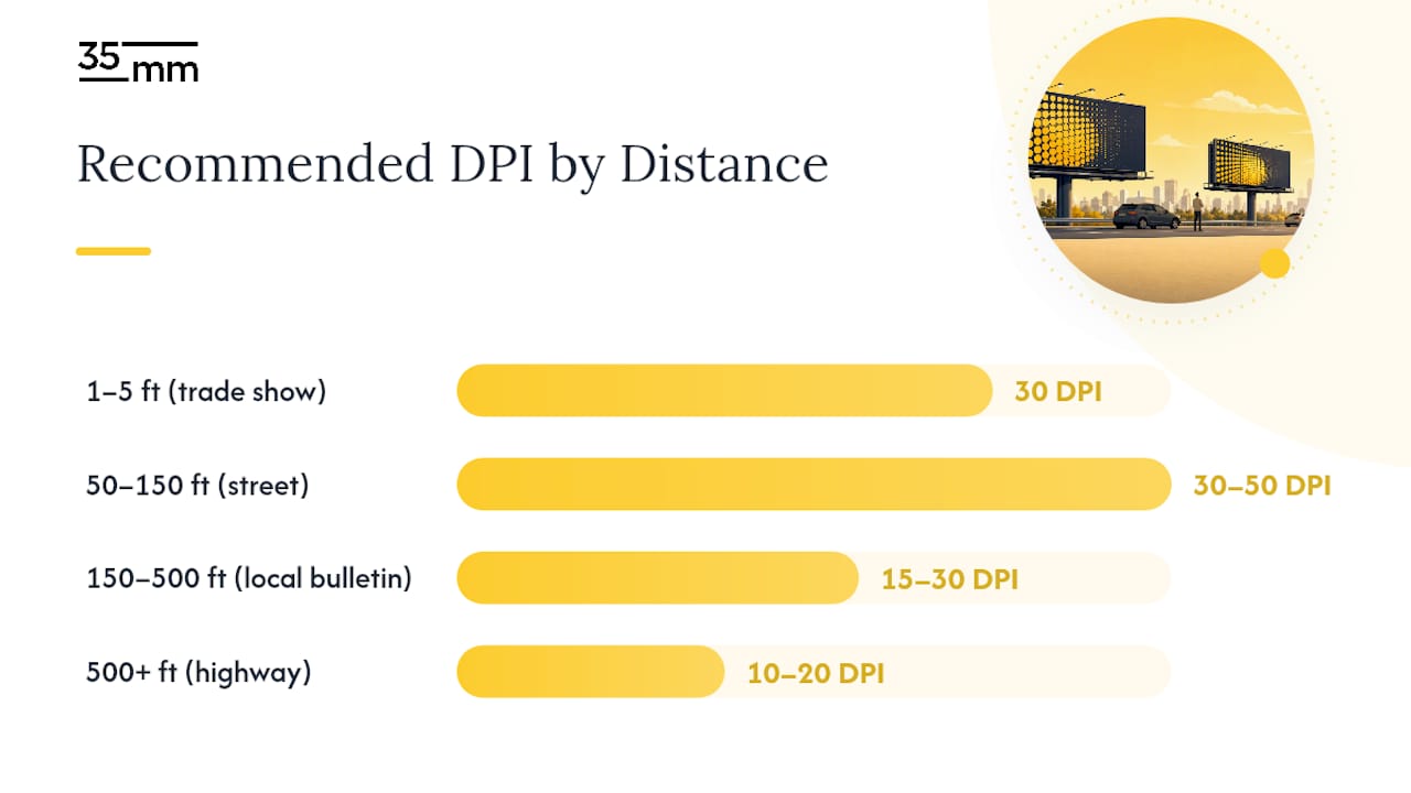
| Viewing distance | Typical environment | Recommended DPI range |
|---|---|---|
| 1–5 ft | Trade show, retail display | 30 DPI |
| 50–150 ft | Street-level, junior poster | 30–50 DPI |
| 150–500 ft | Local bulletin, 30-sheet | 15–30 DPI |
| 500+ ft | Highway bulletin | 10–20 DPI |
Pro Tip: Resist the instinct to push DPI higher "just to be safe." A 14×48 ft file at 100 DPI becomes a multi-gigabyte document that crashes workstations and slows operator approvals. Target the environment, not an arbitrary number.
Common U.S. billboard sizes and what pixel dimensions you actually need
The U.S. outdoor advertising market uses a handful of standardized formats, each with a distinct viewing context that drives its DPI target. Understanding the physical dimensions alongside the pixel math lets you build the right file the first time.
| Board type | Physical size | At 15 DPI | At 30 DPI |
|---|---|---|---|
| Bulletin (highway) | 14 ft × 48 ft | 2,520 × 8,640 px | 5,040 × 17,280 px |
| 30-sheet poster | 12 ft × 24 ft | 2,160 × 3,600 px | 4,320 × 8,640 px |
| 8-sheet / junior poster | 6 ft × 12 ft | 1,080 × 1,920 px | 2,160 × 3,600 px |
These figures come directly from PictureSizes' billboard specification data, and they reflect the most commonly requested production targets across U.S. print vendors.
To calculate pixel dimensions for any custom size, the formula is simple: convert feet to inches (multiply by 12), then multiply by your target DPI. A 10×30 ft wall wrap at 20 DPI: (10 × 12) × 20 = 2,400 px tall; (30 × 12) × 20 = 7,200 px wide. Keep a calculator open and run this check before you build your document.
- Bulletins are almost always printed on vinyl and viewed from highway distances, making 15–30 DPI the practical ceiling.
- Junior posters sit closer to pedestrian traffic, so 30–50 DPI is more appropriate when photographic detail matters.
- Always confirm the exact trim size with your vendor. Nominal sizes like "14×48" often have a slightly different bleed dimension in the operator's template.
How digital billboards differ from printed vinyl in file preparation
Digital LED billboards are fundamentally different from printed vinyl, and treating them the same way is one of the most common mistakes in outdoor advertising production. A digital board is a pixel matrix, not a canvas you print at a chosen DPI. Robinson Outdoor's digital spec guidance confirms that files must be built to the screen's exact native pixel dimensions to avoid resampling artifacts.
Common digital billboard pixel matrices vary widely by operator and board size. A typical highway LED bulletin might run 672×336 pixels, while a smaller urban digital poster could be 1,080×1,920 pixels in portrait orientation. The only way to know the exact matrix is to request it from the operator before you open your design application.
Color mode is the other critical difference. Printed vinyl uses CMYK throughout the production chain. Digital boards are RGB displays, and submitting a CMYK file to a digital operator will produce a color shift that no amount of proofing can predict without seeing it on the actual screen.
- Request the operator's exact pixel dimensions before starting any digital billboard file.
- Work in RGB (sRGB is the safest default for most LED displays).
- Keep graphics bold and simple. Dense photographic detail often reads as noise on low-pixel-count LED matrices.
- Use high-contrast type. Thin serifs and small point sizes disappear at LED pixel densities.
- For animated content, confirm the operator's accepted frame rate, maximum file duration, and whether they accept MP4, GIF, or HTML5.
Pro Tip: Strong visual storytelling for digital boards relies on contrast and simplicity rather than photographic complexity. A two-color graphic with a single bold headline will outperform a detailed product photo on most LED matrices.
How to prepare your files from concept to final delivery
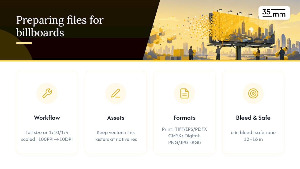
Two workflows dominate professional billboard production. The first is working at full production scale: build your document at the exact pixel dimensions and target DPI, which gives you a true preview of output quality but produces large files. The second is designing at a proportional scale, typically 1:10 or 1:4, at a proportionally higher PPI. A 14×48 ft bulletin at 1:10 scale becomes a 16.8×57.6 inch document; designing at 100 PPI at that scale is equivalent to 10 DPI at full size. Both approaches are valid, and professional designers on Graphic Design Stack Exchange commonly recommend the scaled approach for very large formats to keep files manageable.
Vector elements — logos, type, geometric shapes — should stay vector throughout the workflow. They scale to any output size without quality loss and add almost nothing to file size. Raster images (photographs, textures) need to be placed as linked files at their native resolution and checked against the output pixel dimensions before export.
For print, preferred formats are TIFF (flattened, LZW-compressed), EPS, or PDF/X-1a with CMYK color mode and an ICC profile matching the vendor's press profile (typically SWOP or GRACoL for U.S. print). For digital, a flattened PNG or high-quality JPG in sRGB covers most operator requirements. The Whistler Billboards preflight guide specifies CMYK for print and exact pixel sizing for digital as baseline requirements.
Bleed and safe zones matter more than many designers expect. Most operators require a 6-inch bleed on printed vinyl and a safe zone of 12–18 inches inside the trim on each side to prevent critical content from being obscured by mounting hardware. Always check the operator's template for exact values. The 35milimetre campaign image preparation guide covers these packaging conventions in detail for agency workflows.
What to check before you send the file to the operator
A single preflight failure can delay a campaign by days. Running through a short checklist before submission prevents the most common rejections.
- Confirm document dimensions match the operator's template exactly, including bleed.
- Verify color mode: CMYK for print, RGB for digital. Check embedded ICC profiles.
- Outline or embed all fonts. Missing fonts are the single most common cause of print rejection.
- Collect and package all linked images. Verify each linked file is at or above the target output resolution.
- Flatten layers and merge transparencies before exporting to TIFF or PDF.
- Check maximum file size. Many operators cap print files at 500 MB to 1 GB; use LZW compression for TIFF or ZIP compression for PDF to stay within limits.
- Name the file per the operator's convention (typically including board ID, campaign name, and version number).
- Include a scaled PDF proof at a readable size (e.g., 1:10 scale) so the operator can visually verify layout without opening the production file.
Pro Tip: Export a JPEG preview at 1:10 scale and view it at arm's length before submitting. If the hierarchy reads clearly at that distance, it will read on the board. If you have to squint to find the headline, the design needs adjustment, not a higher DPI.
Why your billboard looks blurry or the colors shifted
Pixelation is almost always a sourcing problem, not a resolution-setting problem. If a photograph was placed at 72 DPI and stretched to fill a 14×48 ft document, no export setting will recover the detail that was never there. The fix is to source images at the highest available native resolution and verify pixel count before placing them. A quick check: divide the image's pixel width by the document's output DPI to confirm the image fills the required physical dimension.
Color shifts between screen and print are typically a color-space mismatch. Designing in RGB and sending a file to a CMYK print vendor without a controlled conversion will produce muddy, desaturated output. Use Photoshop's Edit > Convert to Profile with a U.S. press profile (SWOP v2 or GRACoL 2006) and soft-proof before exporting. Muddy blacks specifically are often caused by rich-black builds (C:60 M:40 Y:40 K:100) that exceed total ink limits; for large-format vinyl, a simple 100K or a modest rich black (C:40 M:30 Y:30 K:100) is safer.
- Pixelation fix: source images at native resolution; never upscale a low-res file and expect print quality.
- Color shift fix: convert to CMYK with a named ICC profile before export; never leave the conversion to the RIP.
- Banding fix: avoid large flat gradients in CMYK; add subtle noise or use spot-color alternatives.
- Scaling artifacts fix: use Preserve Details 2.0 in Photoshop or a dedicated upscaling tool if you must enlarge a raster image, and always inspect at 100% zoom before export.
Pro Tip: Retain your original layered source files. Double-compression (saving a JPEG as a JPEG again) destroys quality irreversibly. Always export from the original layered document, never from a previously compressed output.
The formula that confirms whether your DPI choice is right
The maximum visible PPI formula used by large-format practitioners is: Max PPI = (3438 / viewing distance in inches) × 1.5. At 150 feet (1,800 inches): (3438 / 1800) × 1.5 ≈ 2.87 PPI. At 50 feet (600 inches): (3438 / 600) × 1.5 ≈ 8.6 PPI. These numbers confirm that even a 30 DPI file is delivering far more resolution than the eye can use at typical billboard viewing distances.
Signage experts consistently recommend choosing the lowest DPI that delivers acceptable fidelity for the viewing environment. Exceeding that threshold increases file size, transfer time, and production complexity without producing any visible improvement on the installed board. The economic and practical case for right-sizing resolution is clear: target the environment, not an arbitrary "safe" number. — SignageWorks large-format print quality guidance
When higher resolution genuinely matters: pedestrian-level displays viewed from under 20 feet, detailed photographic content on junior posters, and any board where viewers are stationary (bus shelters, transit platforms). In those cases, pushing to 50–75 DPI is justified and the file size increase is proportional to the board's smaller physical dimensions.
A studio perspective on getting billboard artwork right
At 35milimetre, billboard prep starts with the operator's template, not a blank document. That single habit eliminates the majority of dimension, bleed, and color-mode errors before a single layer is built. When a client delivers source photography, we verify pixel count against the output target immediately. A photograph that looks fine on a monitor at 72 DPI may be carrying only enough pixels for a 10×12 inch print at 30 DPI, which is nowhere near sufficient for a 14×48 ft bulletin.
Our color workflow for print is consistent: all compositing happens in a wide-gamut working space (ProPhoto RGB or Adobe RGB), and the final CMYK conversion uses a named press profile matched to the vendor's RIP. For digital boards, we stay in sRGB and export flattened PNGs at the operator's exact pixel dimensions. No guessing, no resampling on their end.
The question we get most often from agency clients is whether to push for higher resolution on photographic billboards. Our answer depends on two things: the minimum viewing distance and the complexity of the image. A portrait photograph with fine hair detail on a pedestrian-level board warrants 50 DPI. The same image on a highway bulletin at 300 feet does not. Matching resolution to context, rather than defaulting to "as high as possible," is what keeps files manageable and approvals fast. For a deeper look at how this thinking applies across campaign deliverables, the ad campaign imagery guide covers image selection and simplification strategies that hold up at large scale.
35milimetre prepares billboard-ready artwork from source to submission
Getting billboard artwork from concept to an operator-approved file involves more steps than most clients anticipate: resolution verification, color-space conversion, bleed setup, font outlining, and a proof that matches the operator's exact spec. 35milimetre handles every one of those steps as part of its commercial post-production workflow.
The studio's team covers retouching, compositing, color management, and preflight packaging for both print and digital outdoor formats. Files arrive at operators correctly sized, correctly profiled, and within file-size limits, which means fewer revision rounds and faster campaign launches. Whether you are working with a single highway bulletin or a multi-market digital network, 35milimetre delivers operator-ready visual production built around your vendor's exact specifications. Reach out to discuss your next billboard project and get a quote tailored to your format and timeline.
Sources
The following references were used throughout this guide and are worth bookmarking for your own production work.
- How Much DPI Do You Need for Signs? | Large Format Print Quality
- Picturesizes
- Digital Billboard Design | Specs and Templates
When in doubt about any specification, contact the billboard operator directly and request their current template, ICC color profile, and proof requirements before building your file. Operators update their specs periodically, and a template downloaded six months ago may not reflect current requirements.