
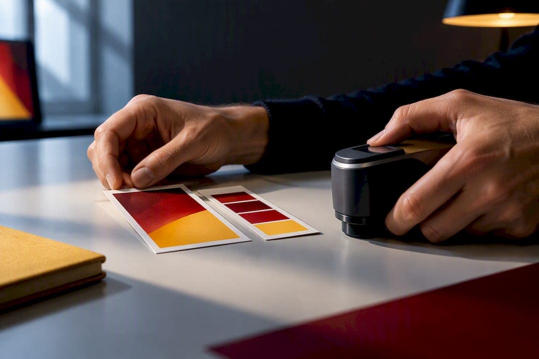
Deliver web and social ads in sRGB with the ICC profile embedded. Deliver print ads as CMYK converted to your printer's exact profile, usually SWOP or GRACoL. The one rule that overrides everything else: embed the profile at every handoff and soft-proof before export, because an untagged file forces the next screen or press to guess at your colors.
TL;DR:
- Most digital ads should be converted to sRGB with embedded profiles before export, as browsers and social platforms widely support it and avoid color discrepancies.
- For print, always request and use the printer's specific ICC profile, soft proof in Photoshop to prevent color shifts, and choose the appropriate rendering intent based on content type.
- Using a wide-gamut working space like ProPhoto or Adobe RGB during editing preserves color information, but final exports must always revert to the target profile for delivery.
- Confirm ICC profiles are embedded in all files prior to delivery and verify profiles match the target platform or press to prevent costly reprints or adjustments.
- A dedicated color management process, including calibration, profile assignment vs conversion, and standardized handoff naming, ensures consistent color accuracy across digital and print assets.
Table of Contents
- What Color Profiles Do Ad Images Actually Need?
- How Should You Export Ad Images for Web and Social?
- How Do You Get Print Ads to Match on Press?
- Building a Chain of Custody So Colors Don't Drift
- What's the Fastest Way to Catch Color Mistakes Before Delivery?
- Studio Rules 35milimetre Uses on Every Color-Critical Job
- Why Color Discipline Is a Business Decision, Not a Technical One
- How 35milimetre Handles Color So You Don't Have To
- Sources
- FAQ
What Color Profiles Do Ad Images Actually Need?
An ICC profile is a small file embedded in your image that tells any screen, browser, or printer how to translate its pixel values into actual color. Think of it as a translation key: without it, the same red can look orange on one monitor and brick red on another, because RGB and CMYK numbers mean nothing on their own. The International Color Consortium's specification defines exactly how these profiles map device-specific values to a universal reference space, which is what lets a designer in Istanbul and a printer in Ohio agree on what "brand blue" means.
Two families of profiles matter for advertising work, and confusing them is the fastest way to blow a production timeline.
RGB profiles describe light-emitting displays, phones, laptops, billboards with LED panels. CMYK profiles describe ink on paper, and because every press, paper stock, and ink set behaves differently, CMYK is device-dependent in a way RGB mostly isn't. That distinction alone should dictate half your workflow decisions before you even open Photoshop.
Here's how the common profiles break down in practice:
- sRGB — the default for anything appearing on a screen. Every browser, every social platform, and nearly every consumer display renders it correctly, which is why uPerfect's gamut comparison treats it as the safest universal target for digital delivery.
- Adobe RGB — a wider gamut, useful while retouching product photography destined for print, where you want more headroom in cyans and greens before you convert down.
- ProPhoto RGB — the widest of the common working spaces, favored by photographers editing RAW files because it captures more of what a camera sensor records before any compression happens.
- Display P3 — increasingly common on newer phones and monitors, sitting between sRGB and Adobe RGB in gamut size, but still not universally supported across ad platforms.
One technical detail trips up more agencies than it should: **ICC v2 versus v4 compatibility. Older browsers and some ad-serving systems only parse v2 profiles correctly, and sRGB is built on the v2 standard, which is part of why it remains the compatibility champion for digital work. Wider gamuts like ProPhoto and Adobe RGB are meant for editing, not delivery. Working in them keeps more color information alive during retouching, but the final export should almost always come back down to the profile your delivery channel actually expects.
How Should You Export Ad Images for Web and Social?
Every export decision here comes down to one habit: converting to sRGB and keeping the profile embedded through export, not just during editing.
Most color problems in digital ads trace back to a mismatch between what the designer saw and what the platform's compression engine did to the file. EIZO's guidance on web color management confirms that browser support for ICC versions still varies enough that sRGB remains the only profile you can trust across the board.
Convert to sRGB, don't just assign it. Converting recalculates the actual pixel values so the image keeps its appearance. Assigning only relabels the file without changing a single pixel, which means an Adobe RGB image assigned sRGB will look washed out or shifted the moment a browser reads that new label. If your master file was edited in a wider gamut, convert before you export. Never assign at this stage.
Here's a practical sequence for getting a file out the door:
- Finish retouching in your working space (Adobe RGB or ProPhoto).
- Convert to sRGB using Photoshop's Edit > Convert to Profile, not Assign Profile.
- Flatten and check for any obvious clipping in saturated reds, teals, or brand colors.
- Export as JPEG at 8bit with the ICC profile embedded, or PNG/WebP if the platform supports profile tagging.
- Open the exported file in at least two browsers to confirm the color hasn't drifted.
For file type, an 8bit JPEG at quality 80 to 90 percent handles most social and programmatic placements without visible banding, provided you're not compressing an image that already has smooth gradients in the sky or a product's reflection. PNG makes sense when you need transparency or crisp text overlays; WebP is gaining ground on programmatic networks for its smaller file size at comparable quality.
Pro Tip: Keep a "reference swatch" corner in your working file, a small patch of your exact brand color values, and check it after every export. If that swatch shifts even slightly after conversion, something in your pipeline is stripping or mishandling the embedded profile.
Facebook, Instagram, and Google Ads all expect sRGB and will render wide-gamut files inconsistently across their apps and in-browser previews. None of the major platforms currently support Display P3 delivery in any official capacity, so even though more phones can display it, sending a P3-tagged file is a gamble the average campaign doesn't need to take.
How Do You Get Print Ads to Match on Press?
CMYK is device-dependent, which is the whole reason print color management exists as a discipline. The same four ink percentages can look noticeably different on a coated stock at one printer versus an uncoated stock at another, and that's before you factor in press calibration drift. Requesting the printer's actual ICC profile, not a generic CMYK preset, is the single highest-leverage move you can make before sending files. According to Printing Industries of America's GRACoL standard, U.S. commercial offset work is generally built around GRACoL or SWOP as the reference conditions printers calibrate toward, and many publications supply a custom variant of one in their media kit.
Soft proofing is how you catch a color problem before it costs you a reprint. In Photoshop, View > Proof Setup > Custom lets you load the target CMYK profile and simulate exactly how the press will render your file on your calibrated monitor. Turn on Gamut Warning (Shift+Command+Y on Mac, Shift+Ctrl+Y on Windows) and any color outside the press's reproducible range highlights immediately, usually in saturated oranges, neon greens, or deep blues that look fine on screen and flat on paper. Soft proofing before conversion is standard practice among print production specialists precisely because it turns an invisible problem into a visible one while you can still fix it.
Rendering intent decides how the conversion handles colors that fall outside the CMYK gamut, and the choice matters more for brand-critical work than most creative briefs acknowledge.
| Rendering intent | What it does | Best for |
|---|---|---|
| Perceptual | Compresses the entire gamut proportionally to preserve visual relationships | Photography, lifestyle imagery, gradients |
| Relative Colorimetric | Maps in-gamut colors exactly, shifts only out-of-gamut colors to the nearest match | Logos, brand colors, flat spot colors |
| Saturation | Maximizes vibrancy at the expense of exact hue accuracy | Charts, graphics where punch matters more than precision |
Red River's rendering intent guidance points to Relative Colorimetric as the usual choice when a specific brand asset, a logo, a product's signature color, needs to survive conversion intact, while Perceptual tends to serve photographic content better because it keeps tonal relationships smooth rather than clipping the outliers.
A practical conversion sequence for a print ad:
- Finish the layout in RGB or your working space with soft proofing active throughout.
- Confirm the exact target profile with your printer or publisher; don't assume SWOP if they use a custom GRACoL variant.
- Convert to that CMYK profile using the intent appropriate to the content (Relative Colorimetric for brand colors, Perceptual for photography).
- Check ink density and total area coverage; most U.S. sheetfed presses cap around 300 to 340 percent total ink.
- Export as PDF/X-1a or PDF/X-4 depending on whether the publisher needs a flattened, CMYK-only file or supports live transparency and embedded RGB images with profile tags.
- Request a physical proof or a certified digital proof if the run is large enough to justify the cost.
GRACoL and SWOP aren't interchangeable, even though both target U.S. commercial printing. GRACoL generally targets sheetfed offset on coated stock, while SWOP historically covers web offset and publication printing. Using the wrong one against a press that's calibrated to the other can shift midtones enough that a client notices before you do.
Building a Chain of Custody So Colors Don't Drift
A dependable color pipeline starts wide and narrows only at the very end. Shoot or scan into RAW, edit in a wide-gamut working space like ProPhoto RGB or Adobe RGB to preserve as much tonal information as possible, then convert down to the delivery target, sRGB or the printer's CMYK profile, only at export. Lightroom Classic's color management actually previews everything in ProPhoto RGB during the Develop stage by default, which is exactly why images can look richer in Lightroom than they do once exported to a narrower space; that's expected behavior, not a bug.
The distinction between Assign Profile and Convert to Profile trips up more production teams than any other single setting in Photoshop. Color management resources describe the difference plainly: assigning changes the label without touching a single pixel value, while converting recalculates every pixel to preserve the image's actual appearance under the new profile.
- Use Assign only when a file arrived with no profile or an obviously wrong one, and you need to tell Photoshop what the numbers actually represent.
- Use Convert anytime you're moving a correctly tagged file from one working space to a different delivery target.
- Assigning the wrong profile to a correctly tagged file is one of the most common, and most avoidable, ways an image ends up looking flat or oversaturated after export.
Monitor calibration underpins all of this. A hardware calibration device run monthly, or biweekly in high-volume studios, keeps your screen's actual output matched to what a profile promises. Store calibration profiles centrally so every workstation on a job references the same target, not five slightly different personal calibrations.
Untagged or legacy files deserve their own house policy rather than case-by-case guessing. Applications like digiKam's color management settings illustrate the fork every team eventually hits: assume sRGB, assign a known input profile, or flag the file for manual review. Set a default assumption in your studio (sRGB for untagged JPEGs is a reasonable baseline) and document the exception process so nobody's guessing under deadline pressure.
Pro Tip: When a client sends an "approved" logo file with no embedded profile, don't just open and use it. Assign sRGB, check it against a known brand swatch, and flag the discrepancy in writing before it becomes your color problem three revisions later.
What's the Fastest Way to Catch Color Mistakes Before Delivery?
Run this check before any file leaves the studio:
- Confirm an ICC profile is actually embedded, not just assumed. Photoshop's File > File Info > Advanced tab shows this in seconds.
- Verify the target profile matches the destination: sRGB for digital, the printer's exact CMYK profile for press.
- Check PDF export settings for print jobs; PDF/X standards enforce color-safe defaults that generic PDF export doesn't.
- Confirm proof sign-off happened on a calibrated monitor, not a laptop screen someone grabbed in a hurry.
The recurring failure pattern across most agency color complaints isn't exotic. It's someone assigning a profile when they meant to convert, or exporting from an uncalibrated second monitor that nobody's checked in six months. A close second is ignoring a publisher's supplied profile in favor of a generic CMYK preset because it was already loaded in the export dialog.
When a color mismatch shows up after delivery, the fix is rarely more retouching. It's usually re-checking the conversion path: what profile was assigned, what profile was it converted to, and whether the press or platform actually received the file with its tag intact. If three rounds of correction still don't close the gap, that's the signal to loop in the printer's prepress team or a dedicated color specialist rather than guessing a fourth time.
Studio Rules 35milimetre Uses on Every Color-Critical Job
On brand-critical colors, we target ΔE2000 of 3 or lower before signing off on final approval, tight enough that the difference is invisible to most viewers even side by side. Anything looser than that on a logo or packaging color usually means another conversion pass.

File handoffs follow a fixed naming convention: the profile-embedded master stays as a TIFF or PSD, while delivery exports carry a suffix identifying their target profile (a file might read _sRGB or _GRACoL so nobody downstream has to guess). For runs where brand color accuracy carries real weight, whether that's a national print campaign or a packaging line, we'll recommend commissioning a physical proof or custom press profiling rather than trusting a generic standard.
Why Color Discipline Is a Business Decision, Not a Technical One
Every extra round of color correction is a delay a client feels, and most of those rounds trace back to a skipped profile check, not a hard color problem. Agencies that write color requirements into the creative brief upfront, target profile, rendering intent, proofing sign-off, cut approval cycles noticeably compared to fixing mismatches after the fact.
— 35mm
How 35milimetre Handles Color So You Don't Have To
A specialized post-production studio can serve as an alternative to keeping a full-time color specialist on staff for campaigns that need press-accurate, platform-ready imagery without a permanent hire. Our studio handles the parts of this workflow that eat the most time: color grading, soft proofing against SWOP or GRACoL targets, CMYK conversion, and PDF/X export prepared specifically for your printer's profile.
If your team is comfortable managing sRGB exports for social but the print run has real brand-color stakes, that's exactly where a specialist pass earns its cost. Our photo compositing and retouching work includes profile-correct delivery as standard, and for high-volume catalog or marketplace work, Amazon Photo Retouching compositing runs $125 per image with the color pipeline already built in. Request a quote or send us a sample file to see how it proofs before your next print deadline.
Sources
- ICC.1:2022-05 ICC profile format specification — International Color Consortium (ICC)
- GRACoL (General Requirements for Applications in Commercial Offset Lithography) — Printing Industries of America
- Color management for web creators — EIZO
- Differences between color gamut: sRGB, NTSC, Adobe RGB, DCI-P3 — uPerfect
FAQ
What Are the Best Colors to Use in an Ad?
There's no universal "best" ad color since effectiveness depends on brand recognition, contrast against the platform's interface, and cultural context. What matters technically is that whatever colors you choose survive conversion intact, which is why color psychology in marketing only pays off if your color management keeps that chosen hue accurate from screen to final placement.
What Are the Different Types of Color Profiles?
The main types are RGB profiles for screens (sRGB, Adobe RGB, ProPhoto RGB, Display P3) and CMYK profiles for print (SWOP, GRACoL, and custom press profiles). Each maps device values to a universal reference space as defined in the ICC specification.
What Is the Best Color Profile to Use in Photoshop?
For digital ads, convert to sRGB before export since it's supported across virtually every browser and device. For print, convert to the specific CMYK profile your printer supplies, typically SWOP or GRACoL rather than Photoshop's generic default.
What Is the Best Color for a Profile Picture?
Profile pictures benefit from the same sRGB delivery rule as any other digital image, since platforms render everything through that space regardless of subject matter. Beyond the technical profile, contrast against the platform's background and consistency with existing brand colors matter more than any single "best" hue.
Does 35milimetre Handle Both Digital and Print Color Delivery?
Yes, 35milimetre's color grading and compositing services cover sRGB delivery for digital campaigns and CMYK conversion with proofing for print. Pricing for specific services like Amazon-ready compositing is listed on the Amazon pricing page, while other project quotes are available on request.